High-converting product pages are essential if you want to establish a successful eCommerce business. This is so that you can determine whether you’re selling what your target audience needs or are just wasting their money by looking at your product pages.
The customer’s decision to click the “add to cart” button is influenced by many factors in addition to your product’s quality and price. Similar to this, optimising your eCommerce product pages makes sure that visitors to your site are encouraged to make purchases and that the process is simple and enjoyable.
You can learn about product page design that converts in this post. These best practices will not only increase your conversion rates but also make your online store profitable.
Product page: What is it?
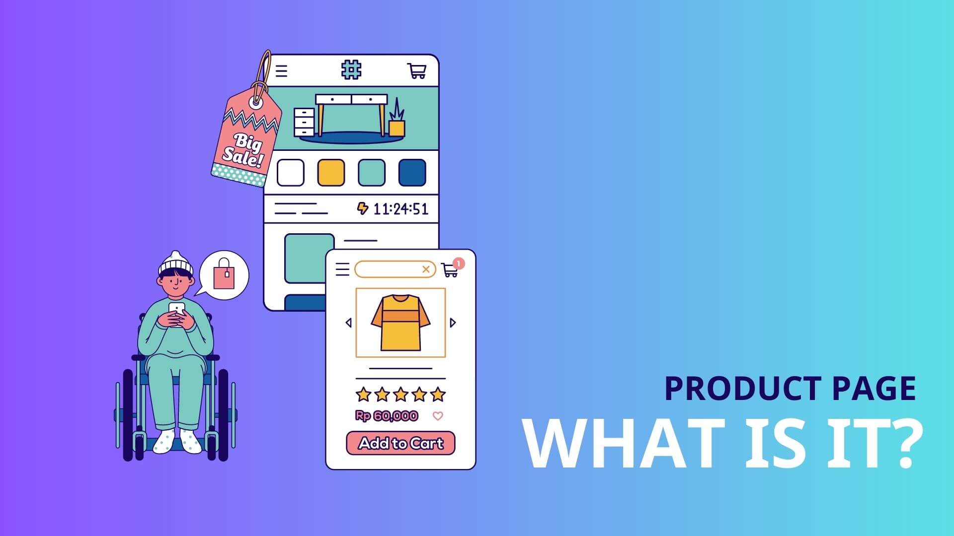
It takes more than just opening an online store and uploading product images to sell a product online. You can increase sales by setting up a product page for the item you want to sell. This gives you a place to highlight the product’s best qualities and encourage users to buy it. One of the most crucial components of today’s online marketing strategy is the product page you use to promote your product.
Everything a potential customer needs to know about the product they are interested in is contained on the product page. Your product page should include everything your product stands for, from a crystal-clear and direct CTA to premium images, pricing details, and copy that is sales-focused.
Why is the design of product pages important?
Whether you are running your own eCommerce business or using a third-party service like Shopify, one of the most crucial suggestions for expanding your business online is to make individual product pages for each of the products you intend to sell. Among the reasons why product page design is important are:
- Enhance the user experience: Finding a high-quality product that connects with a customer can significantly impact the sales funnel. The overall user experience of your potential customers can be enhanced by using individual product pages.
- Find information quickly: A well-designed and optimised product page is a helpful tool that can assist users in quickly finding information about the product(s) they are interested in.
- Streamline your sales funnel: Using product pages can help you streamline your sales funnel by making it simple for visitors to learn more about a product, add it to their cart, and complete the checkout process without any hassle.
What is the best layout for a product page?
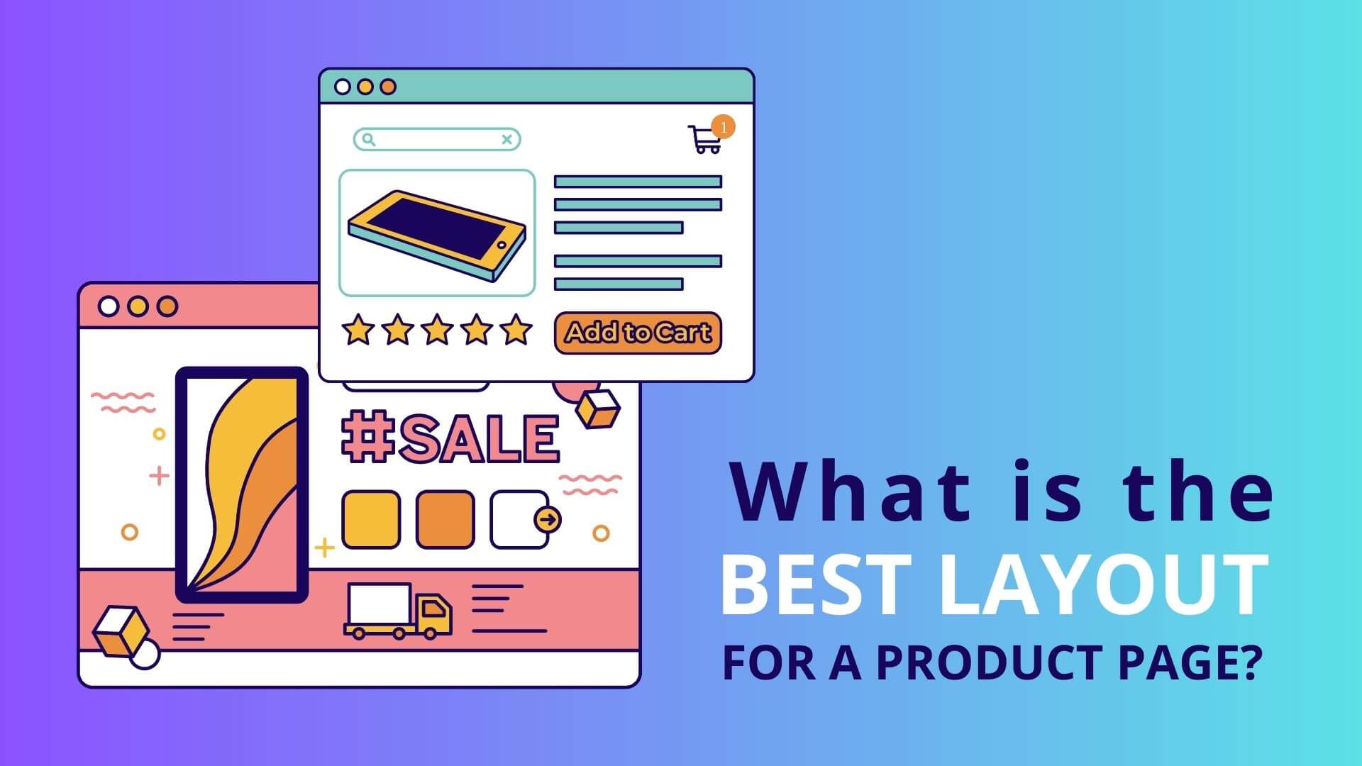
Since 55% of website visitors leave after less than 15 seconds, you only have a brief window of opportunity to capture their attention once they land on your product page. Make sure to prominently place the most crucial details, such as the description, price, and “add to cart” button, near the top of the page so that people can find them quickly.
Additionally, since the majority of readers will naturally read a page from left to right, you should arrange your page’s most important content in that direction. When selling a t-shirt, for example, you might decide to use product images as your lead content on the left side of the page. However, if your customers are more interested in the functionality of your product, you might want to start with the description or product specifications on the left side of the page.
Don’t worry if there is more to say about your product than what will fit on the top half of the page. You can share more details as people scroll down the page, such as reviews, videos, a thorough list of features, or anything else you like.
12 suggestions for creating an e-commerce product page that sells more
You can design your product page to sell more products by using the following suggestions:
Strategic design
Keep in mind when designing that the objective is to showcase the product.
Tips:
- Every page should have your branding visible so that it is obvious whose site it is without taking over the entire page.
- Almost always, simpler is better.
- The image and description of the product should take centre stage.
- Put the crucial information above the fold.
- Utilise white space to clear the area and draw attention to crucial components, such as the Add to Cart button.
- Make sure the navigation and product categorization, including the breadcrumbs, facets, and filters, are simple and easy to use.
Boost site speed
Users will leave a website if it takes longer than three seconds to load, according to Google research. We’ve probably noticed that a page that loads slowly will drive away visitors before they’ve even had a chance to view your offerings.
Tips:
- Make sure you’re using the most recent version of the CMS or site builder you’re using.
- On your website, fix any broken links.
- Don’t complicate the design.
- Optimise each picture.
- Make sure your website is optimised for mobile.
- When using CSS styles for the background and borders, use caution.
- Ideally, your page should load instantly, but if it takes a moment, pay attention to the order in which elements load so the customer sees the most crucial information first.
Show a lot of beautiful pictures
Images are the most effective way to show a customer what they will be getting in the absence of a physical retail store experience. As our brains process images more quickly than text, they are also the fastest.
Tips:
- Display the primary image prominently and place nearby thumbnails of the other images.
- Try to maintain a consistent, ideally square, image size.
- Use a white background and maintain a consistent aesthetic across all of your images.
- Show as many perspectives as you can.
- Make sure the image is in high definition and give customers access to a zoom tool so they can see the finer details, such as trims, textures, or components.
- When possible, include lifestyle photos that demonstrate the product in use so that the customer can get a sense of it.
- Customers should be encouraged to submit their photos of themselves using the product.
- Include videos as well, if you can, as they give you even more room to describe the product.
Use evocative brand names
This makes it easier for customers to find what they need quickly and improves your product page’s SEO.
Tips:
- Make them distinctive and evocative.
- Make eCommerce product pages stand out by including specific details or key attributes, such as Polo Formal Shirt Green Stripe Extra Large.
- Use the product names and keywords wherever you can on the product page, including in URLs, headings, and other text.
Make your product description interesting
A well-written product description that expresses what you’re selling and why a customer needs it is one of the most crucial components of any product page. There are a few other things to consider as you write a description of your product, but as with all of your marketing, the copy on your product page should be on-brand and pertinent to your audience.
Tips:
- Make your writing clear, approachable, and very simple to read (bullets work well).
- Instead of just listing features, emphasise the most important advantages.
- Wherever applicable, address the following questions to cover all the information: who, what, where, when, why, and how.
- Make sure the shipping fees and delivery dates are understood.
- Address concerns before they arise.
- Make an emotional connection with the product if you can.
- Any additional materials that could be helpful should be provided, such as sizing charts, care instructions, videos, or written guides on how to select or maintain the product.
Encourage action with a compelling CTA
The call-to-action button on your product page is arguably the most important component. Site visitors can quickly convert to paying customers with just one click of the “add to cart” button. They’ve committed and are prepared to buy.
However, adding any CTA and then calling it a day is straightforward. However, several variables affect whether a button is clicked or not.
Tips:
- Create contrast with colour: Make a unique colour choice that doesn’t appear anywhere else on the page to add contrast. A consistent colour scheme should be used throughout your website. In this manner, it will be much simpler to sell your products because returning customers will know instinctively which button to click.
- Expand it sufficiently: Make sure your CTA is obvious to visitors. Make it big enough so they can recognise it.
- Improve CTA Placement: The “Add to Cart” button should be displayed prominently above the fold on your product pages to make it as simple as possible. Make sure your CTA is visible above the fold and even higher on mobile.
Make the cost extremely clear.
Make sure there is no confusion regarding price, because that is frequently a deciding factor.
Tips:
- Make the price clear.
- For added selling power, emphasise any discounts you’re providing.
- The cost should be displayed close to the CTA button.
- The product name, price, and CTA button should, to the greatest extent possible, form a distinct, visually arranged unit.
Include social proof
No matter how effective your marketing is, people will always feel more secure purchasing if they know other users have had positive experiences with it. For brands, responding to the question “What do other people think of this product?” is now a requirement.
Tips:
- Make rating and reviewing submissions simple for customers.
- Put these on display where people can see them.
- Encourage social media comments and mention them on the product page.
- To get a product’s rating from experts.
- By asking customers to send photos of them using the product and perhaps including a brief narrative with the photo, you can show “user proof” on your product pages.
You can add one or more of the following in addition to product reviews:
- Social media share bars
- Heart or like buttons
- User-created material
- Logos of other businesses utilising your goods
- Case studies from earlier clients
Multiple images are preferable to a single one
73% of people want to see three or more images when deciding whether to make a purchase, according to Salsify’s 2018 consumer research report. Fortunately, most smartphones have excellent cameras (and integrated editing tools, too), making it simple to take as many lovely, high-quality pictures as you need even if you’re not a professional photographer.
Tips:
- Depending on your products, give them filters to view and choose colours, styles, fabrics, sizes, quantities, and more.
- Where appropriate, offer a visual representation of the decisions made (this is very important for colour or type of fabric, for instance).
- Display cross-sells and upsells in a section titled “Related Products” or something similar.
Assure clients and respond to their worries
Include elements of support and trust whenever you can to make potential customers feel confident purchasing from you.
Tips:
- Create a personal and emotional connection with your audience by using your about us page.
- Include links to pages with more information and prominently display the key points of your shipping, guarantee, and return policies.
- Display money-back assurances.
- Promote the security of your entire website, especially the payment page, and display all necessary security badges.
- By including a FAQ page, live chat, and contact information, make it simple for them to get support.
Additional sources and useful data
Here, you have a great opportunity to get creative and set your product pages apart. Use this section to interact with visitors and aid them in making a purchase, making your website stand out. But keep in mind that not all product pages require additional resources. Resources on that page may distract from the actions you want your visitor to take if your products are self-explanatory.
Tips:
Use this section for the following things:
- Create confidence in your product.
- Describe the assembly of the product.
- Describe its potential applications or how it benefits when used in particular ways.
- Provide evidence that the product is effective at solving complex issues.
- Enlighten visitors about potential uses other than the one they may have originally imagined.
Optimise for SEO
Pay attention to your metadata to help customers find you and persuade them to click on your link.
Tips:
Use this section for the following things:
- Give each of your products enticing and descriptive meta descriptions. Google will create them for you if you don’t, which can result in less-than-ideal search snippets. These ought to be created to get users to click on your link in the search results.
- Identify image files by giving them a meaningful file name with hyphens, such as “Blue-chair-large.”
- Fill in the image alt tags with descriptive words to help search engines understand the image. When users perform a reverse image search, the result will then show up.
- Include any PDFs on your website in a PDF viewer, and in the HTTP header, include a canonical tag. Users will be directed to your website when they open the PDF rather than opening it directly from a Google search, and that PDF page will then be trackable in analytics.
When everything is in place, look for patterns in your statistics. Utilise these to polish your product pages, perhaps by making design changes or including answers to frequently asked questions. To keep your product pages relevant, helpful, and up-to-date, update images and product details as soon as new information becomes available.
Conclusion
Directly speaking to them, e-commerce websites are adored by users. Understanding the needs and expectations of your visitors will help you design a successful e-commerce website that meets those needs.
Thousands of e-commerce stores have put the aforementioned advice to the test. But that does not imply that you put each of these concepts into practise without first testing them on your website. Each e-commerce store has a unique target market, selection of products, areas of expertise, etc. Additionally, if you simply copy what another store did without conducting any testing, your conversion rates will undoubtedly suffer.
If you still do not know how to have an eye-catching store, please refer and get more useful information at 9 Outstanding eCommerce Design Trends for your Online Store.


