

E-commerce is different from how we previously thought about it. It has evolved into a dynamic and cutting-edge online buying environment that reflects the requirements, wants, desires, and even attitudes of the customer.
However, you can’t just create any old website and anticipate a rush of purchases. You may develop an online store that draws clients and leaves your competitors in the dust by being aware of the most recent trending e-commerce design. Using outmoded trends, on the other hand, could cause your company to lag behind.
For your inspiration, we’ve done the research and chosen 9 of the eCommerce trend designs. To help you take full advantage of each trend, we’ve also included practical advice, compelling statistics, and real-world examples.
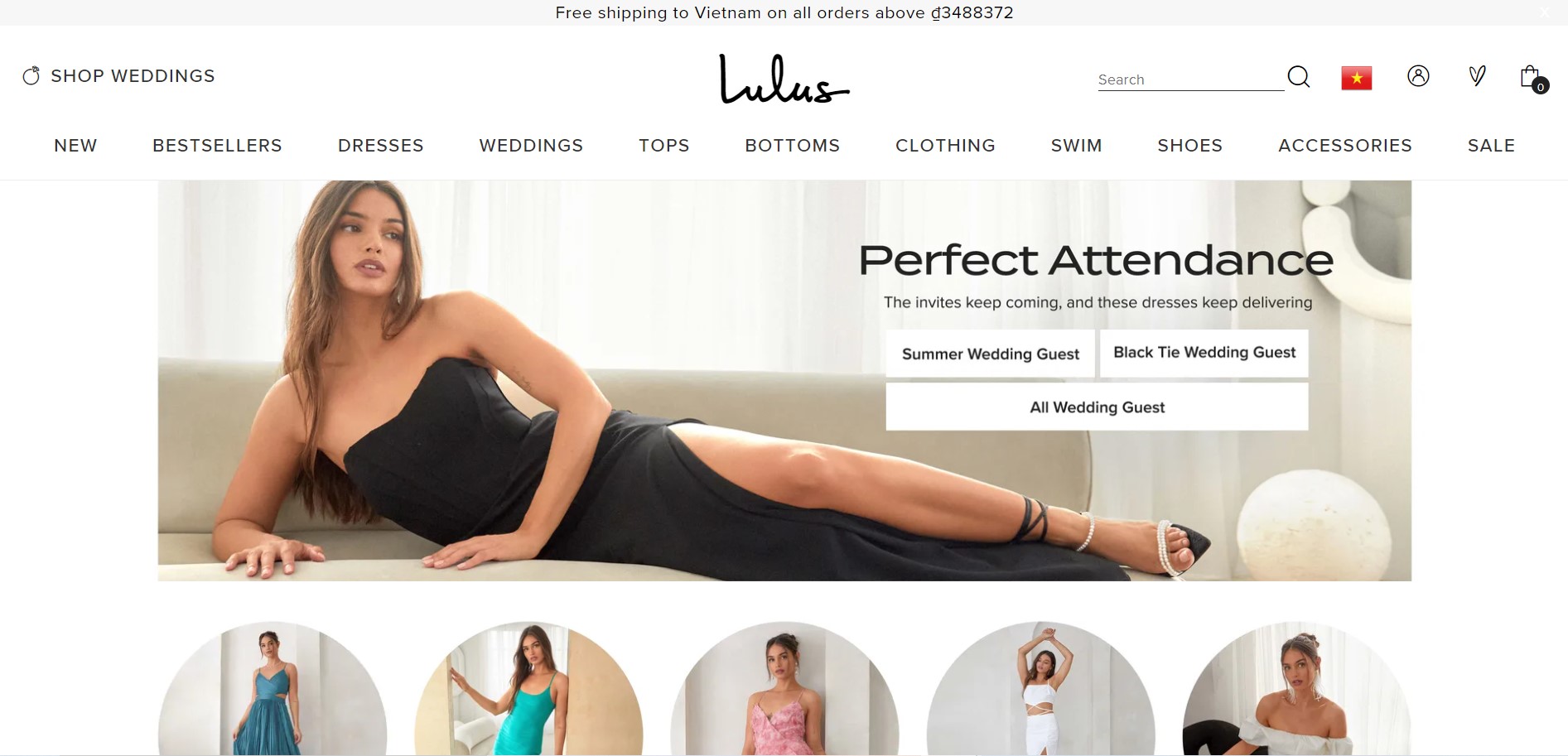
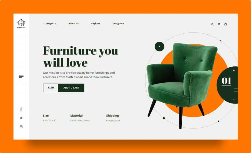
Centered navigation menus
Usual locations for navigation menus include the header, footer, or the left or right side of a page. However, we’ll be able to tell how the new stream is doing in 2023. The topic of centre navigation is now being discussed. Additionally, web designers are beginning to incorporate more animation, branding components, unique fonts, and micro-images. All of these techniques transform the standard navigation of an eCommerce website into a visual feast.
Three benefits of a centered navigation menu for your website are as follows:
- It assists the customer in learning more about the brand’s aesthetic, purpose, and values, in addition to making it easier for them to find what they need on a website.
- Quicker purchases are encouraged by simple navigation.
- Makes browsing on a smartphone even simpler for the user.
In fact, if they can make a quick purchase—that is, if they can find the right product quickly—77% of smartphone users are more likely to convert (buy something). This is one of the simplest eCommerce design trends to implement when building your company website.
Asymmetrical design
Some people don’t want a flashy website with bright colours and silly animations. Because of this, one of the most popular web design trends for 2023 is minimalism. Only the bare minimum of design elements are used in minimalist designs, along with restricted colour schemes. Adopting a minimalist aesthetic has many advantages, but you must pay close attention to the overall harmony of each design because there is so much white space that it is easy to spot when something is just a little out of place.
A minimalist design is also used on the TED website, which is well-known for posting videos of TED Talks given all over the world. But that doesn’t mean it’s tasteless and uninteresting. The homepage is visually appealing without overusing design elements thanks to the screenshots at the top, which feature presenters sporting vibrant clothing or showcasing colourful presentation slides. Additionally, the homepage has a lot of white space surrounding each video to keep the user from feeling overwhelmed.
You’ve also probably heard the adage “less is more.” Did you know that less could result in higher sales, though? In addition to making it simpler for customers to find your products, minimalist design can also speed up page load times. Small business owners can easily and affordably capitalise on this trend, especially if you’re worried about the overall price of web design.
Consumers are impatient more than ever these days. According to studies, users lose concentration on a task after just one second of waiting for a website to load, and they give up and leave after ten seconds. This demonstrates that clearing up clutter can ultimately keep visitors on your website longer because pages that are cluttered with elements load more slowly.
Here are three pointers for creating a minimalist website:
- Instead of including more elements, use colour to direct users.
- Compare ornate typography with empty space.
- Use flat textures rather than gradients or shadows.
Minimalism
Some people don’t want a flashy website with bright colours and silly animations. Because of this, one of the most popular eCommerce web design trends for 2023 is minimalism. Only the bare minimum of design elements are used in minimalist designs, along with restricted colour schemes. Adopting a minimalist aesthetic has many advantages, but you must pay close attention to the overall harmony of each design because there is so much white space that it is easy to spot when something is just a little out of place.
A minimalist design is also used on the TED website, which is well-known for posting videos of TED Talks given all over the world. But that doesn’t mean it’s tasteless and uninteresting. The homepage is visually appealing without overusing design elements thanks to the screenshots at the top, which feature presenters sporting vibrant clothing or showcasing colourful presentation slides. Additionally, the homepage has a lot of white space surrounding each video to keep the user from feeling overwhelmed.
You’ve also probably heard the adage “less is more.” Did you know that less could result in higher sales, though? In addition to making it simpler for customers to find your products, minimalist design can also speed up page load times. Small business owners can easily and affordably capitalise on this trend, especially if you’re worried about the overall price of web design.
Consumers are impatient more than ever these days. According to studies, users lose concentration on a task after just one second of waiting for a website to load, and they give up and leave after ten seconds. This demonstrates that clearing up clutter can ultimately keep visitors on your website longer because pages that are cluttered with elements load more slowly.
Here are three pointers for creating a minimalist website:
- Instead of including more elements, use colour to direct users.
- Compare ornate typography with empty space.
- Use flat textures rather than gradients or shadows.
Mobile-Friendly Designs
Although it’s nothing new, mobile-friendly design is now more essential than ever, making it one of the top eCommerce design trends of 2023.
Simply put, having a website that is mobile-friendly means that all of the content on it, including text, images, videos, and links, is easily and quickly accessible on all platforms, but especially on the much smaller screens of smartphones and tablets.
More specifically, being mobile-friendly means making the most of all the remarkable features of mobile devices in order to give users who are on the go an efficient, positive experience.
You must understand how to create responsive websites, whether you’re aspiring to be a web designer or have years of experience designing websites. For every user to have a positive experience, a responsive site should adjust to different devices, from tiny smartphones to tablets with 12-inch screens. Because many people use their thumbs rather than their index fingers to operate their smartphones, you should also consider the size of the buttons in your designs.
The advantages of mobile-friendly websites:
- Unified user interface across all devices.
- A good ranking signifier.
- Boost the conversion rate for mobile.
- Increased user comfort.
- Quicker download times.
- Cheaper and more flexible than developing an app.
Dark Mode
One of the most recent eCommerce design trends is dark mode, which makes online stores into visually appealing, user-friendly websites.
OLED screens, which don’t have a backlight like LED screens do perform particularly well in dark mode. Since the newest smartphones have OLED screens, this trend is perfect for attracting smartphone users.
Why is this crucial? Because retail m-commerce sales in the US could account for 44.2% of retail e-commerce sales by 2025 and reach $728.28 billion. This trend may be a useful strategy for drawing attention to your website and keeping your competitors in the dark.
Three ways that dark mode can improve your online store are as follows:
- It gives your store a competitive advantage through creativity.
- It’s a simple way to make key components stand out.
- Customers who use OLED screens gain from the battery savings.
We can match your company with the best web design professionals if you want to use dark mode in your online store but are unsure how to proceed. Using our free comparison tool, just let us know what you need, and you’ll get more details and no-obligation quotes from qualified designers. Starting takes just one minute and costs nothing.
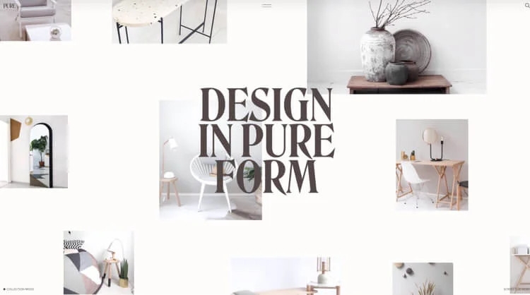
Collage Art
Shapes, patterns, mixed media, and a variety of colours are all included in digital collages. By frequently utilising newspapers, magazines, paper, and fabrics, this produces a hand-made effect that closely resembles the appearance of an old-fashioned collage.
What advantages are there?
- As it mimics an artistic, crafty vibe, this design trend is ideal for creative brands, such as lifestyle, fashion, or home decor.
- You can use a collage to show a variety of images in a single graphic. Collage exhibits a relaxed, imaginative brand personality; the busier, the better.
Neutral colours
We can see a different, more calming trend in the neutral colour palette in response to popular bold and vibrant eCommerce design trends. Prior to 2022, we would see a lot of vibrant colours used in eBusiness web design. However, by 2022, sophisticated neutral colours had taken over, and users continued to favour this design until 2023.
The best option is to use a neutral colour as the background to highlight your product if you find white to be too boring of background but still want to give your photos a little versatility without too much visual impact. While allowing you to experiment with the other elements at your disposal, neutral colours offer a steady and contemporary style. It simply fits any style and will also support any branding goals you may have.
Others may find it a little dull, but with a little imagination, you can make your product stand out against a white background by painting it a brighter colour. In almost every situation, neutral colours are also the best option. It makes people feel welcome and has a positive impact on viewers.
We can discuss the many lovely tones available, such as soft blue, cool grey, creamy, or light yellow. Even more frequently, the background of eCommerce websites will feature these colours.
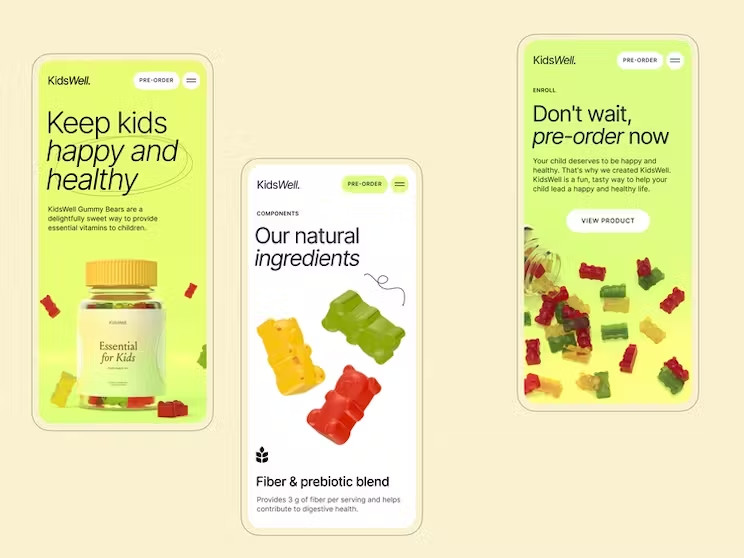
Pastel Tones
The primary and secondary colour hues on the colour wheel are typically lightened or muted down in pastel hues. They are so called because of a “pastel” quality that gives them a soft, delicate, and even dreamlike appearance.
Basically, adding some desaturation and a high hue point (lightness) to any colour will turn it into a pastel shade. If you want to exude a soft vibe, including a pastel shade in your colour palette is ideal.
Simply put, by substituting white for intense concentration, they are any colour’s counterpart. The outcome? A softer, more subdued colour that still retains its vibrant personality for the design!
Mint, baby pink or blue, peach, and mauve are a few common examples of pastel hues.
There are 7 benefits to pastel colour combinations:
- Product images should focus on the product’s colours, details, and shape, using pastel colours for a pop-out effect, even in neutral colours.
- Pastels are cheerful colours ideal for creating festive ads and emails for upcoming celebrations or festive emails.
- Pastels are timeless colours used in event decorations, including banners, place cards, and signage, ensuring harmony and cohesiveness.
- Monochromatic designs have their own strengths in marketing. Pastels add depth to colours and make it easier to create monochromatic themes.
- Combining pastels creates harmonious blends, creating colourful yet mild designs using analogous, triadic, complementary, and split complementary combinations.
- There is a visual softness that makes them special. And this can be used by skincare brands. You can use the delicate nature of pastels to show how pampering your products are.
- Experiment with pastel shades and contrasting colours to create fun and playful designs. They’re popular in children’s nurseries and fashion and can be used for marketing kids’ products.
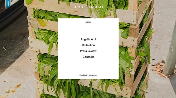
Multi-directional layouts
Unconventional layouts have previously been in vogue. It has advanced even further this year. Users can now scroll and move not only up and down, but also diagonally, left, right, and other ways. A design becomes even more enjoyable and aesthetically pleasing when there is such an intuitive interaction. This incredible technique has a powerful impact and makes an eCommerce website stand out from its rivals online.
Customers can interact with your catalogue and scroll in various directions thanks to this ecommerce web design trend, which also ties in with the trend of Dark Mode. It sounds like fun.
The following are the three advantages of using multi-directional layouts:
- It’s perfect for smartphone users who swipe with their fingers (in 2020, mobile commerce overtook desktops in terms of traffic).
- Customers are kept interested, and the user experience is enhanced.
- It gives your online store a competitive advantage in terms of creativity.
Final Thoughts
Most eCommerce design trends for 2023 place an emphasis on engagement. It always pays to involve your customers more in the online purchasing process, whether that be through interactive design or entertaining filters.
By incorporating some of these trends, your online store should stand out from the competition and promote repeat business. Additionally, it should raise the possibility of word-of-mouth advertising, wherein site visitors urge their friends and relatives to visit your website.
The latest eCommerce design trends are one of the many ways to keep your website looking new, your customers coming back, and your profit margins booming, whether you run a small shop or a thriving e-commerce empire.
If you still do not know how to have an eye-catching store, please refer and get more useful information at How to find the right Shopify theme for your online store.

