

The design for the user experience (UX) is comprehensive. The experience is made up of countless little details. It considers every aspect of a person’s interaction with a product or service, whether digital or tangible.
Consider UX designers to be the audience’s advocates, keeping the needs of the target market at the forefront during every stage of product development.
What is eCommerce UX?
The practice of anticipating your users’ needs at each stage of their purchasing process is known as ecommerce user experience (UX), and it is used to make online shopping consistent, enjoyable, and effective.
UX is heavily influenced by website design, but there are many other factors as well:
- How quickly does the website load?
- Are your navigation menus set up in a deliberate manner?
- Does it adhere to accessibility requirements?
- After each click, is the user receiving what they anticipated?
- Does the user experience (UX) on mobile devices match that on a desktop?
- Is the copy concise, clear, and specific?
- Are there any steps that could be cut from the process that are not necessary?
Ecommerce UX has its own priorities because it aims to bring a lot of customers to your online store so they can finish their transactions—ideally with the least amount of assistance and friction possible.
The biggest misconception about UX for ecommerce stores, according to Daniel Patricio of Bull and Cleaver, an online retailer of South African biltong (a type of beef jerky), is where the user experience starts.
“Maybe your homepage isn’t actually the place where customers are starting,” he says. “They might land on a product page, a blog post, etc. For Bull and Cleaver, the top two visited pages on our site are:
- A blog post about the differences between biltong and beef jerky.
- A product page that is actually the landing page for some of our ads that actually converts far better than the product page or homepage.”
These guidelines can help you design e-commerce sites with the intention of reducing friction and providing a range of users with a positive user experience and seamless customer journey.
Key elements of UX design
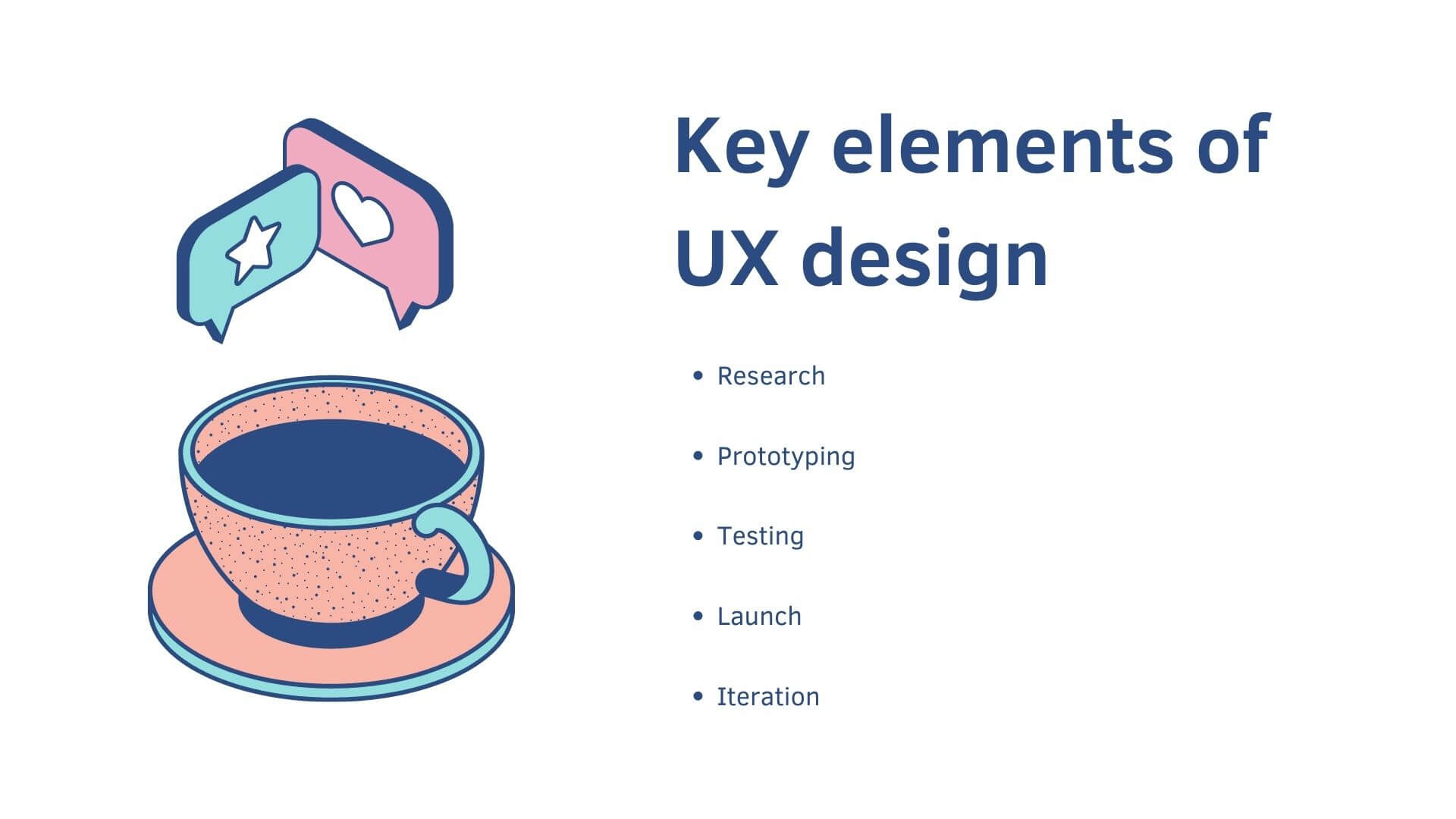
The user-centered design method, which is widely used by UX designers, consists of the following five steps:
Research
The purpose of the research phase is to provide insight into the requirements and attitudes of your target market. When conducting this research, UX designers may speak with customers, look over survey results, or assess the competition.
It helps at this stage to create personas that represent hypothetical individuals based on general demographic research. These personas can then be used to think more specifically about how users will discover, acquire, and ultimately use your product or service.
Prototyping
Making a preliminary, interactive model of a digital good or service is known as prototyping. Before spending time and money on full development, you can visualise and test the functionality, flow, and design using a prototype. Through user testing and observation, prototypes can provide information on user behaviour. Multiple prototypes are frequently created by a company because they can produce more information about user behaviour.
Prototypes are typically simple digital products that test UI elements like layout, button copy, and imagery for websites and apps.
Testing
Prototypes are then tested by users and internal stakeholders. You can then refine the initial design in response to their feedback to produce fresh, improved prototypes. Usability testing makes sure that development is iterative, avoiding costly fixes after launch.
Launch
A product is introduced with specific messaging that conveys to the general public its benefits. UX designers assist in determining this messaging because it also affects how a potential customer will experience the product.
For instance, if a website sells t-shirts that can be customised but has few graphics, the marketing messaging needs to accurately convey the quick checkout process. The emphasis should be on emphasising the simplicity of personalisation within the available options rather than promising unlimited customizability. This establishes clear expectations and guarantees a seamless and effective user experience from beginning to end.
Iteration
UX continues even after a product is released. UX designers may keep an eye on website usage and customer support now that the product or service is in use and the user base is no longer speculative. In theory, more iterations, hopefully, improved performance, and perhaps more design initiatives result from this.
Re-examining earlier steps is encouraged because the UX design process is circular. Following the discovery of a new user problem, user testing, solution prototyping, and finally a revised launch, monitoring ongoing metrics and feedback is just one form of ongoing research.
Designing eCommerce UX best practises
Prioritise function above all else
The truth is that some of those gorgeous online shops may also have some of the lowest conversion rates because flashy features annoy visitors and slow down your website.
Even current design fads can exhibit “bad UX” when they undermine the main objective of boosting conversions:
- When used needlessly, parallax scrolling can be annoying.
- Automatic image sliders frequently fail as calls to action and can be slow to load and difficult to read.
- In keeping with their name, ghost buttons frequently appear unclickable and are disregarded.
- Video backgrounds can be attention-stealing and increase load times, which will slow down your website.
“In general, be careful of flashy features. People build great websites that are performant, and then they get an Upwork developer to add just one thing that breaks it. Image sliders are the worst culprits for this,” says Patricio.
“I once saw a beautiful online store where someone had slipped in this seemingly normal image slider that destroyed their page speed since it was redrawing the page after load and adding unnecessary JavaScript. Speed is a feature and the key to conversion. Those design features aren’t inherently bad. The danger is implementing them with a less skilled developer, which slows your website down. There is a time and place for these nice-to-haves, according to Patricio, but e-commerce websites should concentrate on the essential features that must be functional.
Build sales funnels, not webpages
To make ecommerce UX as self-serve as possible, one of the objectives is to lower bounce rates, customer support requests, and abandoned carts.
To achieve this, the experience must take into account the diverse contexts of its users. Some may be customers attempting to access your About page to learn more about your company. Others may be recent clients who are looking for your return policy (they’ll probably habitually look there in the footer menu of your website).
However, for many e-commerce websites, attracting new users through advertising, SEO (search engine optimisation), and other scalable marketing channels will take precedence.
According to Patricio, the approach new merchants take to ecommerce user experience (UX) is what sets them apart from seasoned merchants.
- Beginner online retailers frequently design their homepage and product pages before considering how to increase traffic to them through advertisements, emails, SEO, etc.
- An experience that is consistent with where the users are starting is designed by experienced merchants after they build sales funnels that begin with channels and campaigns.
“One of the best ways to harness ecommerce UX to convert more is through sales funnels. Take SEO,” Patricio says. “Before touching your website, you’d ask, Who’s searching for us? What are they looking for? What is the content they need? What is the user experience with that content? What is the user experience of how it’s showing up in Google searches (the meta title and description)? How is it setting expectations for what they’re doing? Where does that lead to a purchase?”
The use of landing pages and social media ads is another typical illustration of a basic sales funnel. The Shargeek Storm 2 power bank is promoted in the advertisement below, which links to a detailed product page.
The product page:
- Makes no assumptions about the user’s knowledge of the brand or whether they have visited the homepage.
- Puts the price and call to action right at the top, making it simple for recurring visitors to make a purchase.
- As the user scrolls, explain how the product’s various features and use cases support its higher price tag (typically, the more technical or high-end a product is, the more you’ll need to inform the user).
- Include customer testimonials as social proof towards the end.
- Ends with a suggestion for additional goods.
Start with user-centred copy, then design
Similar to breathing and reading. Most likely, unless something makes it difficult or draws your attention to it, you don’t think about it as you’re doing it (like this sentence).
Users perceive effective copy in this way, so it is best to start there before moving on to design or even choosing a theme for your website.
Copy can:
- For users, set expectations before they click and then meet them afterwards.
- To help users find the places they want to go and the places you want them to go, provide signposts through links and calls to action.
- At that point in their relationship with your brand, users may or may not have context, so provide or reiterate it.
- Speak with the customer in mind to connect with them.
- Inform users of important information quickly.
However, you must first comprehend your target audience, their objectives, and your own objectives for them before you begin writing. Your copy will fall flat without doing some user research to understand its context.
In order to create a consistent UX, let’s examine the role that copy plays in both marketing and website design.
For your marketing
Marketing is frequently thought of as the start of the user journey in ecommerce user experience.
Understanding whether your marketing is attracting attention or achieving its intended purpose is one way to enter your users’ heads:
- Capturing attention. The user is browsing without actively seeking out what you have to offer, but if you can make them aware of it—for example, through a video ad or a social media post—you can pique their interest. Utilising audience segmentation and targeting, you can concentrate on users who exhibit certain characteristics that show they are ready for your offer.
- Capturing intention. The user is actively looking for something you have to offer. The search engine queries they enter reflect their intent. To better comprehend this intent and adjust your content’s or website’s SEO, use keyword research.
The company uses an image carousel in its Facebook advertisements to halt the progress of inactive users. Instead of reading from top to bottom and left to right, your eye is probably drawn to the largest text first, where the copy that immediately piques the user’s interest is displayed: “Winter-ready dog jackets.”
Similar to this, you can use text size and contrast to establish the hierarchy of your copy and draw attention to the information in the order you desire. You can also use a call-to-action copy to establish expectations for the other side of the click (Ruffwear uses “Shop Now” to lead to a collection page for its dog jackets).
When someone searches for “winter dog jackets” in search engines, Ruffwear appears, and their winter dog gear collection page is found. Observe how the page title and bolded related keywords in the meta description match the search. This is a result of the page’s SEO being tailored to this query’s intent.
You are more likely to appear in pertinent search results if you closely match the user’s search intent. And the more likely it is that users will click on your search result, whether it’s a blog post that appears for queries with informational intent in search engines like Google and Bing or a product listing that appears for queries with transactional intent in marketplaces like Amazon and Etsy.
For your ecommerce website
“Am I in the right place?”
That’s the first thing users ask themselves after every click, without even realising it.
Copy sets expectations and delivers on them at every stage of a consistent user experience:
- Labels and menu layout of your navigation (Home, Shop, About, etc.).
- When you hyperlink in blog posts, you use anchor text, such as “how to set up an online store.”
- Button copy that describes the action that will be taken when the button is clicked (such as “Learn more” or “Claim free gift”).
- Copy on a landing page that was above the fold reminded the user of the copy in the advertisement they had clicked on.
- Product information (features, sizing conversions, shipping estimates, variants, options, etc.) that aids the user in understanding the items they “Add to cart” is provided on each product page.
“Never underestimate the difference a single word or sentence can make to the user experience.”
Your landing page’s above-the-fold copy, for instance, can clearly communicate your USP and other important details so that, whether the user scrolls or leaves, you’ve made the right impression.
Take this illustration from the homepage of Molekule. How much about the brand have you learned in the first 10 seconds of landing on it before you even scroll?
- They sell air purifiers.
- Its goods have received accolades.
- When compared to air purifiers that only collect pollutants, this product is unique.
- It has reviews with four stars or more.
- The prices of its products range from $650 to $1,300.
- Its products have a 30-day trial period and are fully refundable.
- Its own technology is known as PECO.
It accomplishes all of that by making the most of the space available and figuring out what the user will need to know.
Using a free wireframing/brainstorming tool like Miro, which includes templates for mapping out your user journey and website architecture as well as laying out your copy, you can plan your copy and page layout on a whiteboard or piece of paper.
Prioritise what your copy says when and where within the user experience by understanding where your users are coming from, who they are, what they’re looking for, what they know, what their potential next steps might be, and how you can make those steps easier to take. If you do this, you can then select a theme for your online shop or alter your current theme to make the page function for the user rather than forcing the user’s experience into the page.
Patricio advises assuming that many of the users who come to your product pages via your advertisements haven’t yet visited any other pages on your website. They haven’t read your brand’s history on your homepage or your shipping policy page’s estimated shipping times.
Make online store navigation intuitive for users
In his book Don’t Make Me Think, usability expert Steve Krug writes, “It doesn’t matter how many times I have to click, as long as each click is a mindless, unambiguous choice.”
The point he’s trying to make is in the book’s title itself: Don’t make me think.
We frequently use autopilot to navigate websites and the internet in general. We simply click on whatever we feel will satisfy our needs the quickest without actively considering what we are doing or why.
Because of this, website navigation must be simple for users to understand and encompass much more than just the links you put in the menu. You must be able to easily guide a user’s experience across your website and anticipate needs that they might not even be consciously aware of.
“On your homepage, make it easy to drill down into your products, pages, and collections,” Patricio says, based on his experience with Bull and Cleaver. “I think it’s important that the utility is there on the homepage. It’s not just to make your brand pretty. It has to predict the user at every scroll and click.”
A temporary tattoo business called Inkbox collaborates with various artists on its goods. Of course, it has a sizable, nearly overwhelming selection of goods. As a result, before the user even scrolls, there are numerous navigation options front and centre for them.
The most noticeable navigation choices are:
- Sticky Search header with the advice to “Find something you’ll love!” (The user’s scrolling causes the main menu to vanish but the search bar to remain.)
- Informational links to the How It Works and About Us pages are included in the navigation menu, some of which can be clicked to expand a submenu.
- Users who, whether intentionally or not, are now factoring size as a crucial factor in their purchase decision can access collection lists based on size.
When a new user wants to make a purchase but is unsure of what to buy, they are likely to click the “Shop” menu item in the top navigation. Here, they will find options to shop by size, product, and category, and even take a quiz to get recommendations for products.
- Each link has a hover effect to indicate it is clickable, and the current menu option is highlighted with a yellow underline.
- The subcategories are arranged and labelled according to size, product, and category.
- Users are also given access to a “picked for you” option, mystery bundle, and tattoo quiz in case they are still feeling overwhelmed with choices.
The user is directed to the appropriate page, product, collection, or shop search with the appropriate filters when they click through to a link from the menu.
They can then return to the navigation menu to browse something else or use the filters and sorting options to further refine their search.
Unimportant links in universal footer navigation are only useful to a small percentage of users, such as customers looking for order assistance, journalists looking for your press kit, or potential collaborators interested in working with your brand.
For instance, you probably don’t want every user to go to your Contact Us page. Instead, you want to encourage users to check out your FAQ page first. For tracking, shipping, and return policy inquiries, Inbox offers self-serve options in their footer menu that are strategically arranged around these priorities.
Always keep in mind how ecommerce works on mobile devices
The shopping experience on a laptop versus a smartphone or other mobile device differs greatly. On a smartphone, elements are rearranged, the navigation menu is hidden inside a hamburger icon, and users can scroll, zoom, and swipe with their fingers rather than a mouse. You tap instead of clicking on these elements.
Fortunately, all Shopify themes make use of responsive design, which instantly optimises your online store for viewing on desktop, tablet, and smartphone screens.
You might want to think about designing your online store for smaller screens first in the modern world, where web traffic from mobile devices accounts for about half of all web traffic. You can switch between the desktop and mobile views while making changes in your theme editor.
One of the biggest barriers to online shopping used to be the inability to pay on mobile devices. An incoming text message was all it took to cause an abandoned checkout because you had to enter your shipping information and credit card information by repeatedly tapping on a tiny keyboard.
With so many mobile payment options available today—including Shop Pay, Apple Pay, Google Pay, Meta Pay, PayPal, and more—users now have the choice of an accelerated checkout where their shipping and payment information is already filled out.
How to find and fix UX problems on your ecommerce site
As unique as your users are, the best practices to use in your e-commerce user experience. While the aforementioned guidelines provide a good place to start, user research provides an even better one for long-term experience improvement.
Utilising both qualitative and quantitative feedback loops, user research enables you to pinpoint demand, drop-off points, and trends in user behaviour on your website.
What options do you have for identifying UX issues?
- Online store funnel analytics. Analytics for your conversion funnel can show you where customers are leaving before they convert.
- Scroll/click heat maps. You can examine the distribution of user clicks on the page and how far down they are scrolling by adding a heat map tool, such as Microsoft Clarity. Consider removing a section of the page if visitors are utterly ignoring it. Investigate the reasons why you might be losing momentum if a large number of users aren’t scrolling down all the way.
- Session replays. Using session replay tools like Lucky Orange, you can record and observe actual visitors as they interact with your website. What gives them pause? How long do they spend reading your copy? Are they browsing your photos?
- User testing. You can either hire a user testing service or just ask a friend who has never visited your website to serve as your test user. Tell them to “claim the discount code and checkout with a cart size of $120,” for example. Ask them to describe their thought process aloud as they attempt to follow those instructions as you watch.
- Five-second test. A focus group should be given a brief tour of your website to determine whether your value proposition and messaging are clear.
Start by posing a specific query, such as, “Why aren’t users adding this product to their cart?” use the tools that will help you respond after that (online store analytics and heat maps).
Below is an illustration of a heat map from Bull and Cleaver that demonstrates users skipping past the collection of dried fruits near the bottom of the page. This implies that perhaps this isn’t the best location to sell these goods. Testable potential improvements include:
- Replacing the dried fruit selection with a different, more user-friendly meat snack option.
- When they are prepared to pay, cross-sell them on the dried fruit snacks.
- Add more information or relevant copy to the page about the dried fruit snacks.
Iteration is a key component of the user experience for online stores
User experience design is a never-ending task. You put something to the test in your shop, evaluate it, and then make adjustments and enhancements.
You may occasionally make mistakes and have to undo the change. Sometimes you’ll hit the jackpot and consider how you can apply the knowledge elsewhere on your website.
You will learn a lot about your customers through this process, across all of their segments and journey stages. However, spending money on your e-commerce UX ultimately guarantees that you connect with your customers in a way that makes shopping with you simple.

