In the world of e-commerce, the checkout page is where the magic happens—it’s the final step in the customer journey, where leads convert into satisfied customers. A well-optimized checkout page is key to higher conversion rates and an improved user experience. Here, we’ll discover the importance of the checkout page, explore best practices, and provide tips to enhance your checkout process.
What is a Checkout Page?
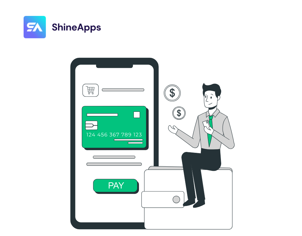
The checkout page is the bridge between a shopper’s desire to purchase a product and the completion of that purchase. It’s the key point in the online shopping journey where customers review their items, enter their shipping and payment details, and finally click the “Place Order” button. The success of this step often determines whether a lead becomes a paying customer or not.
What Makes a Good Checkout Design?

A good checkout design is pivotal, as it marks the moment when potential shoppers transform into loyal customers. The best checkout page designs are characterized by simplicity, clarity, and intuitiveness. They provide shoppers with all the necessary information for a smooth, secure, and hassle-free checkout process, free from distractions or friction points.
Incorporating the principles of good visual design, an ideal checkout page prioritizes efficiency, accessibility, and an exceptional user experience. It leverages design elements such as hierarchy, scale, and contrast to enhance usability.
What Exactly Is Checkout Abandonment, And Why Does It Happen?
Checkout abandonment occurs when a customer begins the payment process during an online purchase but leaves before completing the transaction. This results in lost conversions and revenue. To mitigate this issue, optimizing the checkout process is essential. By using analytics to identify the reasons behind abandonment, businesses can enhance the user experience and capture sales effectively.
On average, approximately 70% of checkouts are abandoned, based on extensive studies. Several key factors contribute to checkout abandonment:
- Unexpected Charges and Fees: The addition of unforeseen costs or fees can lead customers to reconsider their purchase, causing them to abandon their carts.
- Forced Account Creation: Requiring users to register before proceeding creates an unnecessary barrier. Offering guest checkout options or streamlined registration processes can reduce abandonment.
- Complex Checkout Processes: Lengthy, convoluted, or confusing checkout processes deter customers. Simplifying the checkout experience is crucial for reducing abandonment rates.
- Performance Issues, Errors, and Crashes: Consistent performance problems, errors, or crashes erode trust and disrupt the user experience, leading to abandonment.
- Limited Payment and Shipping Options: Failing to offer diverse payment methods and shipping choices can hinder the convenience customers seek. If customers cannot use their preferred payment methods or shipping options, they may be less likely to complete their purchase.
To address checkout abandonment effectively, use analytics to identify specific weaknesses in your checkout process, focusing on areas where improvements will have the most significant impact. By taking targeted actions and making necessary adjustments, businesses can steadily enhance their conversion rates and reduce abandonment rates.
The Importance of Checkout Page Optimization
Checkout Page Optimization is a critical aspect of e-commerce that holds several key benefits:
Reducing Cart Abandonment
Cart abandonment is a widespread challenge in e-commerce, where customers abandon their shopping carts before completing a purchase. A well-optimized checkout page streamlines the process, reducing friction points that often lead to abandonment. By making the checkout process more straightforward and user-friendly, businesses can significantly decrease cart abandonment rates.
Enhancing User Experience
The user experience is at the core of a successful online store. A smooth and hassle-free checkout experience leaves a positive impression on customers. It signifies that your brand values their time and makes the shopping process easy and convenient.
A positive experience during checkout can result in not only completing the current purchase but also fostering customer loyalty. Satisfied customers are more likely to return for future purchases and even recommend your store to others.
Boosting Conversions
Conversion rate optimization (CRO) is the primary goal of checkout page optimization. By addressing user concerns, implementing trust signals such as security badges, and providing convenient options like multiple payment methods and guest checkouts, you can significantly improve your conversion rates.
A well-optimized checkout page turns more visitors into paying customers, maximizing the return on your marketing efforts and investments.
Mobile Responsiveness
The rise of mobile shopping is a significant trend in e-commerce. With an increasing number of customers using smartphones and tablets to make purchases, it’s crucial to ensure that your checkout page is mobile-responsive.
A mobile-responsive design means that the checkout process adapts seamlessly to various screen sizes, offering the same user-friendly experience as on a desktop. Ignoring this aspect can result in frustrating mobile users and missed sales opportunities.
Data Security
Data security is a top concern for online shoppers. Prioritizing data security and displaying trust signals such as SSL certificates and recognized payment logos can significantly increase trust in your online store.
When customers feel their personal and financial information is secure, they are more likely to complete their transactions. Addressing data security not only enhances customer trust but also protects your business from potential breaches and legal complications.
One-page Checkout vs. Multi-page Checkout
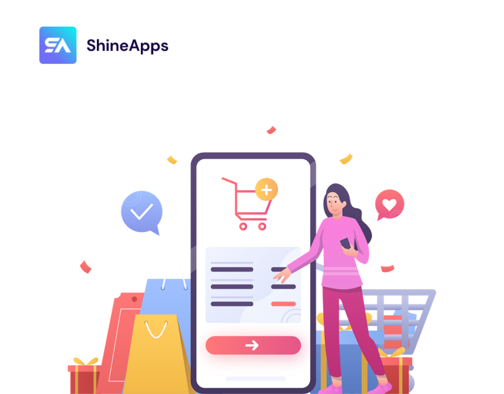
When it comes to checkout processes, there are two primary options to consider: one-page checkout and multi-page checkout. Both approaches have their respective advantages and drawbacks, and the choice between them depends on the nature of your business and your customer base.
One-page Checkout:
Pros:
- Speed: One-page checkout is faster since it doesn’t require customers to wait for multiple pages to load or refresh.
- Psychological Advantage: Shoppers can see their progress, which motivates them to complete the purchase.
- No Navigation: All fields are on a single page, eliminating the need to navigate between pages for edits or changes.
Cons:
- Design Complexity: Designing one-page checkouts can be challenging, especially if you need to gather a significant amount of data. It can lead to a cluttered and off-putting layout, potentially resulting in cart abandonment.
Multi-page Checkout:
Pros:
- Data Collection: Breaking the process into multiple steps allows you to capture customer data even if they abandon the cart at a later stage.
- Design Simplicity: Multi-page checkouts typically have cleaner, more minimalist layouts, giving the impression of a simple and fast checkout process.
Cons:
- Potential Disheartening: Customers might find a multi-page checkout disheartening if they see several steps remaining in the progress bar, potentially leading to cart abandonment.
Ultimately, the choice between one-page and multi-page checkout should align with your business model and customer preferences. Remember that selecting the checkout page type is just the initial step; further optimization can be undertaken to enhance the overall shopping experience.
Tips to Optimize an Online Checkout Page

Before making any changes to your checkout page, it’s crucial to have a clear understanding of the issues that need addressing. Blindly altering your checkout process can lead to unintended consequences. To identify and rectify friction points and drop-offs, leverage tools like Google Analytics, heatmaps, and A/B testing. These insights will inform your changes, leading to improved conversion rates.
Here are some effective tactics to enhance your checkout experience:
1. Skip Mandatory Registration
When optimizing your checkout process, it’s crucial to consider the user’s perspective. Many users prefer the option to proceed with their purchase without being forced to register for an account. While customer data is valuable, asking for registration too early in the process can deter potential buyers.
To address this, offer a guest checkout option. You can still encourage registration by presenting it as an option on the thank-you page after a successful purchase. This approach removes a significant barrier, increasing the likelihood of completing the transaction.
2. Offer Multiple Payment Options
To ensure a seamless and frustration-free checkout, present payment options early in the process. A variety of payment gateways not only caters to different customer preferences but also minimizes the risk of customers abandoning their carts due to a lack of their preferred payment method. By offering multiple options, you increase the chances of customers completing their purchase without any hiccups.
3. Enhance Security
Online shoppers often have concerns about the security of their personal and financial information. To alleviate these concerns, incorporate trust signals throughout the checkout process. Display security seals and recognized payment logos prominently.
Additionally, consider offering guarantees such as a money-back guarantee or hassle-free refunds. These measures contribute to a sense of security, making customers more comfortable completing their purchases.
4. 'Save the Cart' Option
Customers may sometimes need more time to decide or face interruptions that prevent them from completing a purchase immediately. Providing the option to save their entire cart or individual products for later can be a game-changer.
This feature makes it convenient for customers to return to their shopping without the need to start over. It increases the odds of them returning to complete their order, ultimately boosting your conversion rates.
5. Free or Affordable Shipping
Shipping charges are a significant factor in cart abandonment. With services like Amazon Prime setting the standard for free shipping, customers often expect reasonable or free shipping options. High shipping costs can deter customers, so it’s essential to be transparent about these costs upfront.
Where possible, consider offering free or affordable shipping options to enhance the overall shopping experience. Reducing or eliminating additional fees can be a powerful incentive for customers to complete their purchases.
In Summary
Your checkout page is the final destination in the customer’s journey, and it’s where conversions are won or lost. Choosing between one-page and multi-page checkouts, while nuanced, should align with your business goals and user experience. No matter which path you pick, the paramount focus must be on continuous optimization. Make it as seamless as possible, and more customers will happily reach that “Place Order” button.


