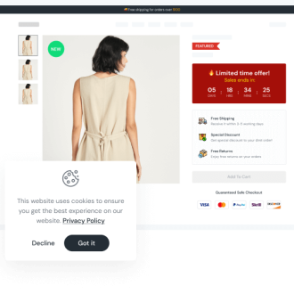
The first thing customers notice when they visit your online store is the layout of your Shopify website. Due to this, Shopify web design is the most crucial component for sellers to ensure that visitors stay on their website long enough to decide whether or not to make a purchase.
However, designing your Shopify store can be a fun challenge for more artistically inclined people. However, the process of deciding between serif and non-serif fonts can be extremely difficult for marketers and business owners alike.
Shopify offers a tonne of tools to make getting started simple, including pre-made theme templates, professional designers available for hire, and an app store with a tonne of add-ons. But it’s challenging to create a Shopify store that is visually appealing, attention-grabbing, and conversion-focused.
How can you then maximise the potential of your Shopify website? You’ll find the top 6 design strategies for both new and experienced stores listed below by the most successful Shopify store owners.
Choosing the Right Theme for Your Shopify Store

The next step in creating a Shopify website is selecting the appropriate theme once you have created a plan for what you want to accomplish. The user experience, brand identity, and general aesthetic of your online store will all be directly influenced by the theme that you choose for your Shopify store. To narrow down your search and browse Shopify website designs, head over to the Shopify theme store.
Since there are so many themes to choose from, each with a number of style variations and customization options, the theme store helps merchants better understand how to design a Shopify website. While some Shopify themes are free, others have one-time fees that can reach $360. In general, compared to the free options, the paid themes are more sophisticated and provide more advantages. It is strongly advised to use a fully customised theme created by expert Shopify web designers if you really want to stand out from the crowd.
How then do you pick the appropriate theme for your website? It’s not as easy as you might think to choose the right Shopify theme. To choose the best one for your store, careful planning and investment are required. Your business strategy, your product line, and the features you require are some of these criteria.
Is there a Shopify theme that is ideal for your store? No. According to your long-term business growth strategy and marketing plan, you could also alter your theme.
Don’t Overdo it
Your site being overloaded and over-engineered is the most typical issue in ecommerce design, according to Mark Perini, founder of Icee Social. You should put all of the information you have to share with your audience on your website.
“You’ll be tempted to showcase everything you have in your arsenal, whether that be a plethora of information or a backlog of every product you’ve ever made. While it’s true that there are going to be customers who want to see the entire history of your brand, those people are few and far between. Figure out what your top products are and give them a place of honour on your site.”
Use whitespace liberally when designing your Shopify store. While visitors scroll through your website, white space enables you to keep their attention on your text and images.
In order to avoid overwhelming your visitors, when adding design elements to your website, make sure they don’t make your site appear cluttered or overcrowded. A/B testing can help you test components on your website to make sure they improve the user experience for your audience.
Improve Loading Times
Speed optimisation is essential for any Shopify store. Even if your website is visually appealing and draws visitors, slow load times can quickly turn visitors away from your business. The amount of time it takes for your page to load decreases pageviews by 11% and conversions by 7%.
Google affirms that one of the most important ranking factors is page speed. Therefore, it is best to optimise your store’s load times as quickly as possible for both desktop and mobile devices if you want your website to rank highly in Google’s search results.
If your website takes too long to load, you can speed it up by doing the following:
- Image Compression – High-quality product images are desirable because they will increase sales, but the drawback is that they take longer to load. Take the easy way out and compress the image. File sizes can be reduced by about 50% using free online tools like Tinypng.com without noticeably lowering image quality.
- Eliminate Unneeded Widgets – Other website add-ons like widgets, apps, and other plugins can speed up load times. To simplify your website, take everything out but the necessities.
- Avoid using third-party themes – Although this isn’t always the case, third-party themes occasionally come with unforeseen additions that increase the time it takes for the entire site to load. Contact the developer of your theme if it wasn’t made by Shopify directly to find out how you can speed up loading.
- Ignore the carousels – Carousels tend to reduce load times, whether you love them or hate them is a matter of design. Carousels are the ideal weight to lose if you’re trying to make your site lighter, but that’s not to say you shouldn’t use them (they have their benefits).
By spending money on page speed services, you can also get assistance with your site’s load times. Shopify themes for SEO should also be taken into consideration, as they can aid in the creation of an SEO-friendly website because page speed can affect search engine optimization (SEO).
Utilise Apps to Create Your Website
You may want to consider using apps to create your website. Shopify uses apps, much like plugins for other e-commerce platforms available today, to make it easier for you to add features to your website that will improve the user experience for your visitors. The Shopify App Store offers a wide variety of apps that you can select and use to create your website.
Application categories include:
- Finding Products
- Orders and Shippings
- Marketing and Conversion
- Selling Products
- Store Design
- Store Management
You can include an app to help create a better e-commerce site, whether you want to streamline your sales process or manage your inventory.
Visualise Your Website
Our next task is to include images. People need to feel as though they can “see in person” the product through your visuals since they can’t actually see it.
Both images and videos can be used to promote your products online. Make sure to use high-quality images that show your product from every angle when you upload these images to your website.
Connect With Leads by Adding Elements
Last but not least, you can add elements to your Shopify store that will help you connect with potential customers.
Social media buttons are one thing you should add. These buttons offer your target market the chance to follow your company on the social media networks you use. It’s a fantastic way for potential customers to get to know your business.
The email signup bar is another thing you can include. You can collect leads for your company using the email signup bar. To encourage users to sign up for your email, you should include a call-to-action (CTA) button in this bar.
Furthermore, you can customise every little detail of your website, including:
- Positioning of CTAs, ads, widgets, etc.
- Colour of particular buttons.
- Choices for navigation.
- Phrases for labels, microscopes, etc.
- The best images for increasing conversions.
Sum Up
It’s time to perfect your Shopify store now that you have your list of Shopify website design suggestions! You can increase the income of your company with a personalised Shopify store.
There is never a single best strategy because it depends on the customer demographic your store is trying to reach. And regardless of how skilled you or your designer are, it’s always preferable to base decisions on solid evidence rather than just on gut feelings.


