Shopify feature icons are made available and necessary for display in or on an online store to help convey meaning and encourage consumers to act while taking up less space on the screen than words. Follow the steps in this blog to learn how to add a successful icon.
What Is A Shopify Feature Icon?
The Shopify feature icon is the graphic icon made available and required for display in or on an online store to convey meaning and prompt users to take action while using less screen space than text.
Shopify feature icons act as visual aids to help sellers complete tasks. They’re simple, informative, and build on the visual language of the design system.
Principles of Shopify Feature Icon
Simple over detailed
Detailed icons increase the cognitive load. Put a focus on simplicity to make icons easier for shoppers to understand and identify in smaller displays for retailers.
Literal
Literal icons are easier to understand than abstract symbols. Use literal icons rather than metaphorical icons anywhere you can convey the simplest ideas or concepts. Choose an icon that is logically connected to the topic if it cannot be expressed literally (such as a coupon or an activity like shipping).
Stay professional
Similar to how information has to do with communication tone, the same goes for an icon’s design. Instead of focusing on the message’s ability to excite. evaluate its effectiveness. In other words, focus more on correctly describing the function than on how attractive it looks.
Stick to the intended size
Two icon sizes are available in Shopify’s system: main (20×20) and minor (16×16). You shouldn’t scale icons up or down. Each icon has been carefully designed for its intended size and pixel grid layout for cleanliness and transparency. By doing this, consumers may be confident that icons are easy to understand and recognize.
Tips for creating or choosing a Shopify feature icon
Firstly, you should use Shopify feature icons that have been used for a long time worldwide, because they have a higher chance of being recognized and understood quickly. For example, delete settings, and search are effective and don’t need to be redefined.
Next, you can use a single icon to represent variations of the same concept. You don’t have to create a custom Shopify feature icon for each of the concepts. This will affect the strong connections around the concept of your online website.
An icon’s purpose is to increase the user interface’s legibility and scannability by working as a visual signal that describes the content. Icons should generally be positioned close to names and titles. Never use an icon in place of a product’s or feature’s name, with the potential exception of an icon that depicts a well-recognized action, such as the trash can icon for deletions.
Remember to keep internationalization in mind, and use a widely recognized icon whenever possible. However, there will be cases where a concept can only be expressed via a locally recognized icon. Verify that the symbol will be recognized at a glance by people from various cultures and backgrounds before choosing it.
When and where to use the Shopify feature icon
A Shopify feature icon is a good way to shorten the display of text. However, it does not mean that you should use it every time you want.
The icon should be used in the primary navigation, in page headers and section titles, in banners to bring attention to a specific theme, inline with text to add clarity, and when you want to direct attention to something the customers take action on.
How To Add Shopify Feature Icon To Your Online Store
There are many ways to add a Shopify feature icon to your online store, however, adding through a third-party is the most simple way. In this guide blog post, we will use Product Labels & Badges Shine as an example.
Step 1 - Find and install the app Product Labels & Badges Shine in your online store.
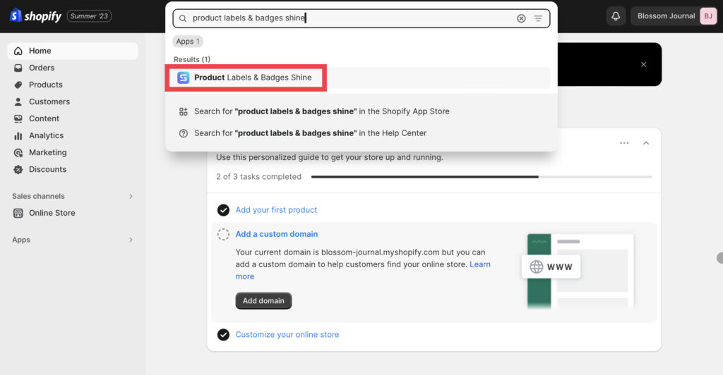
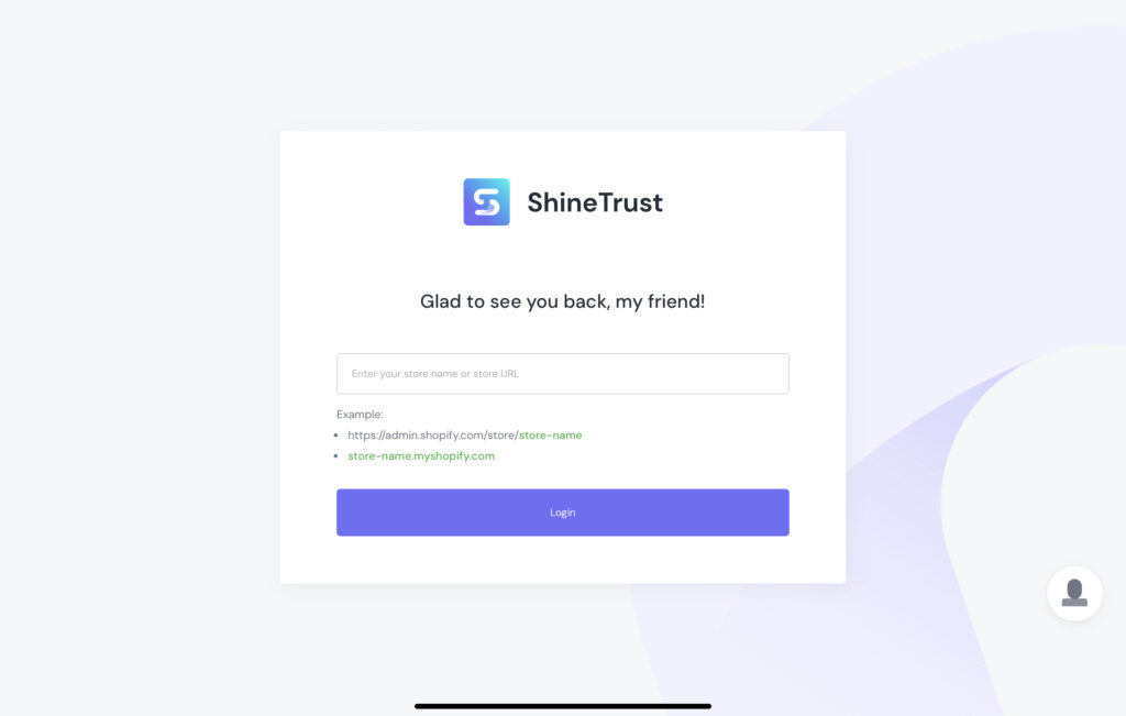
Step 2 - Enter your store name or URL link for your store.
Step 3 - After going to the Dashboard, turn on the Feature Icon.
ShineTrust provides feature icons as visual representations of specific properties, elements, or process steps that must be displayed in or on a user interface.
Step 4 - Choose a block template to start.
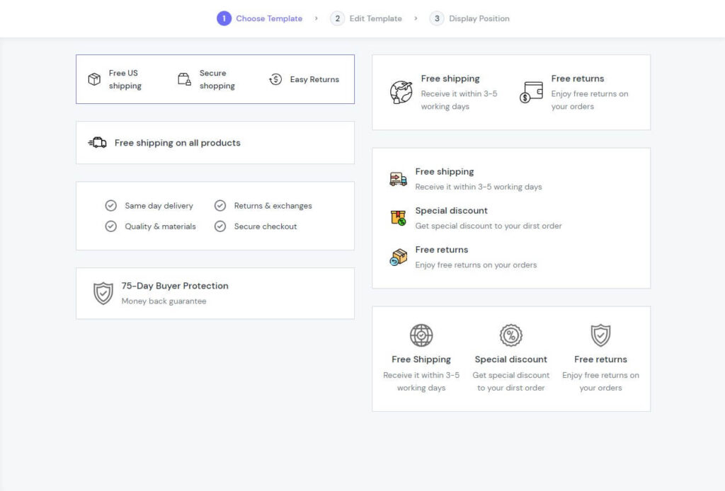
There are seven layouts for you to choose from, depending on your specific requirements. After you have selected your favorite layout, click Next at the bottom right of the screen to move to the next step.
Note: You can also customize your template in case the pre-designed one doesn’t meet your needs.
Step 5 - Edit the Template.
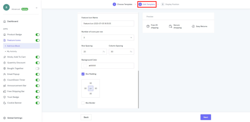
Now, ShineTrust allows three types of media so that you can maximize the display of your products:
Message
Five features in the Message element let you optimize how the content appears for the highest conversion rate. To view a feature’s settings, select the feature in the layout:
- Icon: They integrate 1000+ templates, so you can select a fundamental icon that best meets the demands of the market today or submit your icons in the JPG, JPEG, PNG, and SVG file types.
- Title: An icon’s descriptive name.
- Subtitle: The title is followed by captions that provide more details.
- Add to link: Include the link that enables people to switch between pages by clicking.
- Arrange: Easily change the icon’s position.
- Delete: Remove any unnecessary icons.
- Add icon: Increase the number of icons.
Note: If you don’t need to publish, you can remove the icon.
Style
There are 10 elements to choose from to improve Feature Icons, such as:
Icons | Icon Size: Control icon size to make it useful |
Icon Color: Modify the colour of icons. | |
Title | Title Font Family: Choose a typeface to be the core design |
Title Font Weight: Determine how bold or light your title will appear. | |
Title Font Size: Make your title font size smaller or larger. | |
Title Color: Modify the colour of the title. | |
Subtitle | Subtitle Font Family: Choose a typeface to be the core design. |
Subtitle Font Weight: Determine how bold or light your sub-title will appear. | |
Subtitle Font Size: Make your subtitle font size smaller or larger. | |
Subtitle Color: Modify the colour of the subtitle. |
Layout
Layout design is the process of arranging graphic and textual elements on a screen or piece of paper to catch the reader’s attention and effectively deliver information.
Here are your options for the following six elements:
- Number of icons per row: Choose between 1 and 4 for the number of icons per row.
- Row Spacing: Set the distance between rows to 50 pixels.
- Column Spacing: Set the column spacing to a maximum of 50 pixels.
- Color of the Background: Change the background colour.
- Box Padding: Make a borderless area around the element.
- Box Border: When you define the width and height of an element, the browser takes note of any border and padding. You can choose Radius – rounds the outside border edge’s corner, or Colour – sets the colour of this box.
Step 6 - Display Position
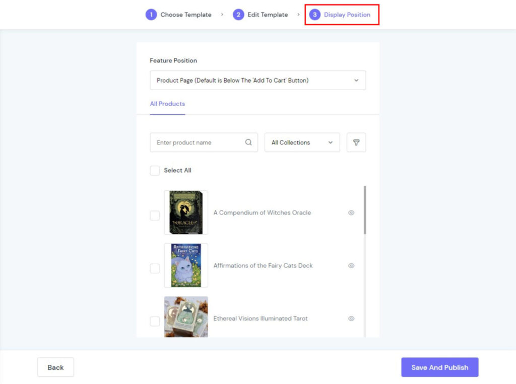
You can change the display’s position to suit your needs with the Display Position feature. Four spots are available for displaying feature icons:
- Product Page (default is Below The ‘Add To Cart Button)
- Cart Page (Default is Below The ‘Check Out’ Button)
- Use Blocks to Customize
- Custom
To display your feature icons, click “Save and Publish” at the end.
Step 7 - Double Check
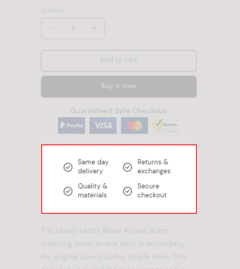
When you have completed all of this, you should double-check how your feature icons are displayed in the shop and make any changes that are needed.
Note: Check My Activity to see how your campaign for the Shopify feature icon is running, or edit if needed.

In Conclusion
The Shopify Feature Icon is a powerful element when setting up your store to be more clear and simple by saving space in text. With this guide blog, let’s try and test icons on your online store!


