In the realm of eCommerce, engaging landing pages are the key to unlocking seasonal success. Halloween, with its whimsical appeal, offers a fun opportunity to create landing pages that attract customers and drive conversions. In this article, we’ll explore some Halloween landing pages to inspire your eCommerce store’s marketing efforts. Join us now!
What is a landing page?
A landing page is a single web page designed with a specific goal in mind, primarily focused on converting visitors into customers or leads. These pages are often used for various purposes such as lead generation, email newsletter sign-ups, market research data collection, or direct sales of products and services.
The key characteristic of a landing page is its ability to streamline the conversion process by eliminating distractions like navigation menus, visual clutter, and competing offers, especially in product sales-oriented landing pages, to ensure a smooth and efficient conversion experience.
Why Halloween Landing Pages Matter?
- Creating Urgency: To boost holiday sales, utilize the limited timeframe of the season to instill urgency in your customers. Messages like “Buy now or miss out” or “Only…days left to grab these Halloween products” can motivate customers to make purchases of special holiday-themed items.
- Precise Messaging: Halloween landing pages should deliver a clear and focused message that presents your products as solutions tailored to customers’ holiday needs. By avoiding distractions and highlighting special offers relevant to the occasion, you can keep customers engaged and improve your store’s SEO by enhancing search engine ranking factors (SERF).
- Customer Segmentation: Use the landing page to gather customer information and understand their purchase behaviors. Analyzing why they are interested in your products, their demographics, and their specific needs allows you to tailor future promotional campaigns and improve your business strategies.
- Seasonal Relevance: Halloween landing pages show your customers that your eCommerce store is up-to-date with the latest trends and festivities. This relevance can help your brand resonate with customers looking for Halloween-themed products.
- Enhanced User Experience: Dedicated landing pages can provide a seamless shopping experience, helping customers find the Halloween products they’re seeking quickly. This can lead to higher conversion rates and customer satisfaction.
Tips To Improve Your Holiday Promotions
- Speedy Page Loading: Ensure your landing page loads quickly to prevent potential customers from getting frustrated by slow loading times.
- Simplicity and Clear CTAs: Keep landing pages simple with a clear focus on compelling Call to Actions (CTAs) that stand out. Minimize distractions to streamline the purchasing process.
- Create Curiosity with Coming Soon Pages: Engage well-informed customers by offering sneak peeks and setting countdowns, sparking curiosity and keeping them attentive to your upcoming holiday promotions.
- Leverage FOMO (Fear of Missing Out): Instill fear of missing out in customers by displaying scarcity and popularity indicators like “Only 3 left in stock,” “333 people have viewed this product,” or “333 people have bought this product.”
- Optimize for Mobile: Given that many users browse on mobile devices, ensure that your campaign ads and landing pages are mobile-friendly to reach a broader audience.
- Streamline Checkout: Simplify the purchasing process by skipping the cart and leading customers directly to the checkout page for swift and hassle-free transactions.
- Create a Festive Atmosphere: Embrace the holiday spirit by infusing a festive ambiance into your landing pages to enhance the overall shopping experience during the holiday season.
Essential Components for Your Halloween Landing Pages
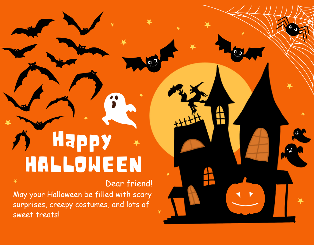
Before diving into the creation of your holiday landing pages, it’s important to understand the key elements that should be incorporated into your Halloween-themed design.
Spooky Background Banner
The hero banner is the first thing visitors see, so make it captivating with a Halloween-themed background. Incorporate eerie images like haunted houses, foggy graveyards, or sinister forests to instantly immerse your audience in the Halloween spirit.
Spiritual Icons
To further enhance the Halloween ambiance, consider replacing standard icons with Halloween-themed ones. These could include pumpkin icons, ghost-shaped buttons, or spiderweb dividers. Customizing your icons or using readily available Halloween icon sets can add a playful and thematic touch.
Mysterious Animation
A well-placed, subtle animation can work wonders. Consider having a ghostly figure float across the screen, a witch’s hat spin, or bats flying in the background. These animations should be eerie yet not overwhelming, creating an immersive Halloween experience without distracting from the content.
Fonts
Choose fonts that evoke a Halloween vibe. Google Fonts provides a selection of typefaces specifically designed for Halloween, allowing you to add a touch of spookiness to your text. These fonts can be used for headings, subheadings, and body text, infusing the page with a thematic atmosphere.
Color Palette
Embrace the iconic Halloween color palette to set the right mood. Incorporate shades of purple, orange, red, black, and yellow strategically throughout your landing page. Consider the following color combinations:
- Dark Tone: Use a combination of black, dark grey, and light grey to create a sophisticated and eerie ambiance.
- Neutral Tone: Opt for grey or red as the base color, complemented by shades of orange and yellow for a balanced and warm feel.
- Light Tone: Combine purple with either orange or red and add accents of light yellow for a playful and vibrant look.
Content
Create engaging content that aligns with the Halloween theme. Incorporate puns and wordplay by integrating Halloween-related terms into your product names, such as “Boo-tiful Home” or “Spook-tacular.” Additionally, use descriptive “Halloween adjectives” to enhance your product descriptions and reinforce the holiday atmosphere.
Attributes
Infuse your landing page with classic Halloween attributes. Decorate it with images of carved pumpkins, jack-o’-lanterns with flickering candles, and silhouettes of black cats. Ghostly apparitions, tombstones, and haunted house silhouettes can also enhance the eerie atmosphere. Don’t forget about evil-looking bats, spooky trees, cobwebs with spiders, skulls, witch hats, and broomsticks scattered throughout the design.
Special Typography
Typography plays a significant role in setting the mood. Select unique fonts or apply creative stylization to your existing ones. Gothic fonts or those with a creepy, handwritten feel can be perfect choices. Ensure that the chosen typography complements your web graphics and aligns with the Halloween theme.
8 Halloween Landing Page Examples In 2023
These Halloween landing pages demonstrate various approaches to capturing the Halloween spirit and engaging visitors with themed content and offerings. Here are some Halloween landing page examples to inspire your design:
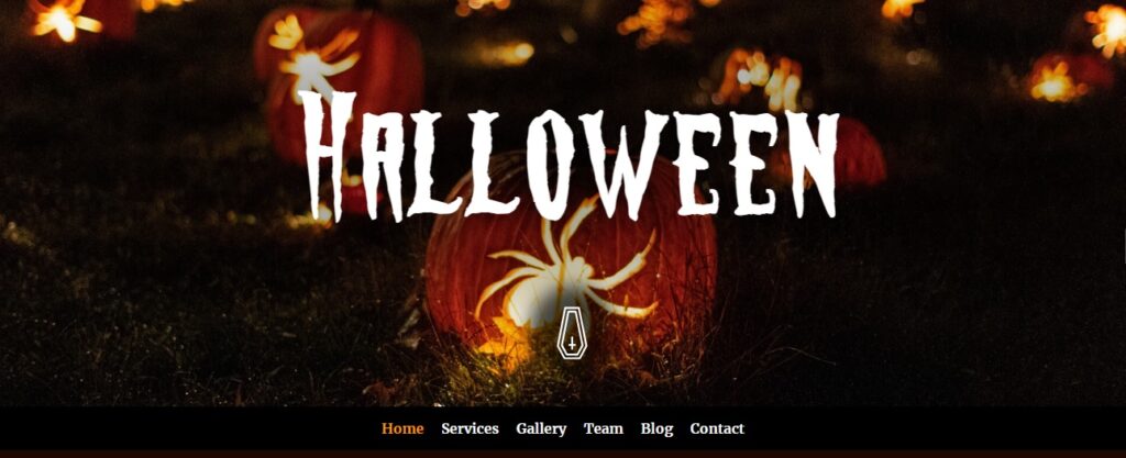
This template skillfully captures the essence of Halloween by immersing visitors in the autumnal transformation and the gathering of supernatural beings like ghosts, witches, and vampires. Its versatility makes it suitable for a wide range of purposes, including parties, stores, and various other spooky needs.
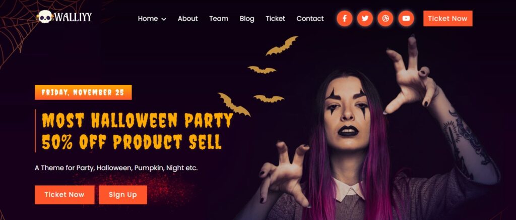
Walliyy stands out as a responsive and highly customizable template tailored for haunted clubs, Halloween parties, and events. Offering two distinct home versions and boasting clean, well-structured code, it extends its utility beyond events to encompass product or service-selling websites.
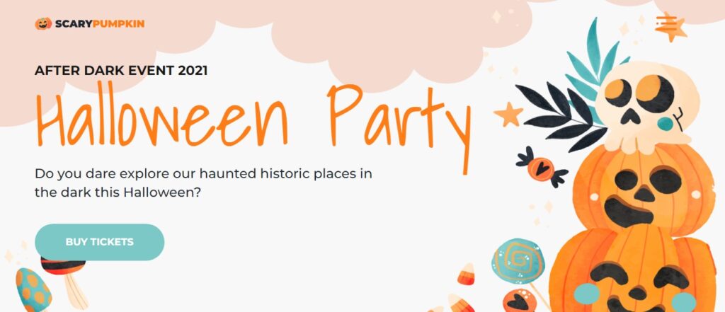
Built on Bootstrap 5, this template offers high responsiveness and reliability. Primarily designed for the promotion of Halloween events, it generously provides expansive areas for textual content, captivating imagery, and engaging videos. Notably, it incorporates fully functional forms, an aesthetically pleasing header and footer design, practical pricing tables, and an array of icons that collectively contribute to an appealing and informative user experience.
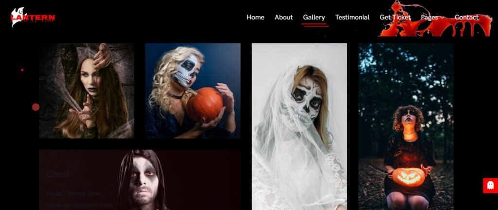
This template is perfect for Halloween parties, featuring a unique Scary Home Slider, ticket section, testimonials, contact form, and event table. Adding to its thematic appeal, the template incorporates Halloween-themed elements, such as a customized cursor and scroll bar, to create an immersive and visually captivating experience for visitors.
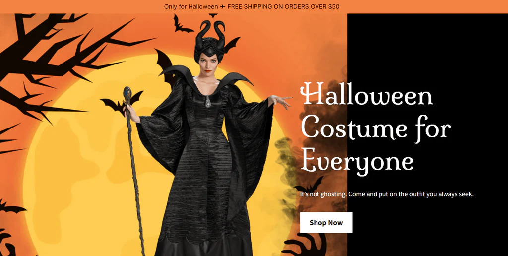
This template features numerous Halloween images, employs a classic Halloween color palette (black, white, and orange), includes an attention-grabbing custom animation in the heading, and offers product categories with specific themes.
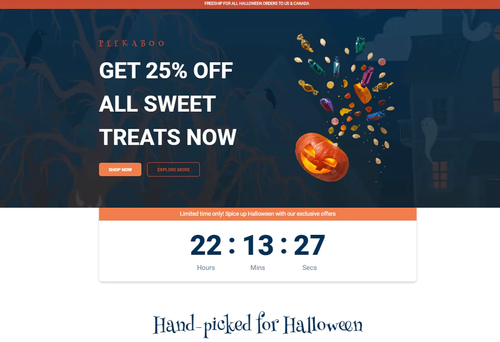
Candice uses a vibrant and colorful Halloween color palette, uses specialized Halloween-themed product names, boasts an eye-catching and distraction-free design, and provides a select range of options for targeted products.
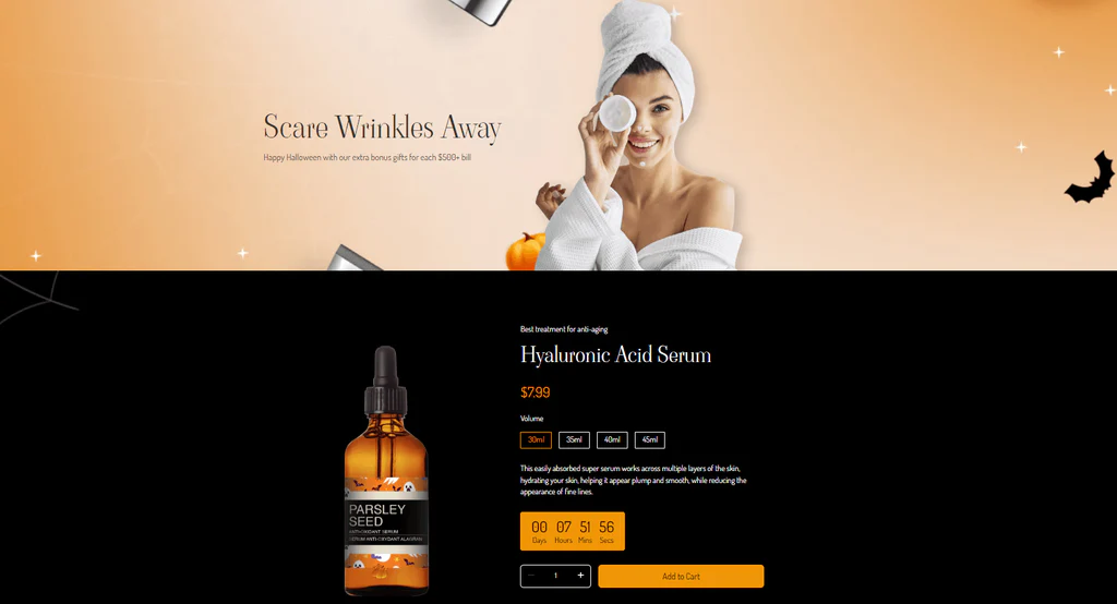
Incorporates Halloween-inspired copy, organizes products by categories, adds urgency with countdown timers, promotes community engagement, and enhances credibility with real celebrity feedback.
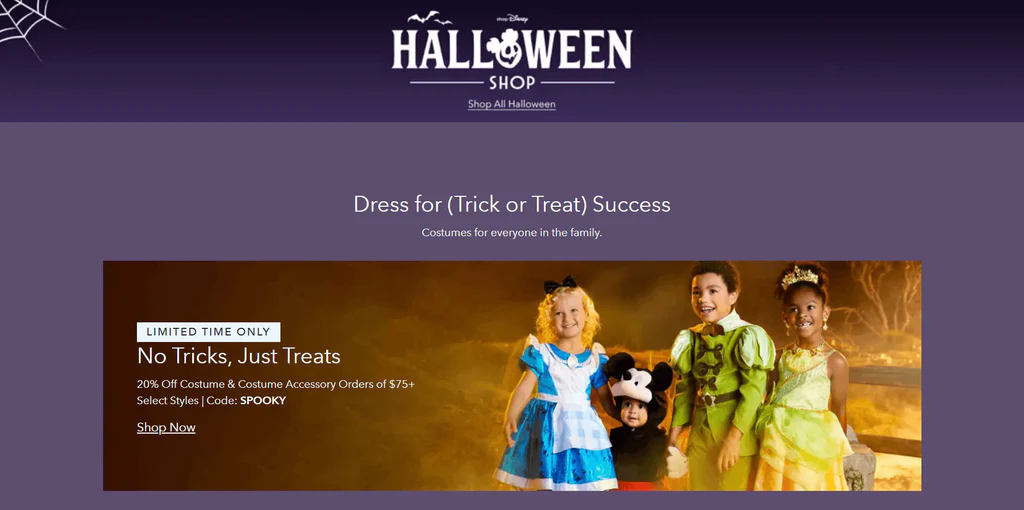
This landing page effectively employs a “Limited time only” strategy to induce a Fear of Missing Out (FOMO) among visitors. It features engaging Halloween-inspired copy such as “Ghoulish From Head-to-Toe,” “Home Is Where the Haunt Is,” and “Bring on the BOO!” Additionally, the page strategically places various Call to Action (CTA) buttons throughout, inviting shoppers to explore Disney’s Halloween offerings.
Wrapping Up
Adding Halloween landing pages to your e-commerce store’s marketing strategy is a smart way to increase sales and engage customers during this spooky season. Whether you’re highlighting products, providing discounts, or running contests, ensure your landing pages are visually appealing, easy to navigate, and SEO-optimized. By doing so, you’ll be well on your way to a successful Halloween sales season that leaves a lasting impression on your customers.


