If you’re looking for the best mobile-friendly eCommerce themes to modernise your store or establish a new one, the Responsive Shopify theme is definitely worth checking out.
Now more than ever is the ideal time to invest in responsive designs and Shopify responsive themes.
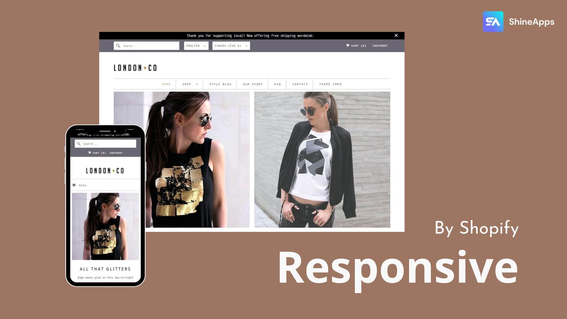
This theme aims to look fantastic across all screen sizes. In particular, it streamlines and expedites the shopping process for customers, regardless of the device they use.
The Out of the Sandbox responsive Shopify theme is an eCommerce theme made to increase your store’s visibility across various devices.
It is a responsive theme that is technically sound and flexible, compliments a range of goods and industries, and looks excellent on all devices.
Using the highly flexible layout, typeface, and included promotional possibilities, you can simply and tastefully convey the narrative of your company.
The most popular and technically sound Shopify theme is responsive. This readily adaptable theme complements a wide range of goods and industries and looks fantastic on all devices.
This theme will put your company and products front and centre because of the eye-catching graphics, simple navigation, flexible product images, and full social media integration.
This theme will put your company’s name and products front and centre thanks to its vibrant graphics, simple navigation, dynamic product image, and thorough social integration.
This theme may also be used to create original promotions for your shop. You may use text and images to educate your consumers about offers, discounts, or new goods.
Theme Highlight | Details |
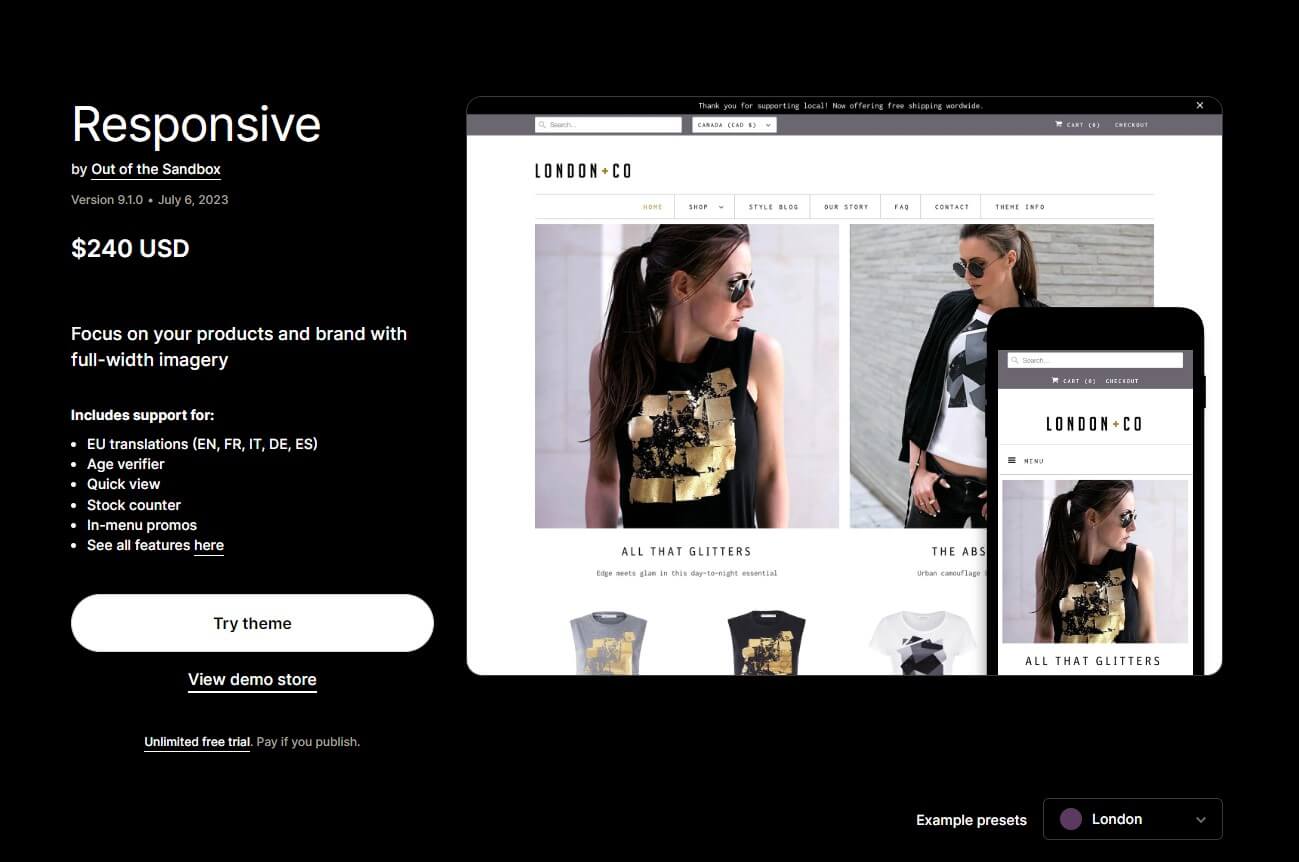
Pricing | Offers an unlimited free trial. Pay once the business goes live. The licence is worth $240. |
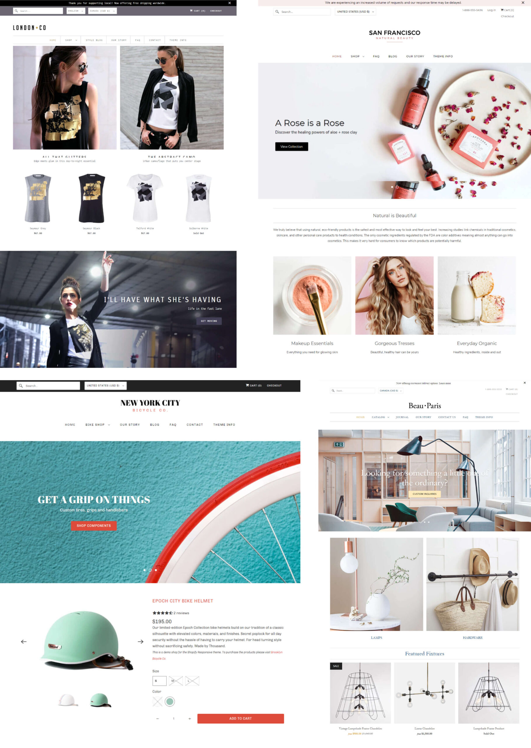
Theme styles | London, Paris, New York, and San Francisco |
Sitewide feature | Look great on every screen, product-popping features, and highly customizable design. |
Theme speed | Tested and proven to be fast |
Theme flexibility | Highly customizable and ideal for branding |
Great for | Ideal for stores with high-traffic |
Best Suited for Niches/Industries
The responsive Shopify theme was created with the goal of displaying your business flawlessly on all current screen sizes. Because of this, practically all markets that demand high-resolution pictures for enhanced shopping experiences can benefit from this theme.
Fashion (clothing, accessories, bags, watches, jewellery, shoes, and sportswear), food and beverages, cosmetics, beauty & health, home & interior décor, outdoor goods, gardening, electronics & appliances, and other industries might benefit from using a responsive theme.
Best Suited for Inventory Size(s)
Shopify stores with a single product or a single product type and those with small to medium-sized catalogues.
Responsive Theme Pricing
The Responsive Shopify theme costs $240. After the initial purchase, there are no extra fees. You will receive lifelong customer support after you purchase one of the Out of the Box themes.
At this price, which is about normal for a professional Shopify theme, the investment is reasonable if you want your brand to stand out from the competition.
Almost everything needed to succeed in the eCommerce game is there in the responsive theme, a powerful Shopify theme. The responsive theme should be used if giving your store a flawless appearance on all devices is your top concern.
Pros | Cons |
Exhibits expertise in designing arrangements that make shopping enjoyable. | Programming in Unicode and the right-to-left switch are both broken. The theme is not recommended if you need RTL support. |
Exemplary performance in terms of page load speeds and ease of navigation. | – |
A design that is very mobile-responsive and features elegant styling. | – |
A very responsive design for mobile devices with a classy appearance that can accommodate different inventory/catalogue sizes and specialised sorts. | – |
The responsive Shopify theme is made to render your store smoothly on all current screen sizes. Additionally, the theme is renowned for its pixel-level refinement, which ensures that all components are shown appropriately for an improved shopping experience.
You can create custom pages using the shop builder’s drag-and-drop functionality without using any extra coding. The theme drives a variety of customisable features, including pictures, quotations, blogs, items, collections, and content. The responsive Shopify theme features four distinct design layouts — New York, San Francisco, London, and Paris—each with a calming flavour of its own.
Homepage
The first presentation of themes with several portions will be partial. To make additional parts visible, choose Show.
Click the (+) Add section in the left sidebar of the theme editor’s (Customise) section. Next, choose one of the available segments. Use the search box to search by section name.
The design has extremely mobile and responsive layouts that are versatile and adaptive. The theme offers a variety of visual effects on photos (for collections, items, promotional banners, etc.), including image rollover, animation, zoom, and more.
You may choose from a variety of adjustable home page parts, including featured goods, pictures, featured collections, customer testimonials, full-width brand videos, blog posts, and much more.
On all pages, popup ads for newsletters and upsells/cross-sells are displayed.
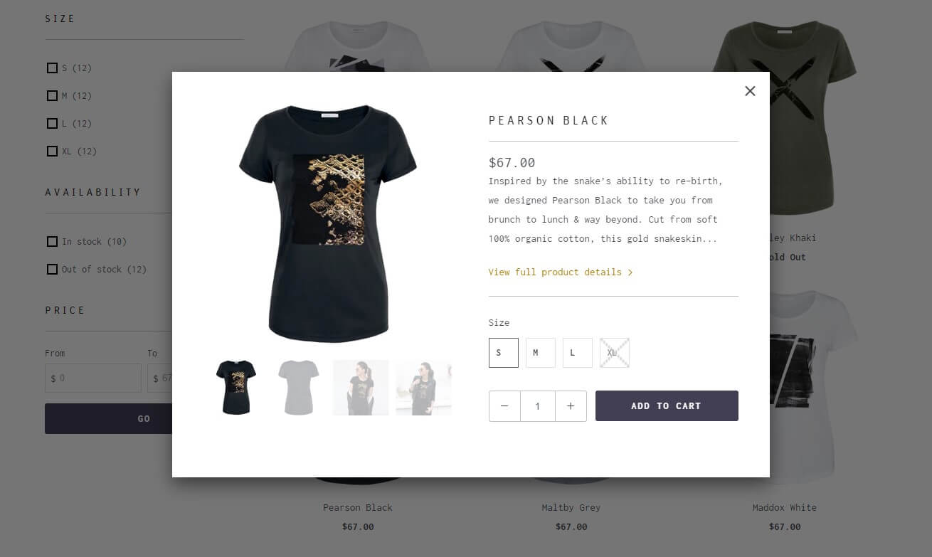
Product Pages
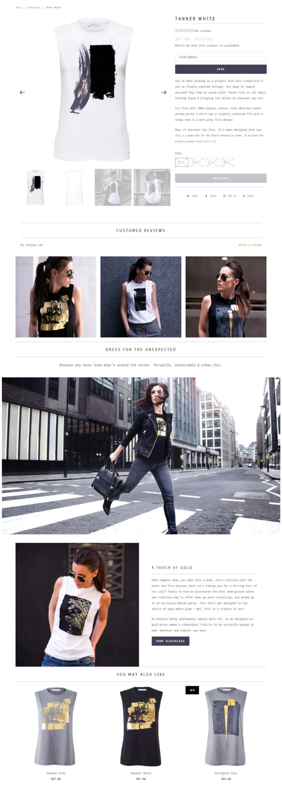
The design, functions, and settings of the product page are controlled by the Responsive Default product template.
Merchants utilise the product page, also known as a PDP or product details page, to highlight the features and benefits of each product.
Using the features on your product page, customers can find out more about a product and add a version to their shopping basket.
To display photographs as thumbnails and present all of the product media through the quick shop, choose the Show thumbnails setting.
The “Show Arrows” setting must be enabled in order to display the “previous” and “next” arrows for your product media.
To allow customers to zoom in and examine your product’s photographs more carefully, enable the Magnify product images with the hover setting.
FAQs
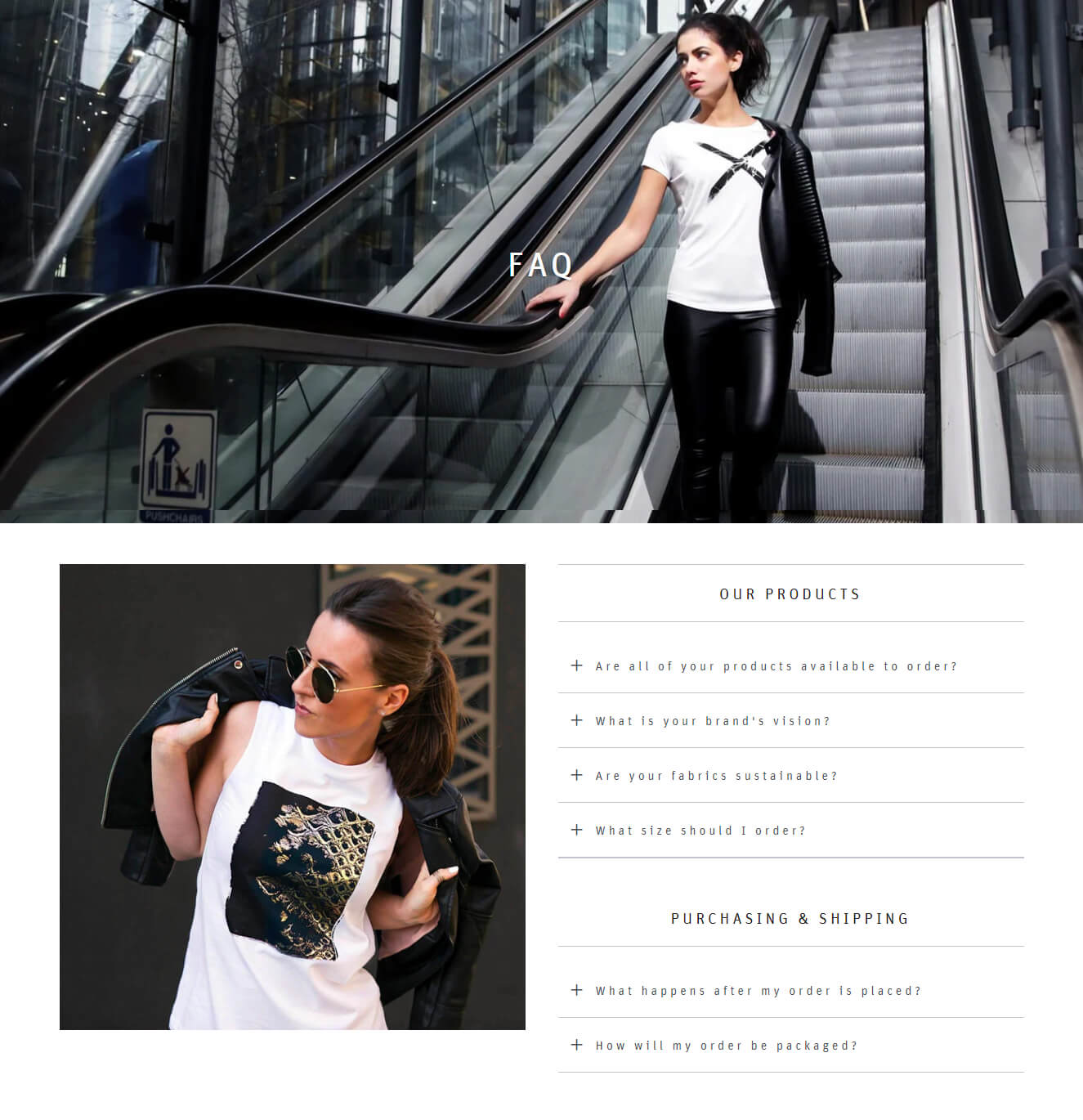
To display commonly asked questions and user answers, the FAQ (often asked questions) page layout employs a dynamic, accordion-style structure.
From your Shopify admin, first create a new page, then give it a title. Select FAQ from the dropdown menu of theme templates to access the section, then click Save.
Although the page templates provided here are only accessible by administrators, additional material can be added to display above the FAQ area. Enter your questions and answers in the theme editor.
Consider adding header blocks if you want to create groupings of questions. To alter the content of the already loaded Title heading block, open it. To fit your demands, modify the header field’s wording.
Collection Banner
You may assign the “Collection Banner” template from the responsive Shopify theme to your Collection in order to display the banner image.
The “Collection Image” from the collection is used by default in the banners. Before using the header picture, you must first create at least one collection.
In the Responsive Shopify theme, you must first upload a “Collection image” for your collections. This picture will appear as the banner.
Custom Liquid
A Custom Liquid area, which functions similarly to the Custom HTML part in the Responsive Shopify theme, makes it simple to add custom code to websites.
You may avoid making direct theme file adjustments by adding the Custom Liquid section to any page and utilising the provided field to add additional, Liquid-formatted content.
Put your code in the Custom Liquid section.
Google Map
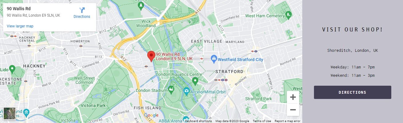
Using this responsive Shopify theme will enable you to include a Google Map section so you can reveal your company location and make it simple for customers to discover you. You may already be familiar with how Google Maps functions.
They will therefore find it simple to investigate and obtain Google Maps instructions for the location of your store.
Newsletter Popup
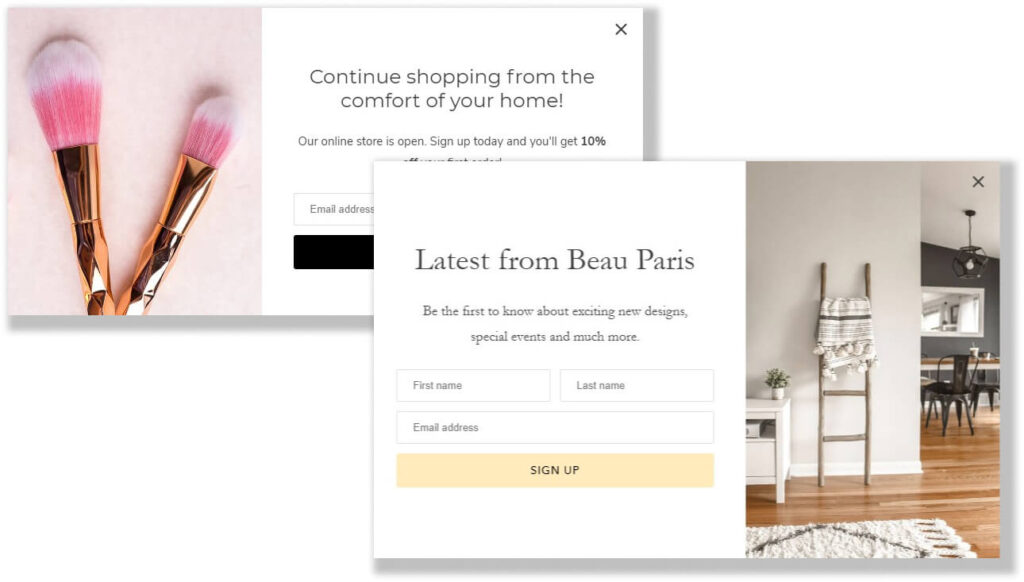
The Responsive Shopify theme offers the ability to enable a newsletter popup. Here, the features of the Responsive Shopify theme are covered in more detail.
To activate the Newsletter Popup, open the Popup section of the Theme Options, then select activate popup.
Select Show popup on mobile to make the popup visible on both desktop and mobile devices. Disable it to limit this to desktop computers.
By selecting Show newsletter, you may activate the area for signing up for the newsletter. Add a field for the first and last names of your customers using the ‘Show first name’ and ‘Show last name’ options.
Mega Menu
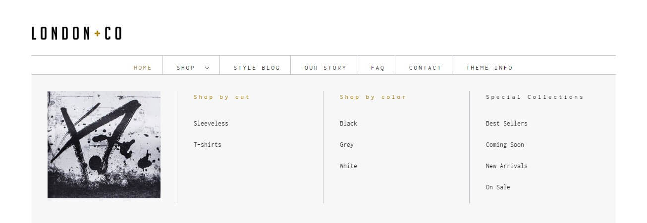
The Responsive theme’s Mega Menu is an excellent tool for showcasing collections and categories. Mega menus allow your clients to quickly explore across product categories. If you wish to organise things by brand or vendor, they are useful.
Create a drop-down menu, then expand it to become a mega menu. To personalise the feature, add a bottom banner and a content column.
Before creating a mega menu, you must create a menu in your Navigation admin. How many columns your mega menu has depends on the kind of menu selections you want to offer.
Ten columns are the most that may be used in the mega menu. The Mega Menu changes into a drop-down menu for each column when viewed on a mobile device.
Your content column and the bottom banner will still be visible here if you’ve enabled them.
Quick Shop
Using the Quick Shop button that has been added to your website, you can quickly and easily read a product’s details from the cart page and then add it to the cart without ever leaving your current page.
Instead of visiting the product page, customers may use the Quick Shop feature to instantly browse product details by hovering over the product image.
Furthermore, Quick Shop makes it simple for customers to choose and add products to their shopping baskets from your collection page.
Blog Setup
The title “News” will by default be present in your business. You can use this one or create your own under a different name.
Visit your Shopify admin page, pick the online shop option, and then select blog posts to add a blog. Next, pick the add blog button by clicking “manage blog.”
Give your blog a name, and pick how you want to handle comments. Also, don’t forget to save your blog.
Within the admin page for the blog post, you may add content to the article. The rich text editor used in this field makes it much simpler to format your posts. You can also decide to add a link, a picture, or other types of material.
Product Media Types
You may use images, 3D models, and videos as product media. You may provide your consumers with a clearer idea of what your items are like and how they seem in use by employing product media.
Videos, up to 250 pictures, or 3D models can all be included in a package. Product media are now supported in version 7.2.0 of the Responsive Shopify theme.
The three categories of product media are pictures, movies, and 3D models.
Images
The product media that comes in the form of graphics will probably be much more recognisable to you. These are the images that display your products.
Although the Responsive Shopify theme provides a feature for “aligning the height of product photos” on Collection pages, we advise submitting product images with the same size and utilising a consistent aspect ratio, or height-to-width ratio, for the best results.
Videos
You may either upload a video file or include a link to a YouTube video when incorporating videos into your product. Before uploading your video files, confirm that they adhere to the following requirements.
If you want to incorporate YouTube videos, you can deviate from this standard.
3D Models
3D models are digital, three-dimensional representations of an object. They allow you to see the object from any angle.
Using 3D models will also enable you to better convey to your customers the size, scale, and degree of detail of your products.
Make sure your 3D model files meet the following specifications before uploading them to your online store.
Out of the Sandbox support does not include phone, live chat technical, or sales assistance, as mentioned in our support policy and terms & conditions, in order to maintain the highest level of value for their clients.
However, you can always email them or use their help centre to get in touch with them. Only emails will be used to process requests. Out of the Sandbox does not provide phone or live chat support for sales or technical issues.
One of the simplest and most user-friendly designs is the responsive Shopify theme. You may exhibit your products and brand personality in an interesting approach that entices customers to scroll down for more information.
Make sure your site is populated with movies, lifestyle photographs, and high-resolution images of your items.
All the design elements and choices you want as a store owner are included in the Responsive Shopify theme, including multi-column submenus and several action buttons.
It offers an infinite variety of customizability options, is mobile device optimised, and has a quick loading time.
Take your Shopify store to the next level!
© Copyright 2023 | ShineApps.co by shinecommerce.co
