“Call-to-Action (CTA)” is an integral element of an online marketing campaign. It’s a simple yet powerful call that encourages readers or customers to take the critical action you desire. So “What is a CTA?” and “Why is a CTA important?” ShineApps will immediately answer you through this article!
What is a CTA?
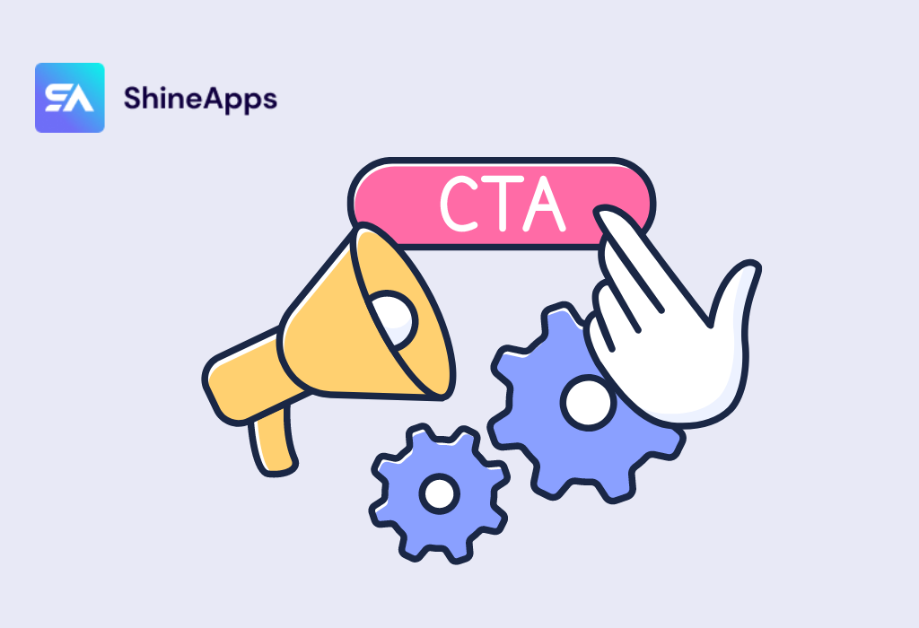
A call to action is a small, attention-grabbing paragraph or sentence that appears in the content, asking the reader to take a specific action. These actions can be: “Sign up now,” “Shop now,” “Download for free,” or any other action that aligns with your goals.
CTA buttons are typically displayed as images, link paths, or even in the form of textual cues on websites, advertisements, and other platforms. They serve as navigation signposts, directing users to the next steps and encouraging them to take specific actions that benefit the business.
Why is a CTA important?

A Call-to-Action (CTA) button is a crucial element in design and marketing, commonly used in both online and offline materials to encourage readers or customers to take a specific action. Below are some important benefits of using a Call-to-Action button:
Encourage Action
CTAs help convert reachers into actual customers by asking them to take certain actions, like shopping, signing up, downloading, contacting, sharing, and more. It motivates and guides the reader to engage with your content or product.
Positivity in Advertising
In online advertising, CTAs can drive click-through rates by clearly and compellingly demonstrating the benefits of clicking that button. This improves your ad’s performance and increases the likelihood of conversions.
Create engagement
CTAs can stimulate customer engagement on social media platforms or in online communities. This helps to create a two-way communication environment and build deeper relationships with customers.
Measure Performance
Using CTAs allows you to easily measure the performance of your marketing campaigns. You can monitor conversion rates, click-through rates, and other related brands to gauge if your campaign is successful and make necessary adjustments.
Motivate to shop
On an e-commerce site, the “Buy Now” or “Add to Cart” CTA helps to motivate customers to shop. A CTA’s clarity and appeal can boost purchasing decisions and increase sales.
Create focus points
CTAs help users focus on the specific action you want them to take, helping them avoid being distracted by other information or activities.
In a nutshell, a powerful CTA has the ability to drive a reader or potential customer to convert from just reading content to taking a specific action. CTAs help guide the reader and create a strong link between your content and your business goals. Without a CTA or a weak CTA, the reader can get lost and not know what to do next.
When and where should you use CTA?
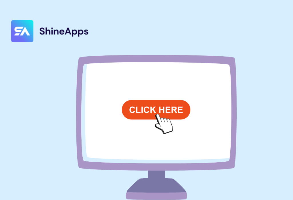
You should use a Call To Action (CTA) in various situations and locations. Utilize CTAs strategically and adapt them to your marketing goals in each context to ensure optimal effectiveness.
- On Your Website: Place CTAs in articles, product pages, or service pages to encourage readers to take action, such as signing up, making a purchase, or downloading resources.
- In Blog Posts and Articles: Insert a CTA in a blog post or article to guide readers to take action, like reading a related article, subscribing to newsletters, or sharing the post.
- In Email Marketing: Use a CTA in an email to invite recipients to take an action, like clicking to buy a product, sign up for an event, or download a document.
- On Landing Pages: Place a clear and compelling CTA on the landing page to encourage potential customers to sign up, request a quote, or take another important action.
- Online Advertising: Use CTAs in online ads such as banners, videos, or ads to drive engagement and conversions from your reach.
- On Social Media: Post CTAs on business social media pages to drive followers or page likes, using phrases like “Sign Up Now” or “Follow Us.”
- In Videos: Place a CTA in a video that requires viewers to take an action like subscribe to a channel, discuss, or visit a website.
- In Mobile Applications: Implement CTAs in mobile apps to guide users through actions like installing an app, making purchases, or participating in courses.
9 Types of CTAs You Need to Know
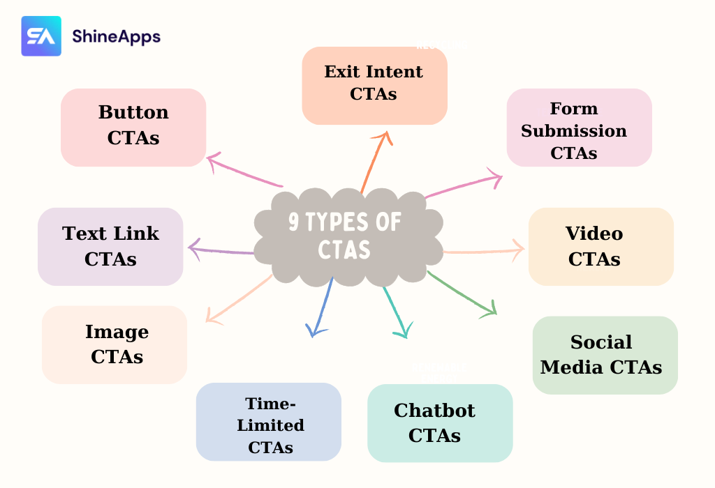
There are several popular types of CTAs that are commonly used in various marketing contexts today. Each type of CTA serves a unique purpose and can be strategically applied based on the context of your marketing campaign and the desired user action. These include:
- Button CTAs: These are the most recognizable CTAs, often presented as clickable buttons with clear and action-oriented text, such as “Buy Now,” “Sign Up,” or “Learn More.”
- Text Link CTAs: These are simple hyperlinks within the text that encourage users to take action. They are often used within blog posts, articles, or email campaigns.
- Image CTAs: These CTAs use visual elements, such as images or graphics, to capture attention and prompt action. They’re particularly effective in visually engaging mediums like social media and banners.
- Time-Limited CTAs: These CTAs create a sense of urgency by highlighting limited-time offers, encouraging users to take immediate action.
- Chatbot CTAs: Chatbots often present CTAs for users to initiate a conversation, seek assistance, or learn more about a product or service.
- Social Media CTAs: These CTAs encourage users to engage with your brand on social media platforms, such as “Follow us on Twitter” or “Share this post.”
- Video CTAs: Used in videos, these CTAs prompt viewers to take actions like subscribing to a channel, visiting a website, or watching related content.
- Form Submission CTAs: Commonly seen on landing pages, these CTAs invite users to fill out a form in exchange for something valuable, like a free ebook or a subscription.
- Exit Intent CTAs: These CTAs appear when a user is about to leave a website, offering them a last chance to take action before exiting.
What is an effective Call To Action?

An effective Call To Action is a design or content element that effectively and naturally drives a reader or customer to take action. Here are some key elements that help create an effective CTA:
1. Create Excitement
An effective Call To Action (CTA) must create excitement for the reader or potential customer. Use evocative language like “Discover,” “Experience,” or “Discover Now” to spark their curiosity and get them excited to take action. The goal is that when they read the CTA, they feel an interest in what it proposes.
2. Color and Design
Color and design play an important role in CTA attraction. Use a striking color that contrasts with the background to make the CTA easily recognizable. The choice of color should also match your brand and make a positive impression. The design of the CTA should be simple, not distracting, but still attractive and easy on the eyes.
3. Create Credibility
To give credibility to your CTA, you can use a review logo, pictures of satisfied customers, or the actual results of a product or service. This gives the reader or customer confidence in the benefits the CTA promises. The higher the credibility, the more likely they are to take action.
4. Critical position
The placement of the CTA is equally important. Place the CTA in a visible and natural place, like the bottom of an article, in the product or service description, or at the top of the web page. Make sure that the CTA is not obscured by other elements and is in the reader’s eye.
5. Highlight Benefits
The CTA should make it clear what benefit the reader or customer will gain after taking the action. Use clear and concise text to highlight the value they will get. This helps them see that taking action is worthwhile and beneficial to them.
6. Avoid Ambiguity
The CTA needs to be easy to understand and not confusing. The text should be clear, without ambiguity, so that the reader or client clearly understands the purpose of the CTA. This prevents users from knowing what to do after clicking the CTA.
7. Continuous Testing
There is no perfect CTA right from the start. A/B test different variations of your CTA to determine which gives the best performance. Track metrics like click-through and conversion rates to optimize CTAs over time.
A few tips for optimizing CTA

By applying these tips, you can optimize your CTAs and achieve more positive outcomes. Here are some tips you should know:
- Specific information: The CTA should be designed to provide product-specific information. A call-to-action button that both reiterates the product’s information and is tied to the customer’s interest will be the most effective.
- Conciseness: Customers will not spend too much time reading and searching for product information. That’s why the call-to-action button needs to be as short and concise as possible. Use strong verbs to bring more stimulation and curiosity to customers.
- Unique and memorable: Users are easily excited by something unique. Therefore, to attract and create attention with customers, you need to use an eye-catching, unique CTA
- Words to use: It is necessary to use strong verbs to create a sense of urgency for customers
- Convey urgency: This will help speed up the implementation of the next steps to ensure the interests of the customer.
Summary
Now, you’ve got all the information you need about CTAs in marketing. Truly, a Call to Action is the crucial bridge between your content and action in your marketing campaign. To create a powerful call-to-action CTA, designers need to focus on the goals behind it. A CTA with the right size, color, and placement will quickly capture the user’s interest and encourage them to take the desired action.


