Parallax Theme – Enhance your brand’s style with a striking parallax scrolling effect
- By Laelia
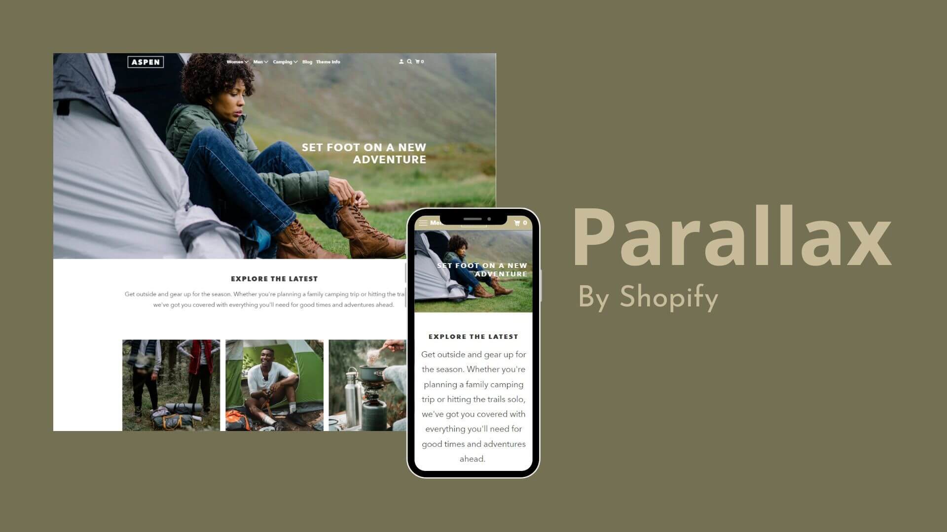
The layout of the Parallax Shopify theme makes it easy to streamline eCommerce marketing in time for the holidays. This suggests that there is plenty of room for you to highlight sales categories, promotions, and lifestyle images to boost sales.
Building a successful Shopify store is made easier by using a theme that most accurately conveys your brand. A seamless and successful shopping experience for mobile device users is another benefit of having a responsive eCommerce website.
More people are searching for online purchases on their phones and tablets as a result of the increased use of mobile devices. According to some research, the conversion rate increased as well.
We’ll go into more detail about the features of the Parallax Shopify theme in our thorough review, as well as how you can use them to boost sales.
The In-depth Reviews
Overview
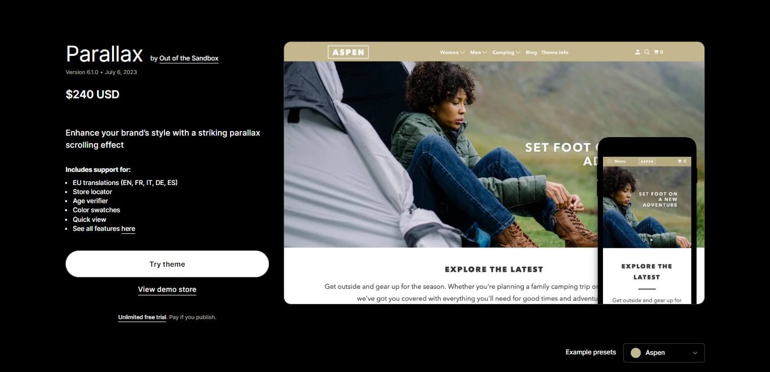
Out of the Sandbox‘s Parallax Shopify theme is a stunning and animated theme with stunning effects.
The theme’s most distinctive feature is its incredibly potent scroll effects. It is a well-known fact that this effect has been useful for web designers lately.
Due to this effect, the website’s background image may move more slowly or quickly than other elements. This design gives the web a sense of depth and movement as you scroll.
The Parallax Theme for Shopify’s cutting-edge design is enhanced by the Parallax effect on the homepage and other areas, such as the footer and header.
It gives the website a “chic,” contemporary, and vibrant look. One of the useful features of this effect is the capacity to emphasise and divide various sections of the webpage to make each section easier for readers to discern.
The Parallax Shopify theme would be ideal if you run a furniture store. This theme has full responsiveness, supports multiple layouts, and has distinct landing pages for each product.
It is easy to construct and configure thanks to the detailed instructions. The Parallax Shopify theme fully integrates Google Maps and MailChimp, in particular.
In the Parallax Shopify theme, there are four different theme designs available: Aspen, Los Angeles, Vienna, and Madrid.
These four names may sound familiar to you because they are based on four well-known cities from around the globe. The stunning images of four different cities were specially created by the blending of several vibrant colours.
Features consist of:
- A distinctive scrolling effect that entices you to explore the website more;
- A design that emphasises visual storytelling;
- Drop-down menus that streamline navigation;
- Distinctive banners for advertising;
- An extendable cart;
- A number of homepage videos.
Parallax Shopify Theme Highlights
Theme Highlight | Details |
Pricing | $240 |
Theme styles | Vienna, Aspen, Madrid, and Los Angeles |
Sitewide feature | Parallax effect |
Store categories | High-volume stores, physical stores, and drop shippers |
Parallax Shopify Theme Pricing
Free or inexpensive themes don’t offer support or unique features. You must put money into your business if you want it to be more successful than average.
If you want to make your store stand out from the competition, this is roughly what a professional eCommerce theme costs.
The Parallax theme, which costs $240, comes in four different styles. You can get a beautiful theme and lots of helpful features for this price. In particular, you can use the free trial version of the Parallax Shopify theme to test it out.
Parallax Theme Presets
Certain audiences will favour particular styles, depending on the preferences of each person and the direction of the website’s style.
However, because parallax design is so widespread, you can use it in almost any sector. This amazing theme will look fantastic in catalogues and trendy products that feature high-quality images.
Aspen
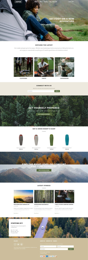
If you’re looking for a fully featured theme that can accommodate various needs, Aspen Style is a fantastic choice. It offers a variety of configurations in a contemporary style that is also simple to use and appealing.
Use the distinctive scrolling effect to your advantage to make articles stand out even more and attract readers.
Every user wants Aspen Style’s numerous premium features, such as movies and bold, large photos. A wide range of home page options are also available to you, including testimonials, logo listings, Google Maps, and newsletter signups.
Additionally, the availability of a variety of layouts for portfolio sites and blogs and a “long-format homepage” design make this theme incredibly flexible and highly configurable.
Madrid
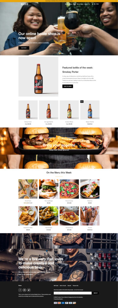
Another attractive Parallax Shopify theme style that can be used for a variety of projects is Madrid Style. It seems tidy and understated.
Parallax effects can be seen in a number of locations, including the cover image and heading. The parallax design idea and streamlined layout help to make each section of the site distinct and obvious.
Practically every component can be customised using the Customizer and Shortcode in order to fit your style.
You also have access to all the sophisticated tools required for a business website, such as Product Filtering, Quick Shop, and Promo banners.
Vienna

Vienna Style is distinct from the aforementioned styles because of its classic beauty expressed in its distinctive fonts, vibrant colours, and delicate lines.
In order to establish highlights and dots on the home page, multicoloured areas with a parallax effect are essential. To capture the spirit and vibrancy of Vienna, a number of effects have been used, including the parallax effect.
This stunning theme can be used for a wide range of purposes by businesses, corporations, and organisations thanks to its excellent customizability. Page scrolling effects can be changed, and parallax effects can be used in different places.
Los Angeles
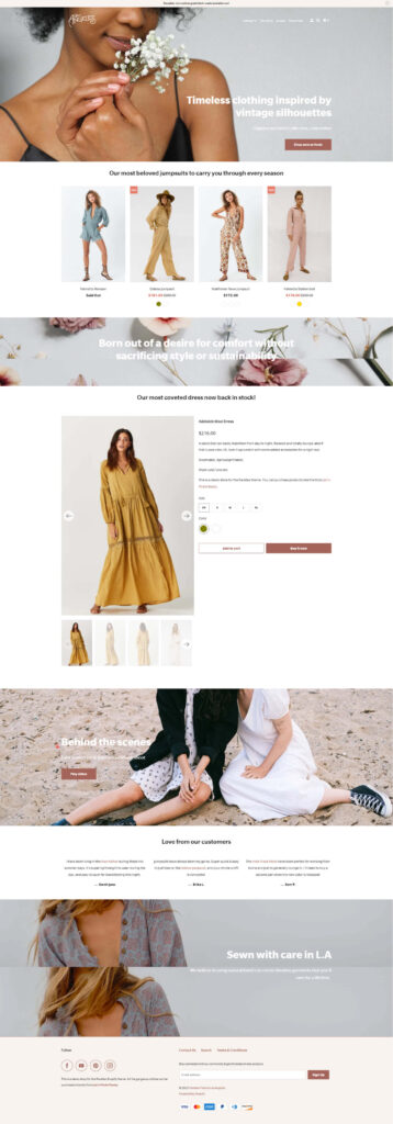
Los Angeles style is a great design for online magazines or clothing stores because it encourages creativity.
When you first see the full-screen video sliders with the parallax effect, you’ll probably be surprised. The parallax effect is also used in the article page’s header.
No matter which page it is, this makes the design stunning and incredibly distinctive. This design is also excellent in terms of the rich-featured imagery system, which gives your website a contemporary feel.
This theme style doesn’t necessitate a deep understanding of technology or code, making it easy to install, modify, and use. Los Angeles is renowned as a superb tool for showcasing your online magazine due to features like multilingualism, flexible design, SEO requirements, etc.
Parallax Shopify Theme Design - Features And Customization
The Parallax Shopify theme places a strong emphasis on visual storytelling to help bridge the gap between your website traffic and your brand.
It’s perfect for showcasing products or using lifestyle pictures to show how using your products can improve the lives of potential customers.
Parallax effect
The term “parallax effect” has already been used frequently in this article. Your online store will have a fresh, recognisable look thanks to this scrolling effect.
Even your customers find it difficult to look away from your website. However, audience engagement is a goal shared by all business owners.
Background graphics on web pages and other information scroll more quickly or more slowly than other content due to the common parallax effect in website design.
By using parallax scrolling, your website will appear three-dimensional. By doing this, you can make a lasting impression on your clients and win their love for your business.
Pop-Up
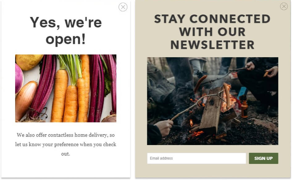
An effective feature to persuade customers to subscribe to your email marketing is an email popup. It is thought of as an additional tool for motivating action.
You can always turn on or off the popup window by going to the general theme options page. In Parallax, you can take advantage of an integrated email signup popup.
A piece of advice: If you make use of an email marketing platform like Mailchimp, you can customise your email marketing strategy by establishing a gender group based on the first and last names you gather.
Promotional banner
Your promotion, sale, or unique offer, like free shipping, will be highlighted more by the banner on the Parallax theme. Visitors are more likely to stick around when a promotion banner is active on your eCommerce store, which demonstrates to them that they can immediately get good value for their money.
Video content
You can display videos on your homepage and product pages if you use the Parallax theme. Videos are a fantastic way to display your products in action and show the lifestyle your brand represents.
Slide-out cart
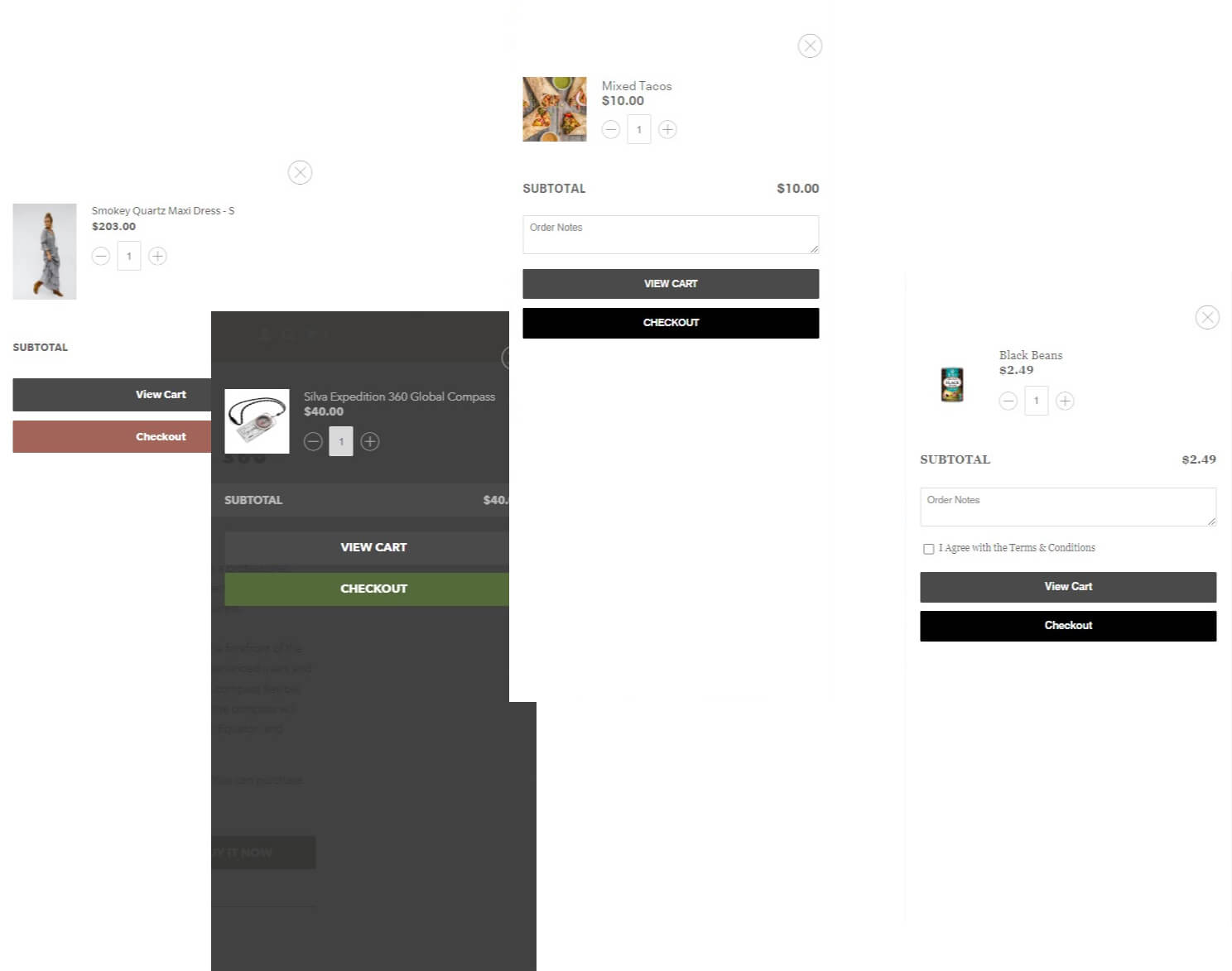
Visitors can quickly and easily review the items they’ve added to their cart thanks to the slide-out cart. According to Baymard, the average cart abandonment rate across all industries is 70%. By enabling users to quickly switch between the cart and your store and add items without leaving your product or collection pages, you can lessen this.
Product forms
Popular goods selling like hotcakes? When a product is out of stock, use the product form feature to allow customers to fill out their information and receive an email or text when it becomes available.
Quick Shop
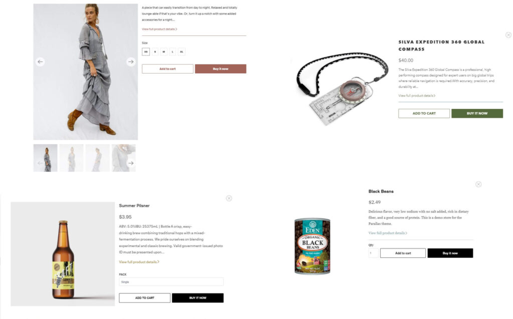
Without leaving the page they’re on, visitors can access a condensed product page to quickly learn more about a product and add it to their shopping cart without being redirected.
Stylish Homepage
Customers typically access the homepage of a website first. A home page needs to have stunning, remarkable, and outstanding website art features to entice visitors to stay, browse the website, and return later.
The homepage provided by the Parallax Shopify theme will entice visitors to stay on your site longer. This specifically serves as a motivator for them to buy various goods.
The homepage of your Shopify store has a unique appearance. The drag-and-drop function can be tailored to instantly update the text and images on the landing page.
You can tell your story or convey your message effectively and efficiently using the theme’s homepage layout.
You can upload an unlimited number of photos while selecting the number of images per row using a slider. A click-through link is an optional component of each image that is uploaded to the logo area.
There can be a maximum of 12 slides displayed at once in the slider section of Parallax. You can choose the duration of the slide’s automatic rotation.
The use of buttons, images, and titles is made possible by the text.
Neat Product Pages
Several features of the Parallax Shopify theme, including Suppliers, Product kinds, collections, Product tags, social sharing, SKUs, related products, and breadcrumbs, can be displayed or hidden on product pages.
It is also possible to move the product description so that it appears above the “Add to Cart” button.
The location of your item image relative to your description can be changed. Product pages can have a sidebar, just like collection pages.
You have the option to display a variety of gallery page content here, such as a menu, a text page, a collection list, a list of product categories, a list of cards, and a list of suppliers.
A helpful hint: You can use the sidebar to display a list of websites that are appropriate for new visitors, such as Returns & Exchanges, Size guides, Shipping Policies, etc.
Multiple-Level Menus
User navigation on your website is made simple by the multi-level drop-down menus. A website’s navigation must be simple for users to easily find what they’re looking for. If you don’t offer this, some will probably go to another store.
How to build a store with the Shopify Parallax theme
It’s simple to set up your store using the Shopify Parallax theme. View the four different styles of the Parallax theme on Shopify. Once you’ve decided on one, click “Buy theme” to finish the transaction.
Installation is straightforward. The real challenge is creating a Shopify store with a high conversion rate using the Parallax theme. Here are some pointers for the beginning:
General store settings
You should first adjust your store’s settings so that the theme matches the aesthetic and personality of your brand. With the Parallax theme, you can alter the colour, font, and more across the entire website, giving your store a unified look and feel.
- Match the colour scheme to the hues of your brand; use no more than two or three colours consistently throughout all of your pages.
- Utilise Parallax’s Google Fonts integration to set up custom fonts for text, headings, subheadings, and other elements. Be consistent once more throughout your entire store.
- When a newsletter pop-up appears, it’s your choice. The next time they come, you can decide how long it takes for them to reappear and delay them by 2 to 120 seconds (between 2 and 365 days). Just a name and email should be required for registration. With the help of email marketing software from a third party like Mailchimp, you can determine a person’s gender based on their name.
Use high-resolution photography
The entire purpose of the parallax theme is to give users a distinctive scrolling experience as they navigate through your homepage. To benefit from this key feature, you need excellent photos. There are primarily two approaches you could take.
- Photos of the products you want to sell stand out.
- Display images of lifestyles that incorporate your products.
You can mix the two styles together. A great way to promote a promotion is to highlight a product on your homepage, especially in your hero image.
A great way to convey to customers what your brand and products are all about is by displaying lifestyle photos. By displaying a lifestyle image that people would want for their own lives, you can show how your products will improve people’s lives.
PRO TIP #1: Before you start, crop the dimensions.
The Parallax theme’s gallery section is a great place to display an infinite number of lifestyle and product images. You won’t be able to crop them in the theme editor, so be sure to crop them to your desired dimensions before uploading.
PRO TIP #2: First, mobile-first photo optimisation
Up to 12 images can be featured in a slideshow, but since it is not mobile-optimized, the images will be scaled down when visitors view them on smartphones. While using images that are optimised for mobile-first display, we still advise using this feature.
#work-with-influencers
You can display up to four promotional items on your homepage using the Parallax theme. The popular products in this section can be merchandised using square or circular images. You might also use this section to highlight some of the social media influencers you collaborate with.
Influencers in your industry can be approached directly or through a third party. Working with social media influencers is a great way to increase your reach and take advantage of social proof, especially on Instagram and YouTube.
Your audience will thank you in the form of conversions if you play around and enjoy yourself with the Parallax features.
Use videos on your homepage
Although high-quality videos are expensive, they are well worth the cost. To gain the trust of potential customers, show videos of your products in use. Videos demonstrate your lack of secrecy and your commitment to your business.
You could concentrate on a single product or use your imagination to create a scene that features a number of your products. Consider drawing inspiration from a scene in the film Fight Club where the protagonist’s flat is shown and each of his IKEA furnishings has a price tag and a product description displayed over it.
Of course, you’re not required to adopt this style. The secret is to use your imagination and come up with a special way to showcase your products that fits the lifestyle that your target customers want to lead.
Parallax video compatibility
You can embed YouTube and Vimeo videos in full-screen 16:9 or 4:3 formats using the Parallax theme. In the event that the video doesn’t play, you can choose to show text or a CTA in addition to the auto-play and auto-loop options.
Feature a collection
Want to highlight a certain line of goods? You can display a collection on your homepage in rows of two to four using the Shopify Parallax theme.
Including a lifestyle image with a number of your products in it and a featured collection with those products listed is a great way to bring your products to life. Visitors are now more likely to click on a featured product because they have developed a connection with it.
Leverage collection page navigation
Users can quickly find the products they’re looking for by using the sidebar as a navigation filter on the Parallax collection pages. This is a cute little feature that makes it easier to navigate the website and increases conversion rates.
PRO TIP: To ensure that visitors can effectively filter your collection pages, enter the appropriate amount of information for each product when you upload it to Shopify.
Optimise your product page layout
Your product pages must be excellent. Make sure they are optimised, because this is where people decide whether or not to buy. You can modify the design of your product page in the following ways using the Shopify Parallax theme:
- Product descriptions should be moved above or below the CTA. When a visitor first arrives at your product page, your CTA must be clearly visible and distinct from the rest of the page’s content.
- Product images should be positioned to the left or right of the description. Choose whether you want readers to focus on the writing or the visual because they are naturally drawn to the left side of the page.
- navigation on a product page’s sidebar. On the Parallax theme, the product pages have the same sidebar as the collection pages. Use this to display a list of choices, such as a size chart, shipping details, and variants.
Parallax Shopify Theme Support
Design, quality, and price are three outstanding criteria. Out of the Sandbox Support has a tonne of tutorials on their website.
For sales or technical issues, Out of the Sandbox doesn’t provide phone or live chat support.
When emailing your inquiries, be sure to provide a thorough explanation of the problem, steps to reproduce it, and screenshots if they are available.
Verdict
Depending on the various objectives and aesthetic preferences you have, you are free to choose a suitable theme for yourself.
But if you haven’t made up your mind about a theme yet, the popular and appropriate Parallax Shopify theme would be a good option.
The Parallax Shopify theme will help optimise your company’s website. Use the parallax effect creatively and effectively to make your website more beautiful, appealing, and “cool” than ever.
