Refresh Theme – Excellent Choice For Business Owners
- By Laelia
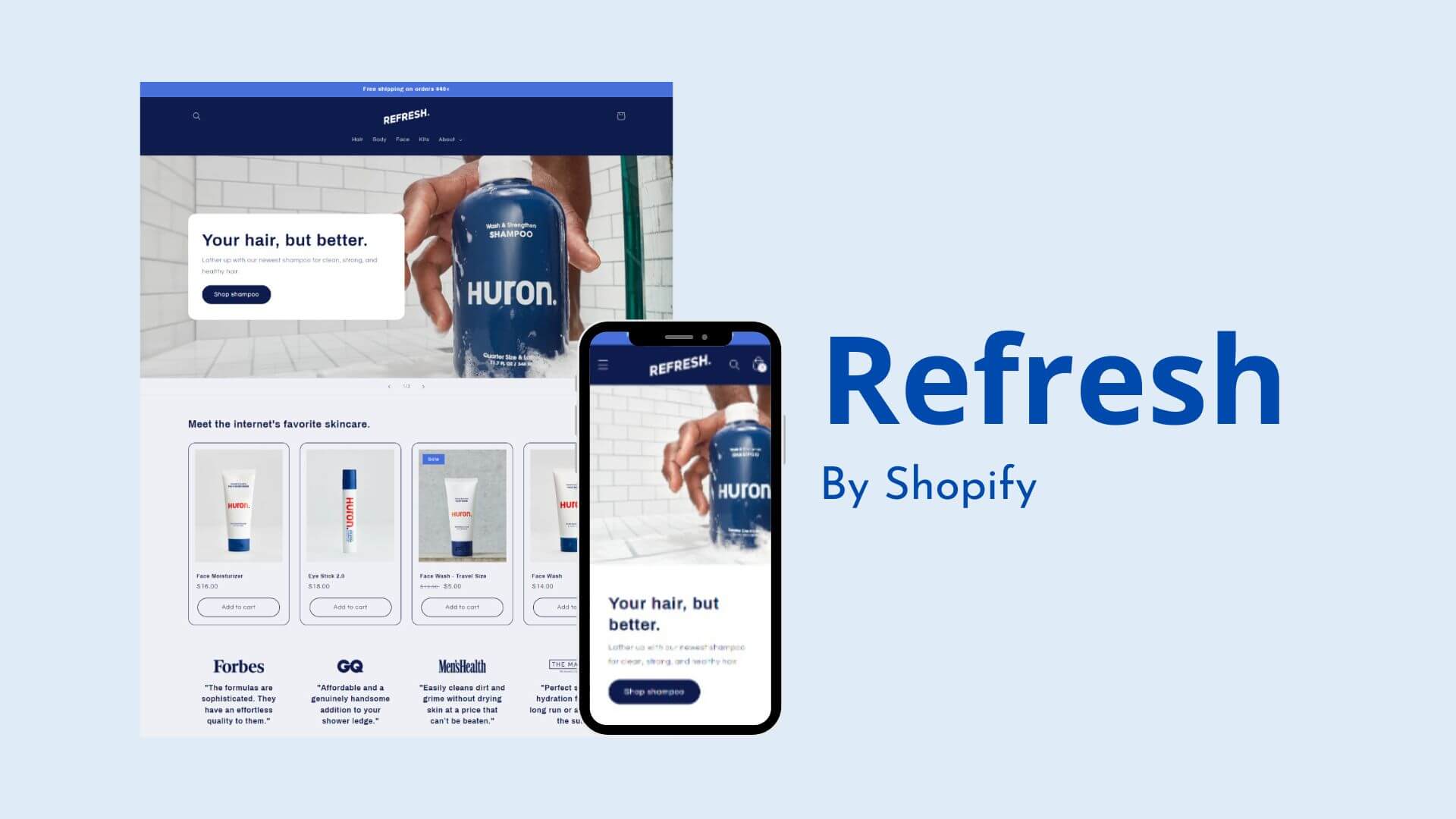
The Refresh Shopify theme is a great starting point if you’re just getting started with online sales or managing a small business on a tight budget.
This free theme has a clean aesthetic and is completely customizable. We hope that by describing the features of this free theme, you were able to select one for your eCommerce website.
There are a tonne of free Shopify themes available, but it can be difficult to choose one that makes your store stand out.
Finding free Shopify themes that have an impact on your company’s identity and distinguish you from the competition can be challenging.
It can be difficult to justify spending money on a premium Shopify theme when you’re just getting started. The good news is that Shopify offers a number of free themes that can be used as a base to build your ideal online store.
The In-depth Reviews
Overview
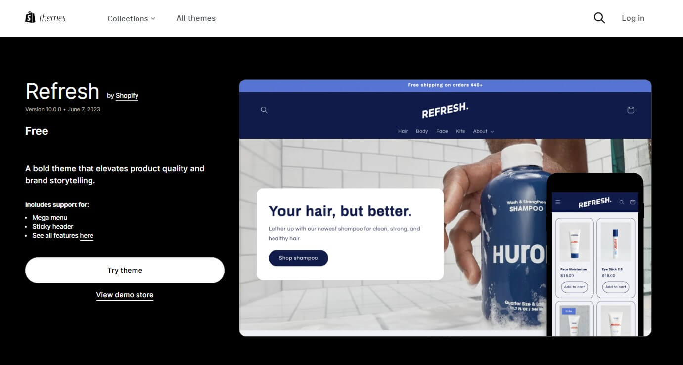
The Refresh Shopify theme will assist you in elevating your brand’s reputation and offerings.
If you’re in a bind and need to launch your online store right away, this eye-catching theme will do the trick with the least amount of work on your part.
For tech-savvy store owners who want to create custom theme extensions, manage apps inside of their themes, and create online stores from scratch, the new editor offers a refreshingly different way to edit.
You can also begin here if you need to build a basic e-commerce website as part of a larger strategy to expand your business.
You have more control over how the content of your store is displayed thanks to its sections and blocks. Without touching any code, it’s a great way to give your online store a distinctive look.
High-end customizations like the Slide Out Cart, which enables customers to view their shopping cart without leaving the current page, are included in the Refresh Shopify theme. Visitors will also value how easy it is for them to find your website.
Bold headlines and the basic colour scheme of the Refresh Shopify theme are contemporary design elements that can make your company stand out. The product’s contemporary, minimalistic appearance sets it apart from the competition.
For Shopify merchants who want to highlight their best products without sacrificing design, the Refresh Shopify theme may be the best option.
By posting long pieces of content like blog articles and frequently asked questions, you can use this Shopify design to spread the word about your company’s history and improve your SEO.
Additionally, it offers a variety of configuration options that can be modified to meet specific needs. Small to medium-sized catalogues, like those found in retailers selling cosmetics and health products, are perfect for the Refresh Shopify theme.
Refresh Shopify Theme Highlights
Highlights | Details |
|---|---|
Pricing | Free |
Ideal For | Personal Care Items for Men |
Best Suited for Niches
The Refresh Shopify theme is simple and has few features. Selling anything, including tangible goods and services, works extremely well.
Best Suited for Inventory Sizes
eCommerce stores with any size categories.
Dawn Shopify Theme - Pros and Cons
Pros | Cons |
Mobile friendly | No highlight page |
Quick setup | Missing slide view segment |
Advanced customization options | – |
High-resolution photo gallery | – |
Refresh Shopify Theme Design - Features And Customization
Fully Mobile Experience
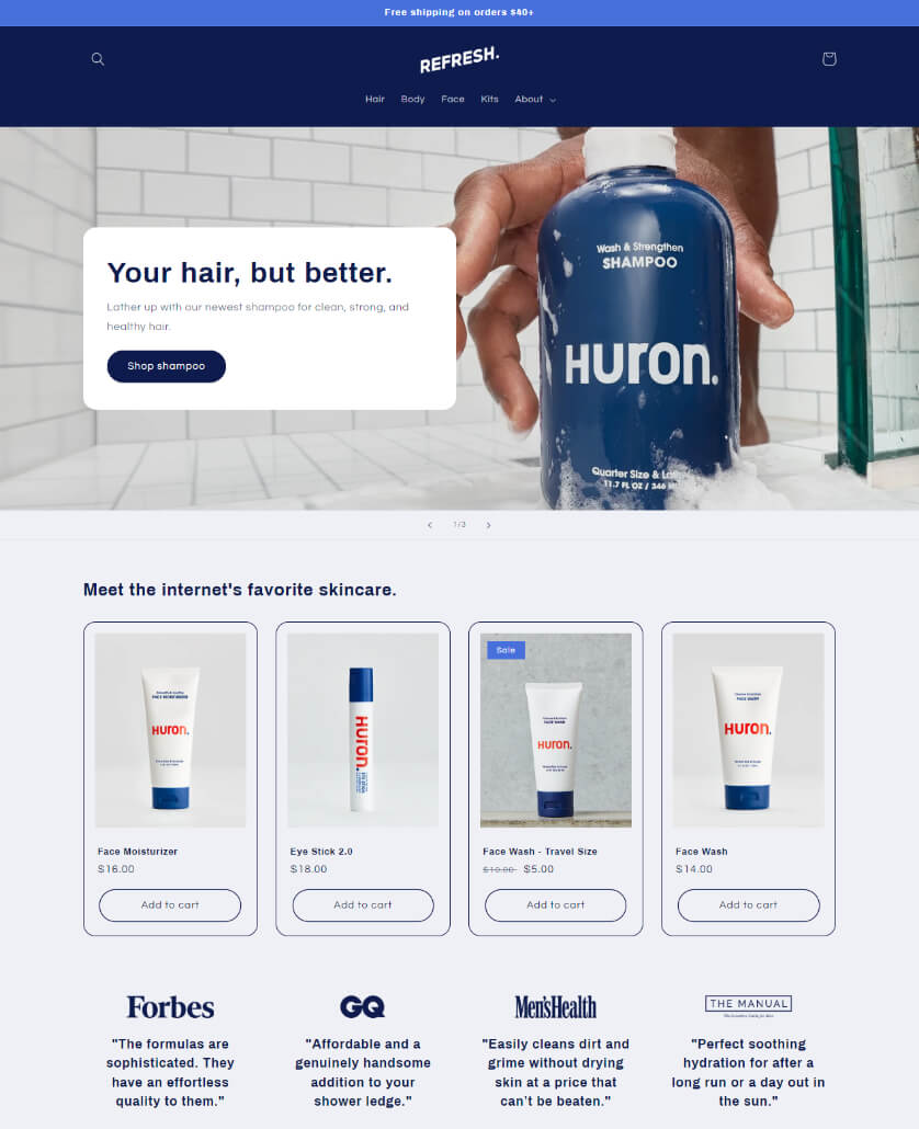
Both the desktop and mobile versions of the Refresh Shopify theme are beautiful. Your customers will like it.
With the increasing number of mobile users continuing to climb, it is more crucial than ever that your Ecommerce theme is mobile-friendly.
With the help of the Refresh Shopify theme, you can take certain measures to guarantee that your Shopify theme is responsive for mobile devices right from the start.
You can watch your page adapt to the screen size of the mobile device being used to view it as you switch between different modes.
Collections
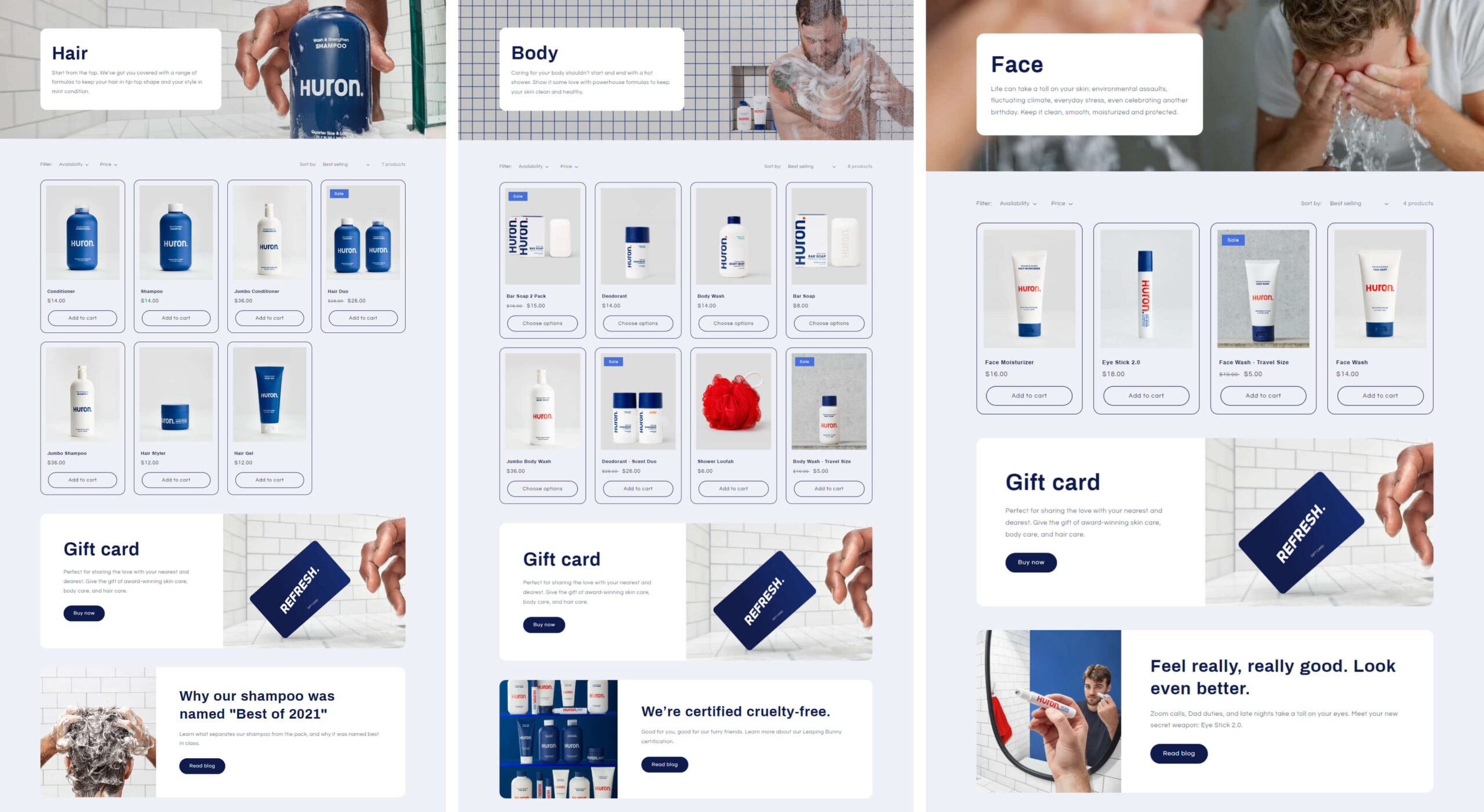
A collection page’s default design features a banner promoting the collection and a grid of the products that make up the collection.
The theme provides a description of the collection, illustrates it, and uses an image from it as an example. Customers will always be directed to a page that lists all of your collections when they visit your online store.
Column width on the desktop computer can be altered. You need 1 at the very least, and 5 is the maximum. Make a column layout specifically for mobile viewing.
Product Quick View
You can view a summary and pictures of a product by hovering over it on the collection page rather than opening a new tab. You can now browse the web much more quickly as a result.
Fast product views resemble walking along a rail. You can leave the gallery by clicking if you like the products you see.
You can browse products on the Collections page quickly by utilising the Refresh Shopify theme. Making sure your product pages are set up to load quickly can help your customers spend less time shopping.
Share Block
Visitors can use the share button in this section to spread the word about your products on social media.
Badges
As soon as the price drops or the stock level reaches zero, labels for “Sale” and “Sold Out” will automatically be added to your product photos.
You can move and resize badges to meet your needs. You can move and shape these badges however you want.
Search With Auto-Completion
One of the few themes with built-in search auto-completion that is currently available and doesn’t require any additional premium apps is the Refresh Shopify theme.
This indicates that users only need to type two or three letters to see relevant products; additional pages of search results are not necessary.
Cart
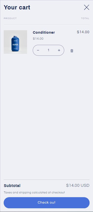
Your website’s shopping cart layout is editable. When a customer adds an item to their shopping cart, your shopping cart may appear in a number of formats, such as a pull-down menu, a new page, or a notification window.
When there are no items in the cart drawer, showcasing a featured collection there is a great way to entice customers to make more purchases.
Do you want to add a stylish and useful slide-out cart to your online store to enhance the quality of the customer experience?
A sleek, slider cart that greatly simplifies the purchasing process can be added to your site’s default shopping cart page by simply inserting a few lines of code. It will look good on any size screen because it is responsive.
Customers will value the streamlined shopping experience offered by a cart that clearly displays all of its contents and makes it simple to add and remove items. The site’s improved usability and newfound simplicity will also win you over.
Announcement Bar
You can update your customers on any page of your website using the announcement bar.
There are a total of 12 different announcement modules available; however, there are no section-specific parameters. If you include a link in your announcement bar, customers will be taken to the page you specify right away.
Header
Every page of your online store has a header.
The logo can be seen in the upper-left corner of the screen when a customer views the website on a desktop computer. The logo will appear in the ideal spot for mobile devices.
Either the top or bottom of the header needs more space. Use the range slider to change the header’s vertical margin.
Contact Form
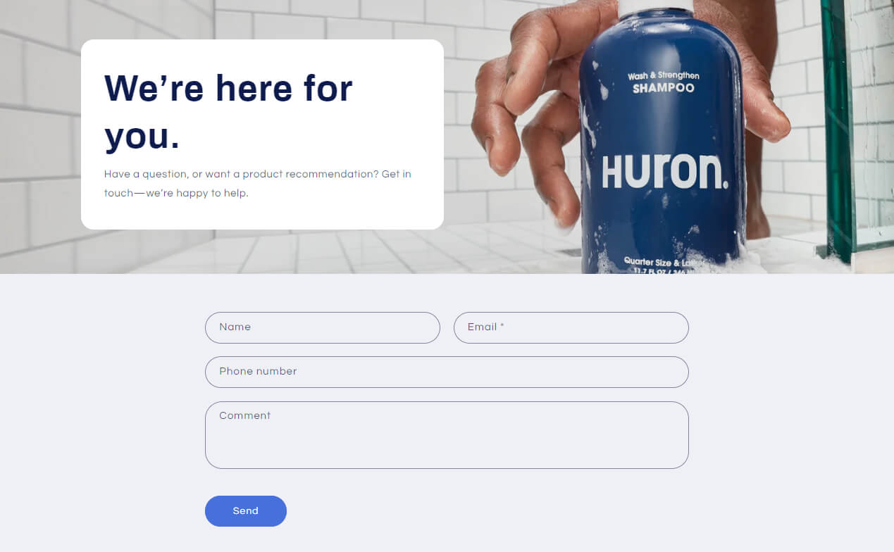
By clicking here, you can learn more about Shopify’s support options if you’re using one of their free themes.
It’s a good idea to have a contact page if you operate an online store so that customers can get in touch with you if they have any questions about your products, policies, or purchases.
Any page you create with any Shopify theme can have a contact form added to it. The first step in adding a contact form is to create a new page.
You can use the rich text editor to add text, images, or videos to the information you want to display above the contact form, such as response times or brand-related details.
Blog Posts
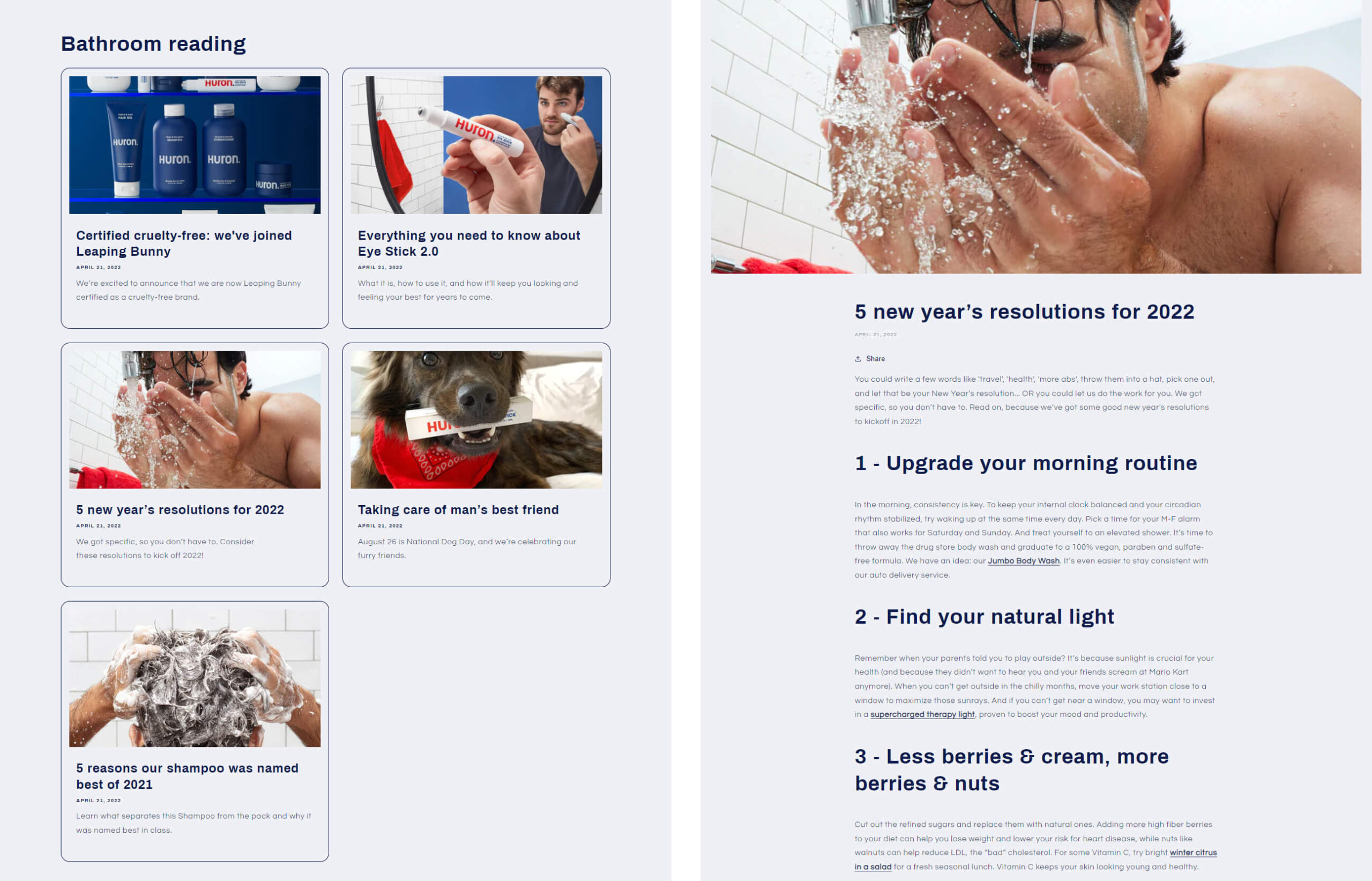
In a specific Blog post area, you can highlight blog posts from your Shopify store’s blog. Only the first 55 words of each blog post are shown in the section titled “Blog Posts.” The first 30 words will appear if there is no excerpt available for the blog post.
Visitors are directed to the blog’s home page by a “View all” dialogue box if there are more blogs than are specified in the Blog post field.
About Us
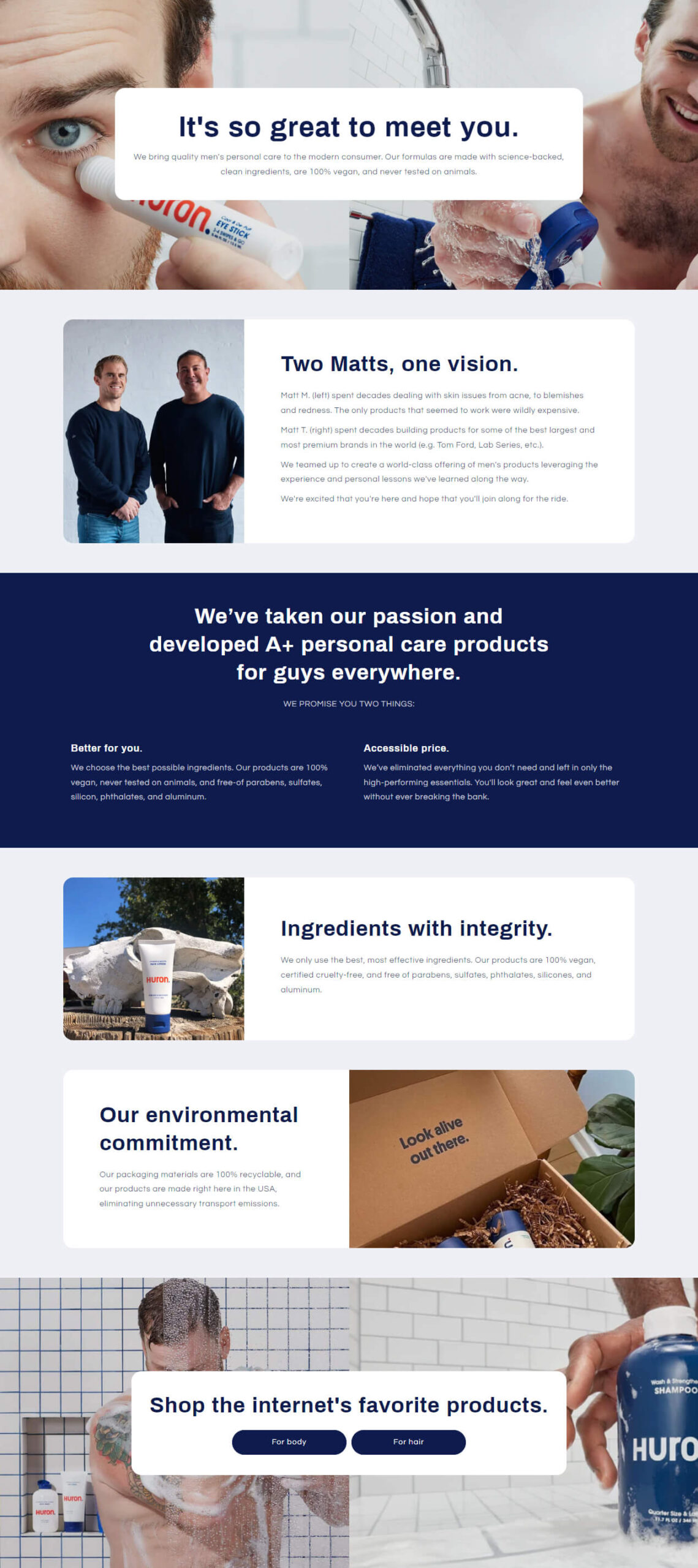
A great way to humanise your business and establish rapport with customers is to include an “About Us” section in the content of your online store.
Feel free to substitute another title if you don’t want to use that one. A more appropriate headline for your business would be “Our Story”, for example.
Do not worry about making the perfect “About Us” page. As your business grows and changes, you can keep this website current with information that matters to your customers.
Improved Product Filtering
Customers can now access sub-collections without having to refresh their Shopify theme on the collection page. To see how the goods change in front of your eyes, all you need to do is choose a filter.
Time is saved, and as a result, the collection page appears and feels more expert.
Product Recommendations
Based on the item being browsed, this section offers related products, products with related descriptions, and items that are frequently purchased.
Using the slider, select how many suggestions will be displayed at most. Learn the number of columns that will be displayed on desktop and mobile devices.
Email Signup
Customers can sign up with their email addresses to receive your newsletters or other marketing materials.
This section’s function is to provide customers with the opportunity to subscribe to your email newsletter and receive updates from you, such as the opening hours of your store.
Theme Pricing And Updates
This theme is available for free. For access to the most recent theme options and bug fixes, go to Shopify’s Theme Store. You can always download your previous purchases.
Refresh Shopify theme support
You’ll have many questions if this is your first time setting up an online store. If you run into any issues with the theme, it is preferable to have assistance available.
Log into your Shopify account in order to contact support for a store.
It’s also essential to address issues as soon as they arise to keep your shop operating smoothly. Therefore, when choosing a free Shopify theme, the calibre of the developer’s Refresh theme support service is equally important.
Verdict
A store’s appealing layout can persuade customers who are merely window shopping to make a commitment. Shopify store owners should evaluate whether or not their current layout is ideal in order to maximise long-term sales.
The reputation of the store and the shopping experience for customers can both be significantly enhanced by having a Shopify site with a pleasing yet aesthetically pleasing theme.
The eye-catching Refresh Shopify theme was created to highlight premium products. The theme’s strikingly bright blue background is highly configurable. You have complete control over your store’s appearance, right down to the individual blocks and sections.
For food and drink, pet supplies, health and beauty care products, and dietary supplements, this layout works best. This theme is the epitome of sophisticated and elegant web design.
