When running an online business on Shopify, perhaps one of the questions you frequently ask yourself is, “How can I earn more sales?” or “How do I get more customers?”
Even if you offer excellent items and services, how can you convince people to become buyers and experience your high-quality products? Even if your store receives a considerable amount of traffic, that doesn’t mean the number of customers will increase.
So, to convert visitors into customers, every section of your Shopify store should be designed to encourage people to buy. Every stage of the customer journey can be considered an opportunity to shorten the path.
Conversion rate optimization (CRO) is the process of experimenting and continuously enhancing your website to encourage visitors to make a purchase.
Then, what exactly is CRO, and what CRO strategies can you implement in your Shopify store to boost sales? This article is going to give you a detailed answer.
What is a conversion?
When a visitor comes to your website and completes a specific goal you set up, they convert. So, conversion can take different forms depending on your business goals.
For every Shopify store, the most important conversion is to stimulate people to buy products or services. However, there are also various smaller conversions, such as inviting visitors to sign up for newsletters, complete a form, register for membership, or simply click on a certain link.
And your conversion rate is the percentage of visitors who complete the desired actions.
It is obvious that you want your website to be high-converting and work effectively so that nothing can stop visitors from making their purchases. Therefore, CRO is an essential practice to make your online store more appealing to visitors, turn them into customers, and boost your revenue.
Basically, CRO is the activity in which you identify the problems on your website that hinder people from converting, fix the issues, and test your store’s performance. It’s not a one-time task but a constant practice you should undertake to upgrade your Shopify store to a better version that will help you get more customers and increase sales.
Why do you need conversion rate optimization (CRO)?
Even though the ultimate goal of CRO is to attract customers and increase revenue, the following are a few CRO advantages that you shouldn’t pass up in order to better understand their importance to your online business:
- Understand your target audience for better business strategies: Applying CRO to your store requires testing your ideas frequently while learning about your ideal clients, their habits, and their perceptions of your brand. This will make it easier for you to determine which elements of your website are working well and which ones aren’t. These insights and data can be used to improve business plans and marketing campaigns so that they better serve the needs of your target market.
- Make your online store more professional: With CRO, your Shopify store will appear more professional to users because you must constantly update and improve your website. Because it shows that you are constantly changing for the benefit of your customers, this also increases the credibility of your brand.
- Deliver a smoother user experience: CRO improves the shopping experience by helping you identify and correct issues on your website. CRO can enhance every aspect of your Shopify store, including possible touchpoints that incite consumers to take whatever action you want them to take.
- Acquire new customers and retain current ones: When your Shopify store is optimized, you can both draw in new customers and persuade current ones to make repeat purchases. This is so that your customers will enjoy their interactions with your brand, become loyal to it, and possibly even recommend it to others. CRO also improves the post-purchase experience.
- Support your SEO strategies for higher ranking on search engines: CRO is beneficial to SEO since it makes your website more responsive to visitors on both desktop and mobile devices and generally enhances the user experience. It also improves your store’s loading speed, which is vital for SEO and helps you rank better on the search engine results page.
- Effect on sales and revenue: The ultimate goal of optimizing your conversion rate is to convert visitors into customers. As a result, CRO has a direct impact on increasing the sales and revenue of your Shopify business.
How to calculate the conversion rate of your Shopify store
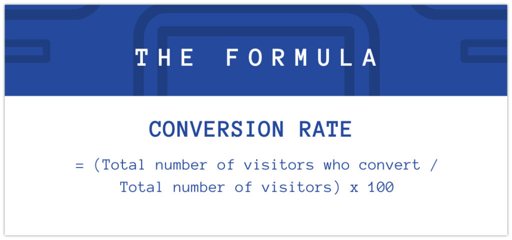
Here is the formula to determine the conversion rate of your Shopify store:
Conversion rate = (Total number of visitors who convert / Total number of visitors) x 100
Let’s assume that your store was visited by 2000 people last month. 50 of them clicked on the “Buy Now” button and purchased your products. Based on the formula, the conversion rate was 2.5%.
The average global conversion rate for an eCommerce store is 3.68%. A typical online store has a conversion rate of about 2.5-3%, while the normal rate for a Shopify store is 1-2%. If your Shopify store has a 3.3% conversion rate or more, it is considered to be in the top 20% of global high-converting Shopify stores.
Therefore, if your website is working well, try to improve the conversion rate to 3.5% or more. For a new Shopify store, a conversion rate of 2-3% is an ideal goal.
What you should do to optimize conversion rates for your store
As mentioned previously, CRO is not a one-and-done activity. You should always update and improve your website to enhance the user experience and acquire more customers. Below are our suggestions for CRO solutions that you can apply to your Shopify store. It’s better to combine different tactics that are suitable for your business at a time.
Enhance the user experience on the homepage
Have an attractive homepage design
Statistics reveal that a visitor’s initial impression of a website is created in only 0.05 seconds. Many people will land on your homepage initially when they visit your site, so don’t pass up the opportunity to wow visitors with an appealing homepage and persuade them to buy your items.
The homepage is the crucial digital storefront that showcases what your business is all about, how trustworthy your brand is, and why it is worth it for people to choose your products or services. Therefore, having an appealing homepage design can enhance the user experience and boost conversion rates.
It’s suggested that you create a simple homepage design. All content on your website that is displayed above the fold, where users can see it immediately, should be brief, effective, and direct.
Instead of using long text and excessive graphics, consider displaying a brief and catchy message with one or two large hero banners to grab people’s attention and urge them to explore your website further.
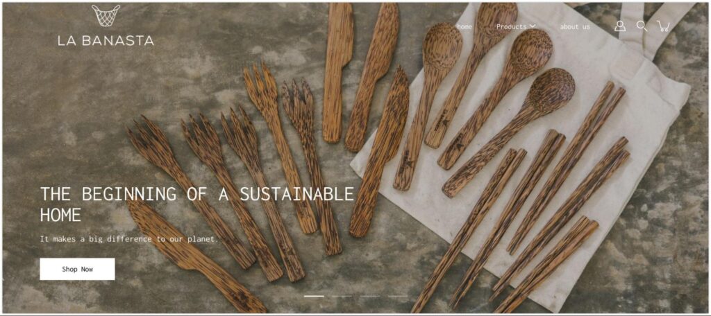
See an example of a homepage from the brand La Banasta, which sells eco-friendly homecare products. There are straightforward, high-resolution hero images of their products as soon as you arrive on their website. The headlines immediately let people know they offer sustainable cleaning items and home goods with the “Shop Now” button underneath, encouraging them to explore more products and make purchases.
As you scroll down, the content is organized clearly with custom blocks that introduce the benefits or characteristics of the products. Different collection catalogs with stunning image banners and CTA buttons are displayed that navigate users to collection pages.
Give clear CTAs
CTAs (Call-to-action) are essential since they help you guide visitors to a certain page that you have put up for specific goals. Basically, CTAs tell users to do what you want them to do, which creates conversions.
On the homepage, the most prevalent CTAs are “Buy Now” or “Shop Now”, which direct people to product or collection pages and encourage them to make a purchase or browse additional products.
Another type of CTA is “Learn more”, which navigates people to other content pages such as “About Us”, “Contact”, or blogs to help them learn about your business, brand credibility, and ethics before taking any further actions such as purchasing, signing up for newsletters, or joining memberships.
To attract and encourage people to follow your messages, it is critical to display clear CTAs in relevant sections on the homepage. However, in order to place the right CTAs in the right places, you must first understand which parts of your homepage are most appealing to visitors.
You may utilize heatmap tools like Hotjar Heatmap, Lucky Orange, or Peek! to learn about where users click the most on your sites and what causes them to scroll down for additional information.

On the homepage of BioLite, a business that sells solar-powered cooking and lighting appliances, you can see an illustration of a direct call to action (CTA). On their website, a simple “Shop Now” button with full-width banner images is located directly in the header.
As visitors scroll down, they will see several catalogs with CTA links to various collections. BioLite also includes a part that explains their product solutions, which help provide reliable electricity in over 31 African and Asian nations. Visitors may discover their brand story and vision by clicking the “Learn About Our Mission” button.
Show engaging announcement bar and popup
An announcement bar is a little text display on top of your Shopify site that alerts visitors to special offers such as free shipping or discounts. You may include a CTA link in this section to direct them to product or collection pages and encourage them to buy.
Popups are another add-on you may use to draw attention to your website. In a popup, you can promote sales events, discount coupons, email signups for particular perks, membership registration, or request cookie consent. Visitors will perform desired actions immediately on the popups, which will directly enhance your conversion rate. It also aids in the creation of an email list of potential consumers.
A different form of popup is used to ask why people are leaving. When users decide to drop your website, a popup can help you engage with individuals who are just browsing and ask them why they left. This will yield some critical insights for your company’s future improvements and marketing campaigns.
When setting up your popups, make sure they don’t slow down your store’s loading speed, interrupt visitors’ browsing experience, or affect SEO performance.
Many Shopify themes will include a popup feature when you build your store. But if it’s not available in your chosen theme, you can install a popup app on the Shopify app store.
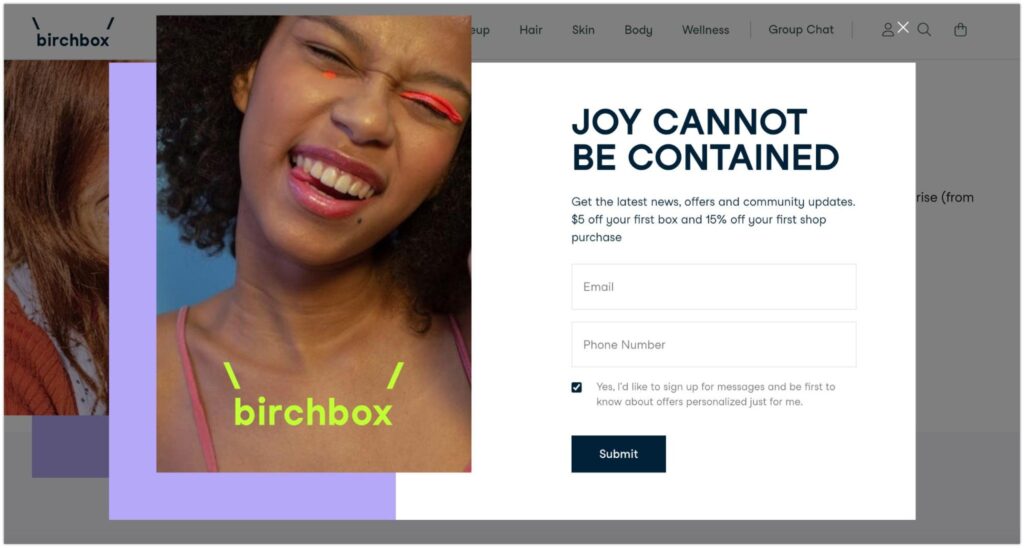
See a popup example from Birchbox, a subscription service that sends you personalized boxes of beauty and cosmetics from many popular brands. As you land on the homepage and scroll down, a popup will appear with an enticing image and short messages offering a discount of 15% for the first purchase if you provide your email and phone number.
Optimize navigation
People are more inclined to purchase if you make it easy for them to find what they genuinely need. Therefore, good navigation is essential for directing users to places where they can get their desired items.
Try to group products on the navigation menu into relevant categories that customers might search for. The most significant product groups should be arranged from left to right because they are easier for people to see. ‘Best sellers’ and ‘discounts’ collections, for instance, can be positioned directly to the left to make it easier for customers to find high-quality items at competitive prices.
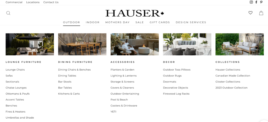
Take a look at the navigation menu from Hauser, a furniture company in Canada. Their menu is straightforward, with collections organized for outdoor and indoor purposes. When you click on ‘outdoor’, for example, smaller collections will be presented that help you find specific product types, such as sofas, benches, or umbrellas and shades under the ‘lounge furniture’ section.
Improve the search bar
People search for certain items when they don’t know where to find them. Also, statistics show that people who search in your store are 2.4 times more likely to buy products than those who don’t. Therefore, optimizing the search bar on your homepage can help convert such intended searches into purchases.
Autocomplete search and other intelligent search features can predict what users are typing and provide a list of possible search terms that are relevant to their needs. This not only improves the user experience but also enables customers to skip browsing through your store’s various collections and go straight to the items they want.
Several themes on Shopify, such as Bullet or Empire, support search suggestions, so you don’t need to write additional code to enable this feature in your theme. If you want advanced search functionality, use Shopify apps that provide smart search features for your store.
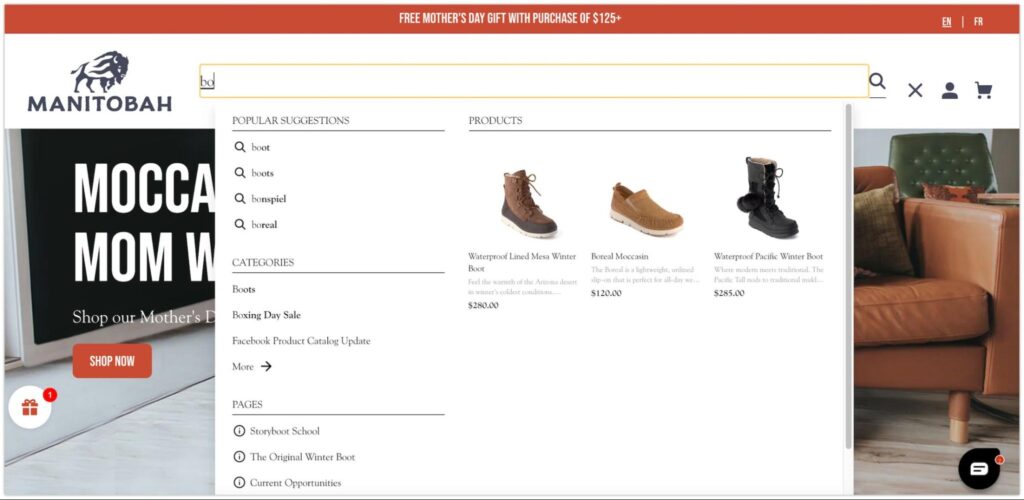
See an example of an enhanced search bar from Manitobah, a company that sells winter boots, mukluks, and footwear. As you type in just one or two characters in the search field, a list of popular suggestions will appear to help visitors discover what they need quickly. It also displays goods, collections, or pages that may be relevant to people’s search intent.
Add testimonials
Having testimonials or social proof on your homepage can increase your brand’s credibility and persuade people that your products or services are worth buying. Reviews from your existing customers, business partners, or the media help build trust between your business and potential customers and encourage them to take action, which is good for CRO.
In fact, according to some research, 72% of consumers admit that their trust in a brand increases when they see positive testimonials or product reviews. Also, more than 70% of visitors will take a certain action only when they read positive feedback.
Most Shopify themes have a ‘testimonials’ option that allows you to edit and display good evaluations on your homepage or other pages. To boost your store’s authenticity, you may also include a trust badge or logo on your website.
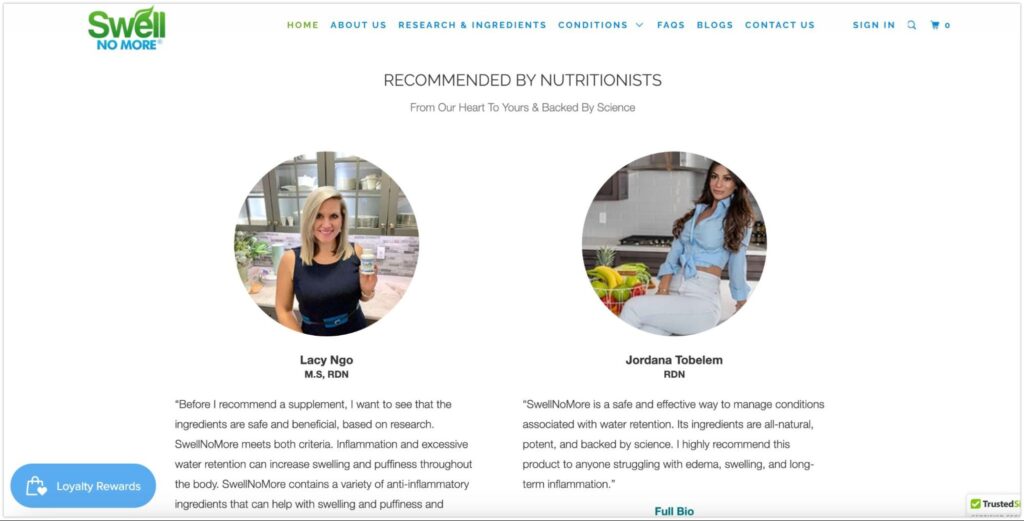
Consider this example from SwellNoMore, a company that sells supplements that help reduce swelling throughout your entire body. They post testimonials from two nutrition experts right on the homepage to increase the credibility of their products.
Have a consistent brand scheme
Good branding strengthens your business’s credibility and professionalism. It’s about how you set up the layout, logo, color, text font, and images that represent your brand in a consistent way. By doing this, you will improve the user interface of your website and impress visitors.
It also makes your brand more memorable to people. As a result, even if people don’t make any purchases on their first visit, there’s a good chance they’ll come back later to buy your products because they remember your brand name.
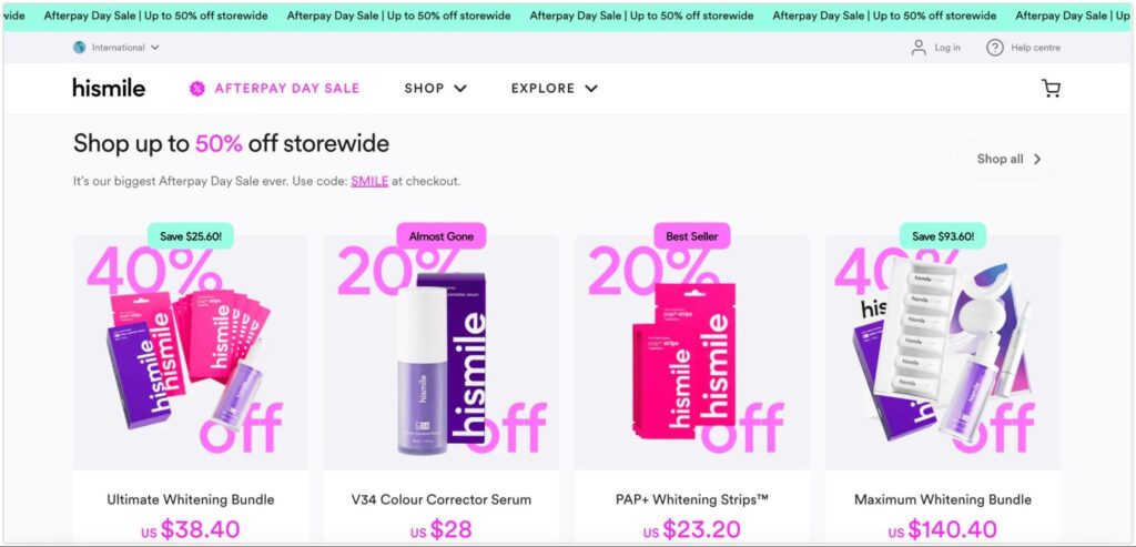
See an outstanding branding design from Hismile, an oral care brand that offers teeth-whitening solutions. Its signature product, which is popular among young audiences, is the purple teeth-whitening gel. Hismile uses neon pink and green cyan to highlight crucial information such as discounts and pricing.
The font colors, which complement their product packaging in bright pink and purple, create a youthful and lively feel. The banners are likewise designed in bright hues that correspond to the brand’s young and dynamic image.
Have your product page optimized
Place high-quality product images and videos
When buying online, people can’t touch, feel, or see physical products. As a result, you should display high-resolution images from various angles to help them better visualize your products. Beautiful photos can also attract visitors and entice them to add your products to their shopping carts.
A tutorial video on how to use and take care of your products is also helpful for customers. Another type of media you could consider is 3D views of your items. Research reveals that 3D images can boost your conversion rates by up to 40%.
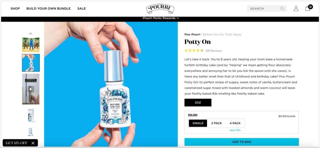
Take a look at the Pourri product page, a brand that sells bathroom odor. Aside from the high-quality product photos, they also post engaging and authentic tutorial videos to let their customers learn more about the brand and products and encourage them to buy.
Have engaging product descriptions
Provide customers with a detailed and appealing product description. This will allow them to learn more about your products’ origins, materials, functions, sizes, product benefits, and even the manufacturing process. It can also increase customer trust in your brand because you provide them with useful information.
On Shopify, you can utilize AI-generated product descriptions. You just need to enter some keywords and select a specific writing style, and the rest will be done in seconds. This new feature helps produce interesting and engaging product descriptions to persuade your visitors, as well as improve SEO with the keywords you choose.
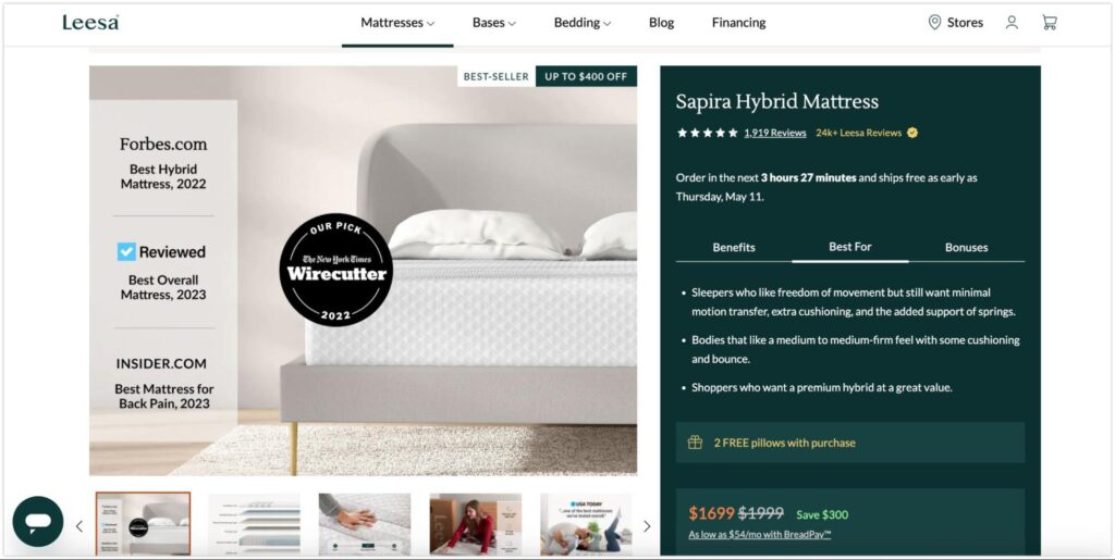
A Leesa product page could be a good example. This company sells mattresses and other bedding items. On their product page, you will see detailed information organized into different columns, which talk about product functions, what types of users it is suitable for, and several perks that come with the item.
Be clear about the product price, delivery, refund & return
Price is one of the crucial factors that affect people’s buying decisions. Therefore, it’s recommended to provide noticeable pricing (including taxes and fees) and discount offers for your customers.
Also, make sure that there’s no hidden cost that is added up in the final checkout because, according to statistics, nearly 50% of online shoppers will abandon their carts if there are high extra costs at the checkout step.
You should also inform customers about the delivery time, free shipping options, and return and refund policies. People will feel more confident shopping on your website and be more likely to make a purchase if all of the information is clear.
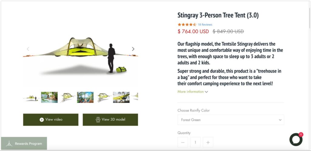
For example, Tentsite, a company that sells tents and other camping equipment, clearly displays product pricing and discounts. Buyers may also find detailed information on product warranties, shipping, and returns in the dropdown menus on the product pages.
Showcase product reviews
Studies show that conversion rates are increased by 18% if you display product reviews on your website. People want to know how others talk about your brand and products before they make any decisions.
Positive feedback from previous buyers helps build trust in people’s minds. Product reviews convince the audience that your products and services are worth their money and time. Therefore, having reviews or even user-generated content on the product page is critically important to persuade visitors to hit the “buy now” button.
There are many product review apps on Shopify that you can utilize to display customer feedback on the product pages.
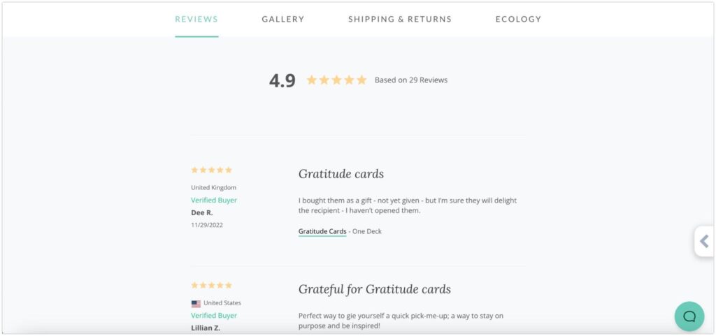
An example from Holstee
Optimize cart and checkout experiences
Offer one-step/one-page checkout
People are more likely to abandon their carts if your Shopify site has a difficult checkout experience. In fact, 17% of consumers will drop their shopping carts if the checkout is too long or complicated.
Therefore, consider providing consumers with a one-step or one-page checkout. With this solution, customers can put all of their shipping and payment information on a single page and make a rapid transaction. It helps improve the user experience while increasing sales.
It is also recommended that you provide diverse and flexible payment gateways for customers to avoid people abandoning your site because they can’t find their preferred payment method.
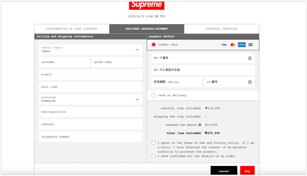
An example of one-page checkout from Supreme
Allow guest checkout
For many people, creating an account before checkout is quite offputting. Statistics reveal that more than 30% of online buyers will abandon their carts if they are required to register for an account to buy a product.
This is why visitors should be allowed to check out as guests. Their shopping experience will be greatly enhanced, encouraging them to return for more next time.
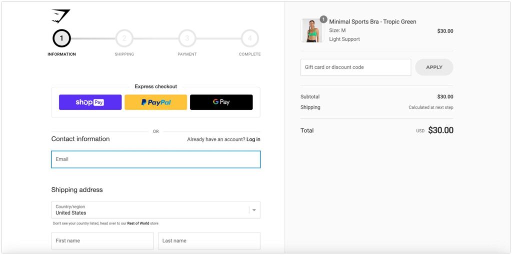
An example of guest checkout from Gymshark
Auto-fill customer information
When customer information, such as delivery address or credit card details, is auto-filled, it speeds up the checkout process and improves the shopping experience and conversion rates.
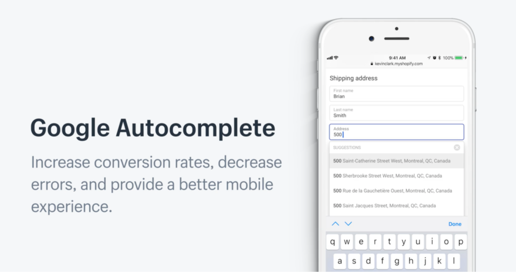
For Shopify stores, you can enable the Google Autocomplete feature to automatically fill in customer information and save buyers’ time by 20%. Customers only need to type in a few characters of their name or address, and the rest is done.
Enable cart abandonment emails
People will sometimes abandon their carts even though they have picked many items. Sending cart abandonment emails can help you engage with visitors and learn more about the reasons they leave your shop.
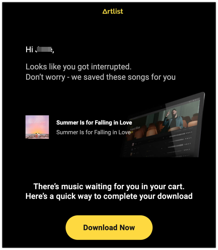
This increases the chance that people will return to complete their orders, which results in more sales. In Shopify, you may enable the cart abandonment email feature or add plugins from the Shopify app store.
Send a thank you email or page
Normally, when a customer finishes a purchase in Shopify, there will be a thank you page or confirmation page to inform them of their successful order. With an optimized thank you page/email, you can boost conversion rates and acquire new customers.
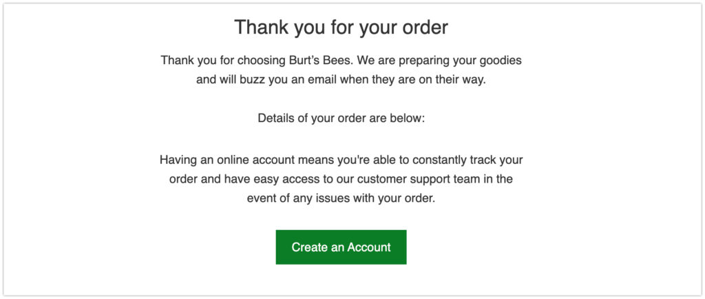
You can include related product recommendations in the thank you page or email to encourage people to buy more. Another tip for a high-converting thank you page is to add a CTA that proposes the next steps for your consumers. They can, for example, invite friends and family to buy your products in exchange for a discount or voucher for their next purchase.
There are several Shopify apps that can help you customize your thank you page for better CRO, such as ReConvert, Shogun page builder, or StoreBundle.
Improve store performance
Boost your store's loading speed
Every additional second that your store takes to load results in a 7% drop in your conversion rate. Loading speed is a crucial factor that directly affects consumers’ shopping experiences and their buying decisions.
People will leave your store immediately if the loading time is too long. Similarly, if the checkout process is slow, people are more likely to abandon their carts. Therefore, you should improve your store speed as soon as possible to deliver a smooth experience to your customers and increase sales.
To check your store’s performance and loading speed, you can read the online speed report in your Shopify admin account or test your site on popular tools such as Google PageSpeed Insights or GTmetrix.
Pay attention to mobile optimization
45% of consumers worldwide use mobile devices to do online shopping at least once per day. Therefore, having a mobile-friendly Shopify store is essential for boosting conversion rates. If you don’t want to miss out on the significant sales generated by smartphone users, it’s best to constantly improve the performance of your website on mobile devices.
Almost all Shopify themes are built to be mobile-responsive. However, pay attention to the mobile version’s loading time, make the checkout process user-friendly for smartphone users, and keep general navigation in mind when updating and customizing your store.
You can utilize the mobile-friendly test tool from Google to check your store’s mobile responsiveness and improve its performance regularly.
Implement marketing and sales boosting strategies
Offer up-selling or cross-selling
Both up-selling and cross-selling are strategies that aim to increase sales by motivating people to buy more. However, there is a difference between the two techniques.
Up-selling focuses on suggesting people buy higher-priced, upgraded, or premium products. Customers will place larger orders with higher values. This strategy is implemented at a certain point in the customer journey. It usually happens after they’ve already made a purchase because, at this stage, they have a strong desire to make more purchases if there are still worthwhile options available.
On Shopify stores, upsell recommendations are often seen in the “You may also like” or “Customers Who Viewed This Also Viewed” sections.
For cross-selling, you encourage people to buy supplementary items or related products that are frequently bought together. For example, if a customer buys a one-piece outfit, you might suggest that they add a trendy bell that complements the item to their basket.
According to research by McKinsey, cross-selling helps increase your sales by up to 20%.
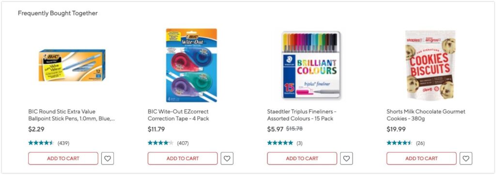
An example from Staples
Provide special or discount offers
By offering special deals like discounts, free shipping, free returns, or coupons, you can draw in more customers and boost your sales. These rewards also help with building loyal customers who will return to your store again and again in order to take advantage of better offers. For example, around 90% of online shoppers will buy more often if free shipping is available.
It’s recommended to leave noticeable and eye-catching announcements regarding the special perks on your Shopify store. For instance, you can place discounts or free shipping offers on the announcement bar, popups, hero banners, collection, and product pages to urge consumers to make a purchase and receive such incredible incentives.
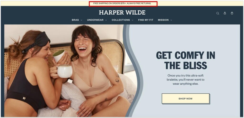
An example from Harper Wilde
Provide special or discount offers
Sometimes your items are out of stock, yet there is still a high demand from buyers. It’s obvious that you don’t want customers to leave your store empty-handed since this might result in huge revenue losses for your business.
One solution to this problem could be to provide a “notify me” button on the product pages. People will receive an email from you when their desired goods are back in stock and will be able to purchase them right away. This allows you to stay in touch with your visitors and compile a list of potential leads who are likely to become customers.
There are several “Back in Stock” Shopify applications available to assist you in setting up the “notify me” function in your Shopify store.
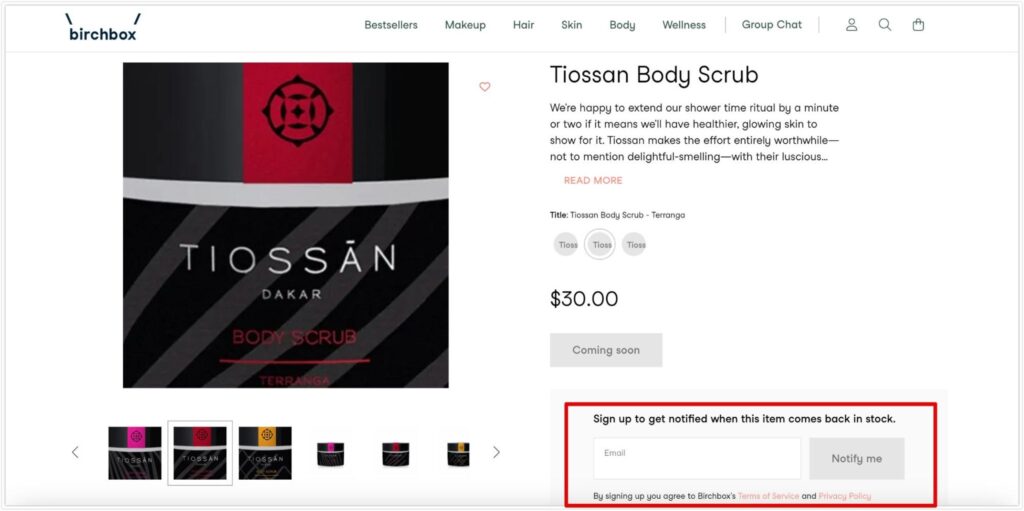
Create urgency
Have you ever heard of the term “FOMO”? It’s an abbreviation for the fear of missing out. When you provide special discounts or irresistible benefits, many customers will undoubtedly want to get them.
However, you can use FOMO strategies to motivate people to take action faster in order to claim the incentives. According to research, 60% of online buyers will make a purchase within one day because of FOMO.
Customers don’t want to miss out on good deals, so you can create a sense of urgency to encourage them to make a purchase right away. Examples of this include posting a countdown timer, a stock countdown, or real-time buyer updates. This will help boost your conversions in just a short time.
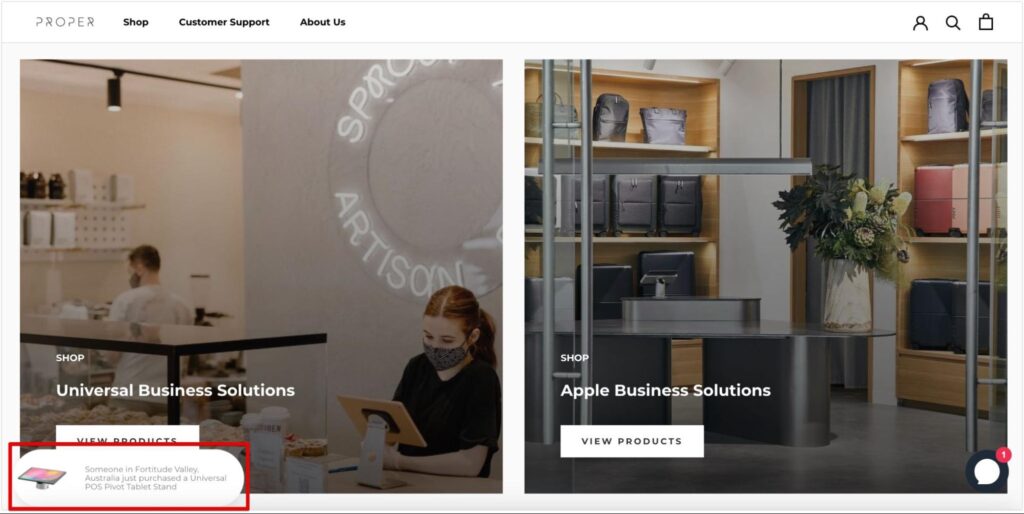
An example of real-time buyer updates from Proper
Do follow-up email marketing
Sending follow-up emails not only allows you to keep a continual connection with customers, but it also has the potential to increase sales. It’s a good CRO strategy to keep in touch with visitors who left your store and turn them into buyers.
Follow-up emails also promote brand loyalty by strengthening relationships with existing customers. You can send emails urging customers to take the desired actions by informing them about new collections, sales events, special discounts, or fresh blog content.
Install chat support
People are more likely to buy from your store if you provide exceptional customer service. Setting up live chat support allows customers to interact with your brand right away. This can improve the customer experience by addressing their issues as quickly as possible through direct chat with your team.
Good customer service increases your brand’s trustworthiness because you become a helpful source for your customers. People will remember your name and may come back to your website to make a purchase. Because of your excellent support, they may even promote your business to others.
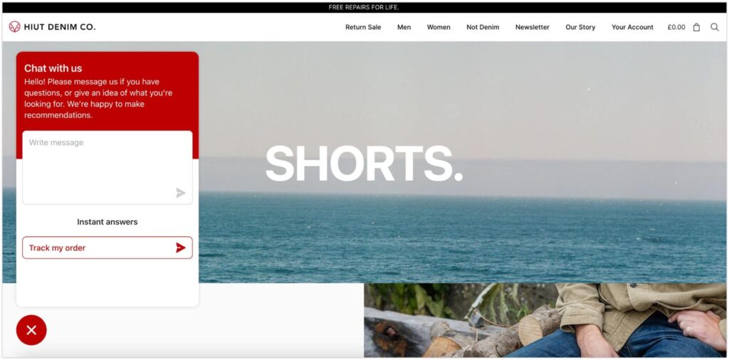
A live chat support example from Hiut Denim
Provide useful and relevant content
A blog might be a valuable asset to your CRO strategy. Sometimes, people may find you through your useful writings rather than your products. If your blog has relevant content to the issues that your customers are facing, they may find your articles on Google and click on them.
By providing informative and instructional content to your audience, you will gradually establish yourself as a reliable expert in the field. Customers will trust your solutions and may take action by making purchases. In your blog, you can put CTA links that encourage readers to sign up for newsletters or even direct them to the product pages.
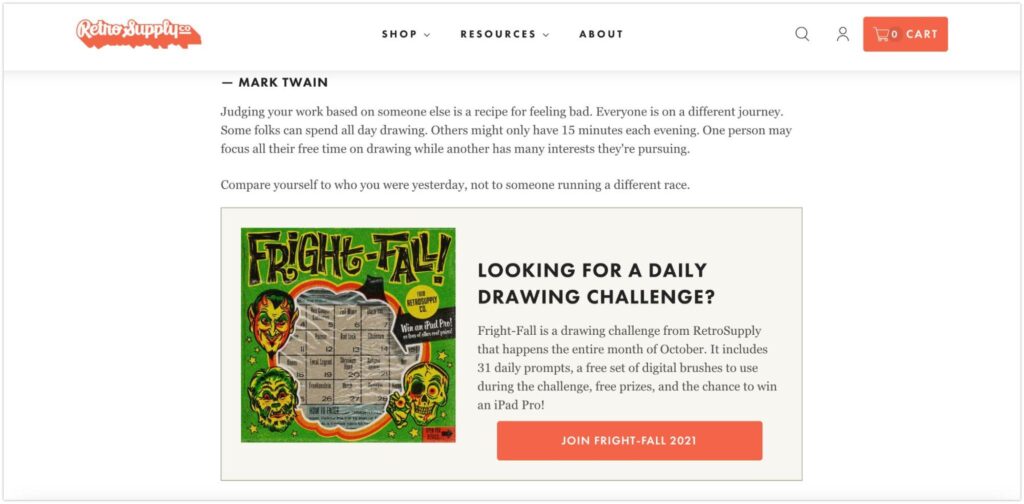
An example from Retro Supply
Apply the A/B testing practice to your CRO strategies
The suggested CRO strategies above could be a bit overwhelming to some merchants, especially if you are a newbie on Shopify. You don’t need to apply all of the CRO tactics to improve conversion rates.
Depending on your store’s performance at the time, your target customers’ behaviors, and your business plans, you should select or combine different strategies at the right time to achieve the best results.
But how can you determine which strategies are effective for your store? There is a method known as “A/B testing”. Basically, you run a test on two alternative versions of a page that have been optimized using various CRO approaches. The version with higher conversion rates is considered to be the better option for your company.
Before doing experiments on your store with A/B testing. Firstly, you need to do some research and analyze the behaviors of your customers or visitors on your website. You can utilize the behavior reports in your Shopify admin account, or use Google Analytics to learn about your consumers’ insights. Another previously mentioned tool is the heatmap, which may show you what areas of your store are busiest and where customers interact with your brand the most.
After that, with the gathered data, hypothesize what CRO tactics you should use to improve your store’s performance and encourage people to take action. After finishing your hypothesis, pick the important pages that you prioritize to make changes and fix the issues that affect your conversions.
This time, create two copies of your chosen page and begin A/B testing. The last step is to test your pages and evaluate their outcomes. This will help you learn more about your customers and continuously improve your CRO strategies in the future. Remember that CRO is an ever-changing process.
To track your conversion, go to your Shopify admin account and access the conversion report. There are also various Shopify applications you can install to help with conversion tracking.
Shopify app recommendations for CRO
Page builder apps:
Search optimization apps:
- AI search, Filter & Recommend: Rating 4.9 (1600+ reviews). Free plan available.
- Smart Search Bar & Filters: Rating 4.7 (1400+ reviews). 14-day free trial.
- Smart Product Filter & Search: Rating 4.9 (1100+ reviews). Free plan available.
Image and speed optimizer apps:
- SEO, Image Optimizer & Speed: Rating 5.0 (1300+ reviews). Free plan available.
- Booster: Page Speed Optimizer: Rating 4.9 (1200+ reviews). Free.
- Crush: Speed & Image Optimizer: Rating 4.8 (900+ reviews). Free plan available.
Product review apps:
- Judge.me: Rating 5.0 (15000+ reviews). Free plan available.
- Ali Reviews: Rating 4.9 (12000+ reviews). Free plan available.
- Loox: Rating 4.9 (11000+ reviews). 14-day free trial.
- Yotpo: Rating 4.9 (6000+ reviews). Free plan available.
Up-selling and cross-selling apps:
- ReConvert Upsell & Cross sell: Rating 5.0 (3000+ reviews). Free plan available.
- Frequently Bought Together: Rating 4.9 (2000+ reviews). 30-day free trial.
- Vitals: All-in-One Marketing: Rating 5.0 (5000+ reviews). 7-day free trial.
Final thoughts
In this article, we explore some great suggestions for increasing the conversion rate of your Shopify store. For any business owner, the ultimate goal is always to convince people to click that CTA button.
Every e-commerce marketing plan should, without a doubt, incorporate website conversion rate and page optimization. Implementing the aforementioned tactics can help you develop better experiences for your visitors and encourage them to take the desired action. However, you should not expect to see magic immediately after putting them into action. It’s a long-term process that needs constant changes and improvements.


