What if I need help along the way?
Will I receive tech support?
While we hope to answer a lot of your questions here with links to our super detailed tutorials along the way, we also have a wonderful support team you can access within our in-app chat or email! Reach out to us anytime if you have any questions!
Product Badge
Why do the product badges not display instantly on the page(s)?
In case the badges appear on the related page(s) after a few seconds for the loading site. This is due to the fact that our app will wait for all product images to load first and then add the product labels/badges later.
What is product badge
Product badge is to highlight a key feature or selling point of a product. Most commonly this would be when an item is on sale, but it can also be used to spotlight a key feature of the product itself.
The difference between product badge & label:
Badges are numerical indicators of how many items are associated with an element (a link) and labels are used to provide additional information about something.
How can I mark a product as “Sold out” using Product Badge feature?
When your products run out of stock, you should notify customers with a badge. This way, they acknowledge that the desired items are not on sale anymore, and no need to wait time on the buying process.
To mark a product as “Sold Out”, you can follow these below steps:
Choose Badge
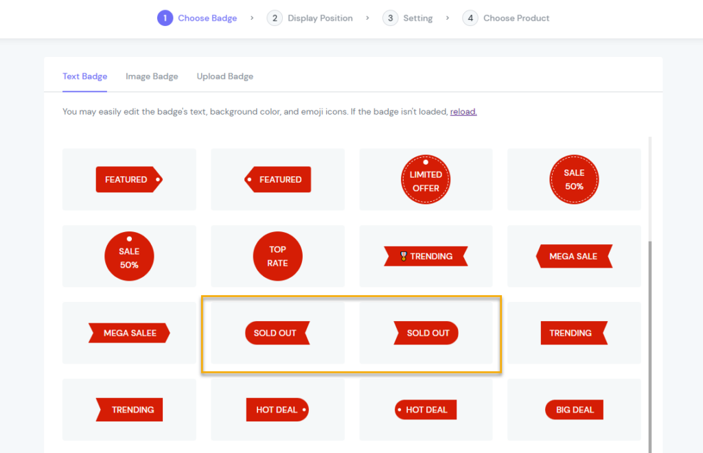
In the Text Badge tab
Select pre-designed “Sold Out” badges from the list
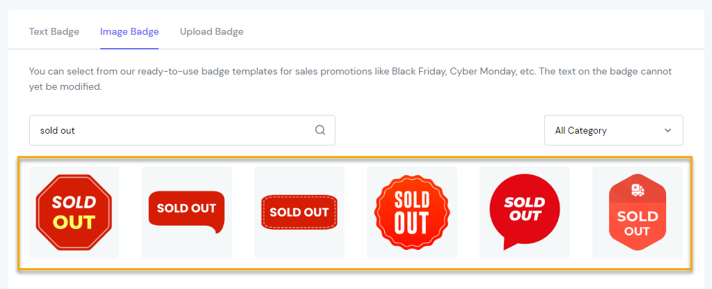
Image Badge tab
Tab Upload Badge
Otherwise, if you want to have more engaging badges, design them your way and upload to your own library.
Hit the Browse button -> Choose badge from your device
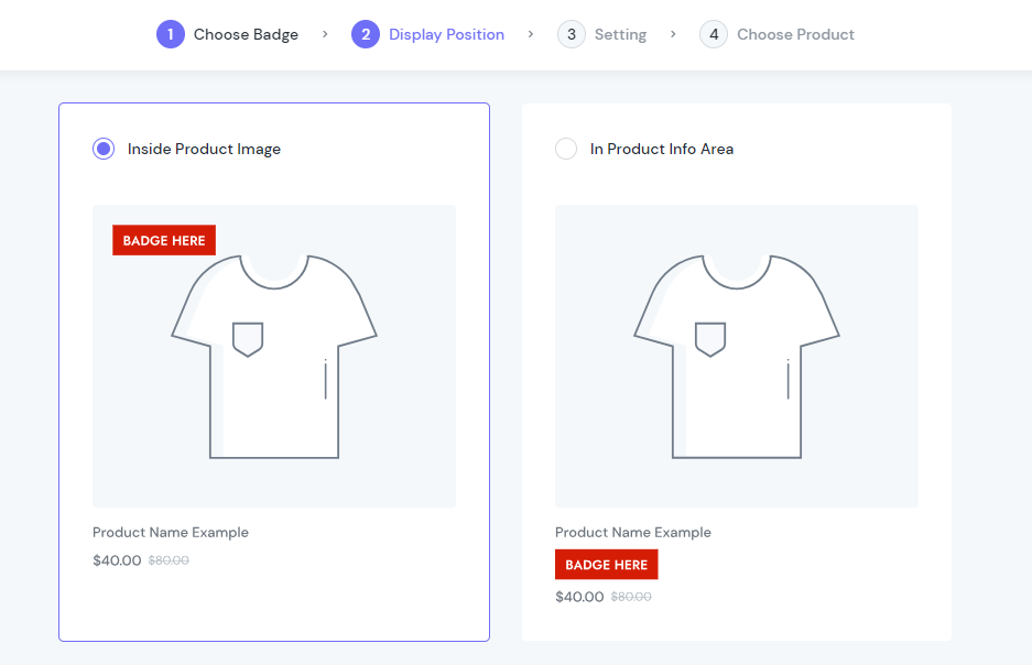
Display Position
In this step, define the “Sold Out” badge position by selecting from 2 options:
Inside Product Image
In Product Info Area
This case, we select the first option
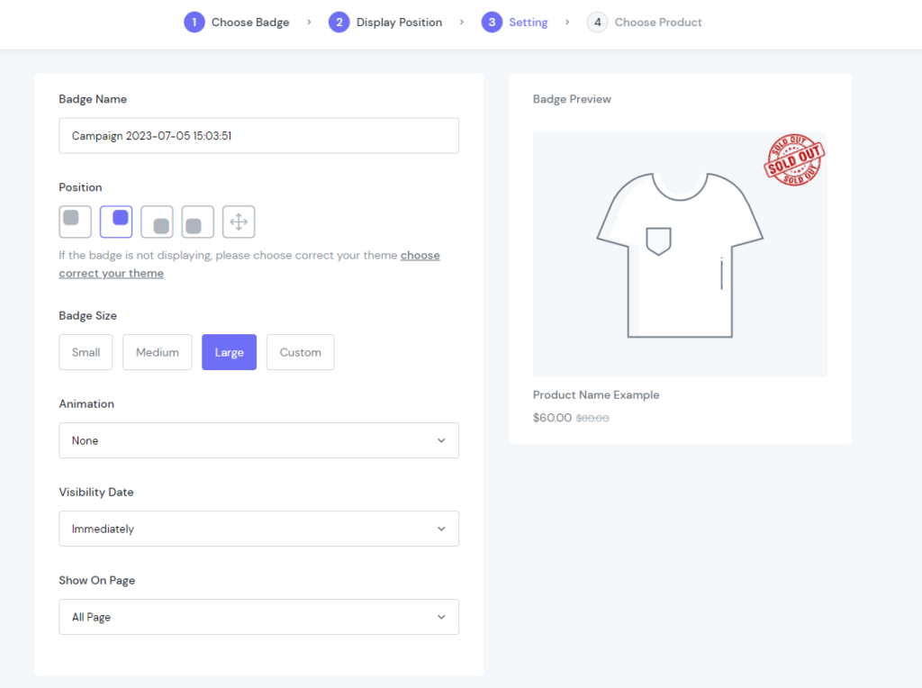
Setting
Set up the configuration like below
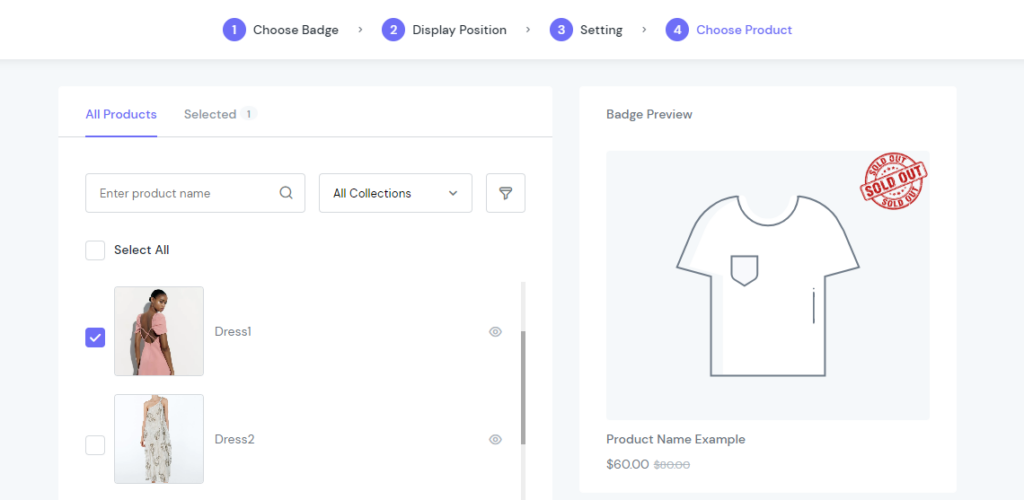
Choose Product
Finally, choose the product that is currently out of stock
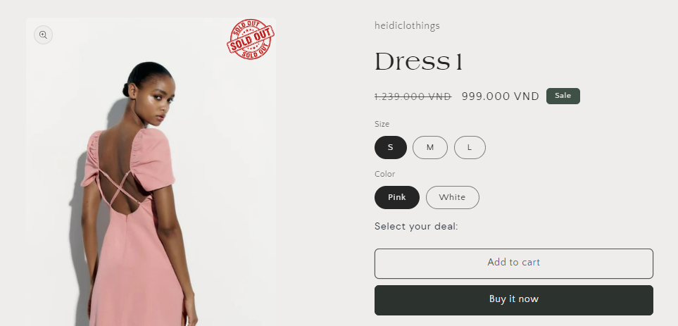
Done! Let’s see how the sold out badge display on the storefront:
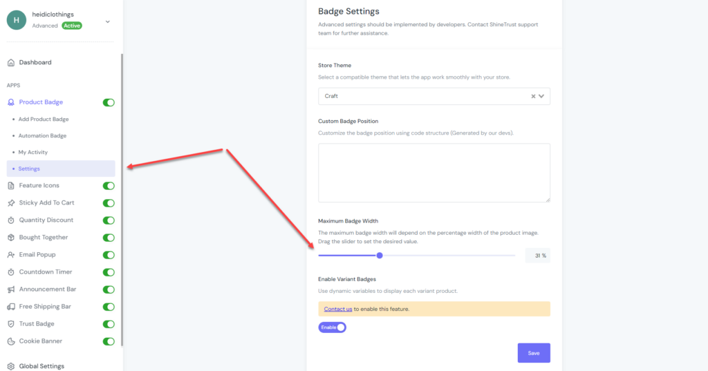
What is the largest recommended size for badges?
To set the Maximum Badge Width, go to the Settings section and set the size by dragging the slider. The maximum Badge Width will depend on the percentage width of the product image.
Trust Badge
What are the benefits of Trust Badges?
The ecommerce industry and websites are growing rapidly, but so are e-commerce frauds. When people shop online, they want trustworthy websites that protect their data. That’s where trust badges come in.
Trust badges make potential customers believe that your website is genuine and safe. By strategically placing them, especially on the checkout page, you can increase trust and reduce concerns about making transactions.
Cart abandonment is a common problem for ecommerce sites, often due to lack of trust or security worries. Trust badges can help decrease cart abandonment by a significant amount.
How to add a Trust Badge with ShineTrust?
To add Trust Badges to your Shopify store, the quickest way is to use ShineTrust.
Please follow the below steps:
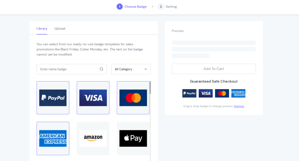
Choose Badge
Firstly, you can select badges from our ready-to-use badge templates in the Library tab.
Or, upload yourself in the Upload section.
Setting
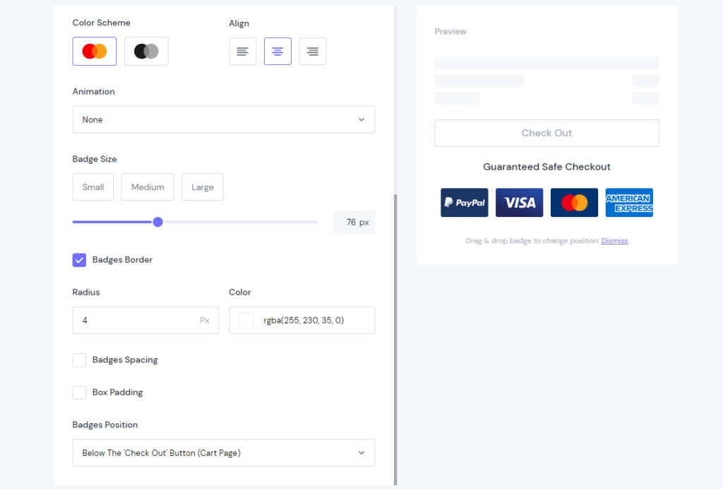
In this step, configure general information of the badges and set up them rationally.
Then, see how the trust badges look on the storefront
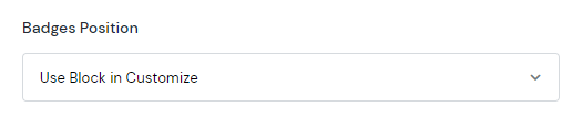
What is the “Use Block in Customize” position?
You may find this option in the Badges Position field and wonder what exactly it is.
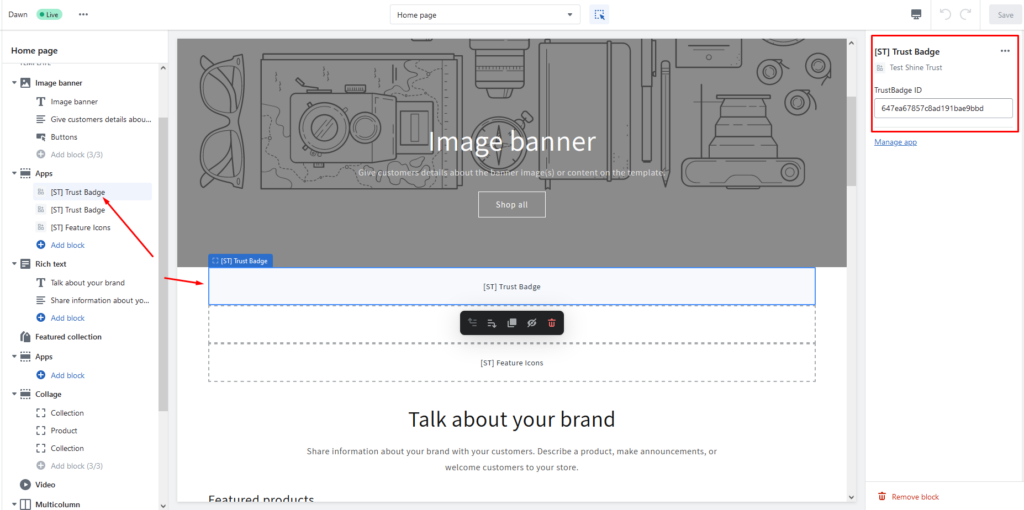
Once you select this position, ShinePages app will integrate ShineTrust as a widget in its layout. Then, you can define where to display the Trust Badges by dragging & dropping them into the page layout. See the example below:
How to add Trust Badge to the footer of Shopify Store?
As described in the previous section, you can freely set up the Trust Badge position to everywhere in the store. After selecting the Use Block in Customize option, ShineTrust will be connected to the ShinePages. The trust badges then will be set as widgets inside the ShinePages editor.
No matter it’s Homepage, Product Page, Collection Page, Cart Page or Checkout Page, you have full control over badges’ positions. Add trust badges to the footer? Easy! Go ahead – drag & drop it to the desired place.
How to add Trust Badge to Custom Position?
Another way to customize your trust badges’ position. You can place them anywhere using a small trick of the CSS selector. We record a detailed tutorial here.
Feature Icons
Does Shopify have built-in feature icons?
No, Shopify doesn’t have a built-in feature for feature icons. However, you can add feature icons to your Shopify store by using custom coding or third-party apps. ShineTrust helps eliminate lengthy product descriptions and utilize icons to showcase features effectively. Place the dedicated icon section anywhere in the store.
The feature icons do not display when adding new products to collections
You configure the position of the feature icons, and you decide to display them on product pages. Here, you can filter the products by collections and display icons on these product pages.
However, the problem is when you add a new product to the selected collection. The feature icons assigned don’t appear.
In this case, the system does not automatically update. So, you need to open all the created feature icon blocks in the My Activity section. Hit Save again. Then back to the storefront and reload the site.
Add Feature Icons anywhere in the store
Another way to customize your feature icons’ position. You can place them anywhere using a small trick of the CSS selector. We record a detailed tutorial here.
Sticky Add To Cart
How to hide Sticky Add To Cart from Out of Stock Products?
To do this custom work, you have to add some code into the store. Please contact our dedicated team to get further assistance.
How do I create a sticky add to cart button?
To create a sticky add to cart using ShineTrust, you can follow below steps:
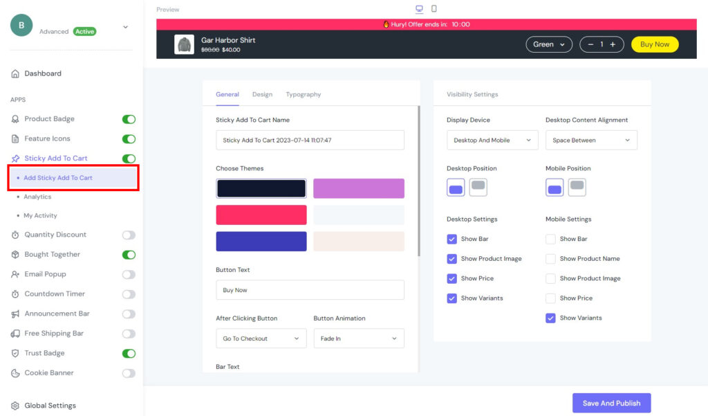
Add Sticky Add To Cart
Go to the General tab and configure the settings as below.
You can change the Name for further management.
Select the main background color with Choose Themes field.
Personalize other fields including Button Text, After Click Button, Button Animation, etc. the way you like.
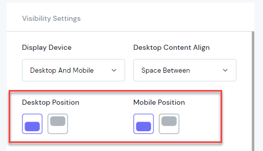
The Visible Settings table on the right side lets you define how the Sticky Add To Cart bar will display.
Define the Display Device by choosing from options inside the dropdown. Set up the Desktop Content Aligns, Desktop Position, Mobile Position, etc.
Finally, decide which portion of the bar will be shown in the frontend of Desktop & Mobile (Bar, Product Image, Price, Variants, Product Name)
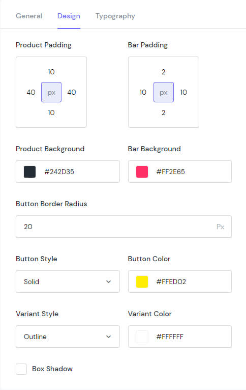
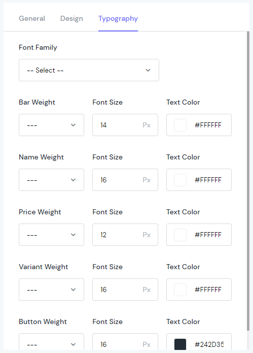
Also, you can customize the look of the Sticky Add To Cart bar using the Design & Typography tab.
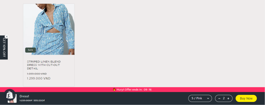
After finish all settings, let’s see the result:
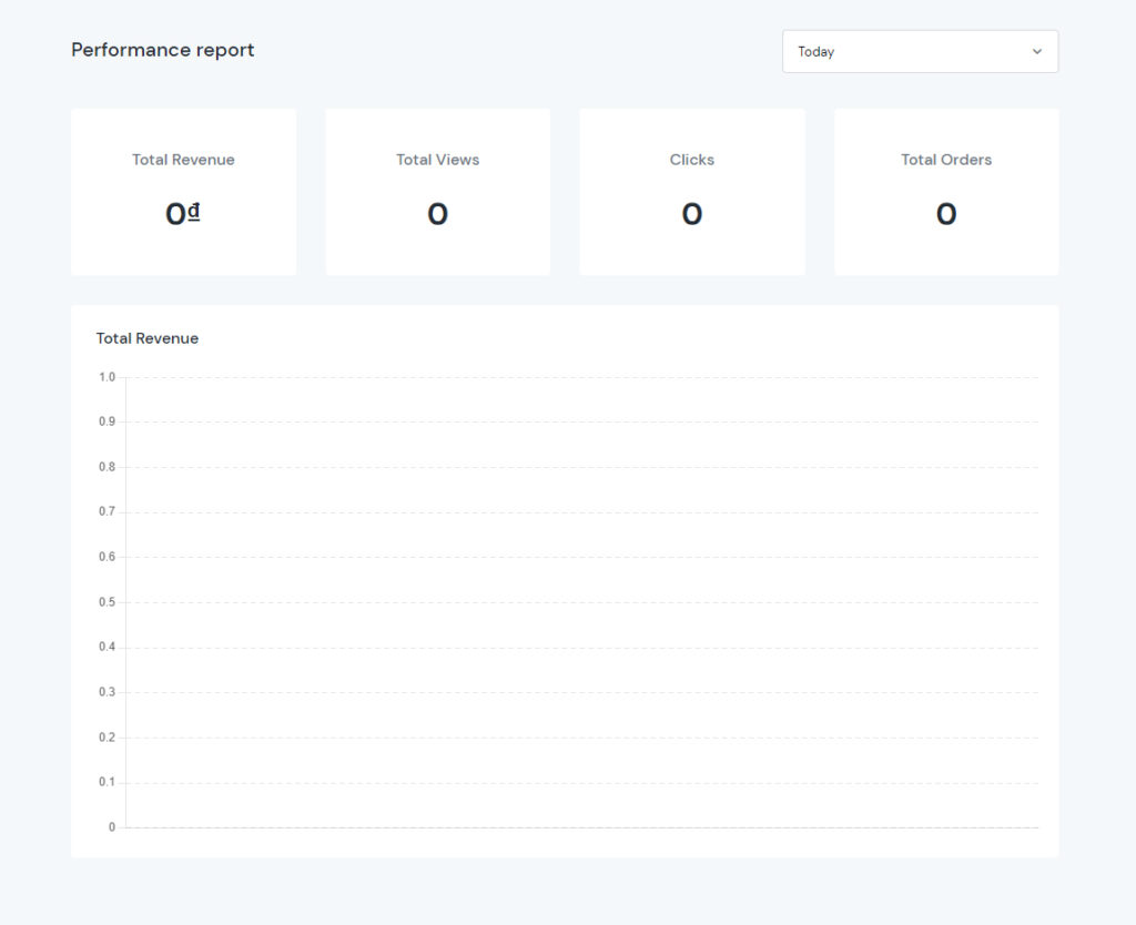
Analytics
The Analytics tab lets you track the performance of the Sticky Add To Cart bar. The report data includes Total revenue, Total Views, Clicks, Total Orders, and a graph visualization showing how the revenue changes over time. Besides, you can also filter the report by different duration such as Today, Yesterday, Last 7 days, Last 30 days, Last 90 days, Last Month, or All Time.
How to display Sticky Add to Cart Bar in different places on different devices?
Imagine you want to configure the Sticky Add to Cart to stick on the header of the website in the desktop view. However, on the tiny screens like mobile phones, you want it to appear at the bottom.
So, in the backend, select the position (to the top, or to the bottom) for Desktop & Mobile independently.
Quantity Discount
How to set up a simple Quantity Discount?
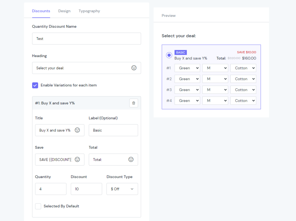
Firstly, in the Add Quantity Discount step, head for the Discount settings.
Name the Quantity Discount box, and set up a convincing Heading.
If your products are configurable, check the box next to the Enable Variations for each item field.
Besides, set the Title, Label, Saving Amount and Total heading the way you want.
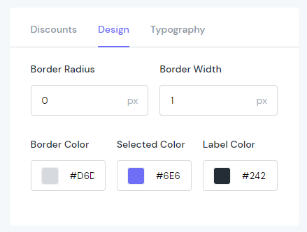
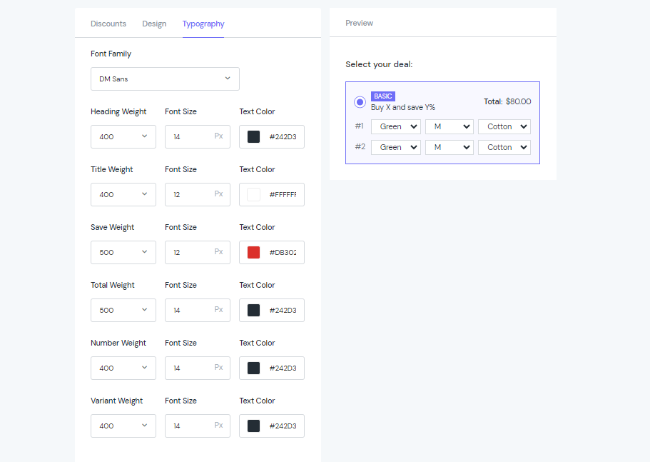
To customize the look of your Quantity Discount, go to the settings inside the Design & Typography tab.
Everything is visual & lets you preview the result right away.
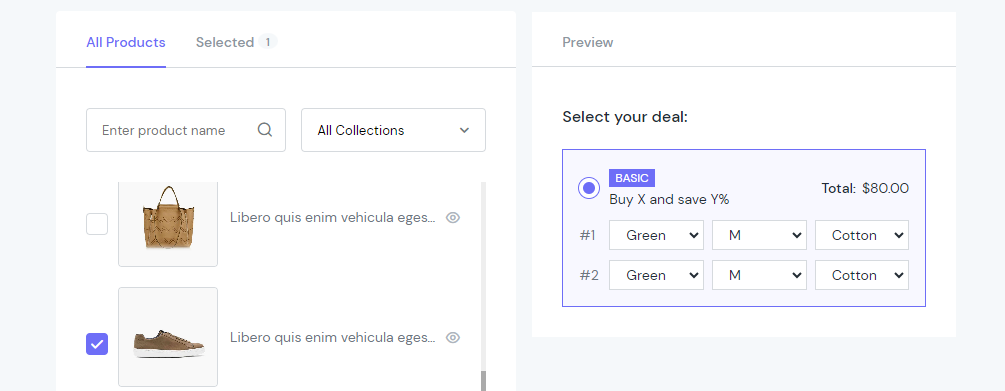
Then, move to the next section: Select Product to display. You can filter products by collection. Then use the check box to select one by one or all at once. This case, we select this shoe.
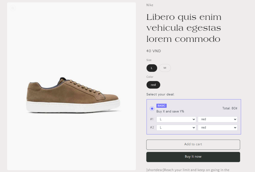
Okay, let’s see how the Discount box displays on the storefront:
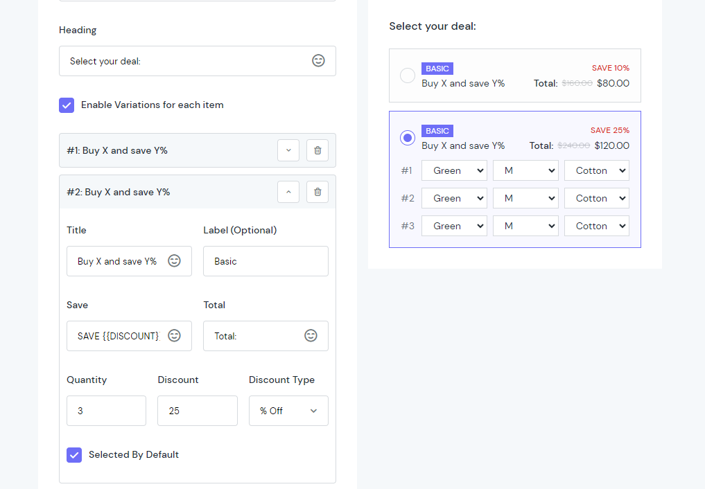
What does Selected by Default check box mean?
You can create multiple options for Quantity Discount. For example, you have 2 options of bulk orders that you want to offer your customers.
The first one: 10% off for 2 items. The second one: 25% off for 3 items.
So, in the backend, you configure 2 different discount boxes. Like this:
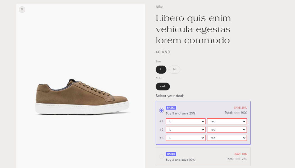
The discount option of “Buy 3 get 25% off” comes with the checkbox. Then, this option will be preselected as default in the product page when customers head for checkout. They can deselect and use the other option anytime.
Email Popup
Can I add a button that directs to another page in the email popup?
Currently, we don’t support that functionality in the Email Popup feature. If you want to custom it, contact our support team to get further assistance.
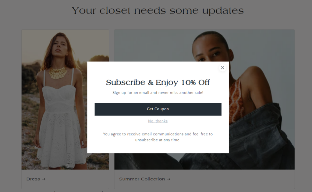
How to create a simple Email Popup?
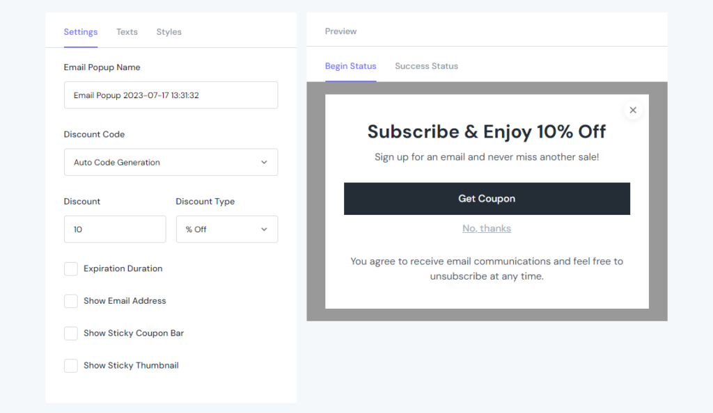
Firstly, in the Add Email Popup section, go to Settings tab:
Set up the name for the popup. Select how customers can get code from the popup by choosing from 3 options: Auto Generation, Enter Code Manually or No Coupon. (This case we select Auto)
Define how much you want to discount for your customers with Discount Value & Discount Type fields.
Then, decide how long the popup will stay at your site, using the Expiration Duration field.
To show Name & Email fields, tick the checkboxes and custom the placeholder texts.
Tick the checkbox of Show Sticky Coupon Bar to remind customers about the code.
And finally, check the Show the Sticky Thumbnail to make sure the popup floats whenever they scroll down the site.
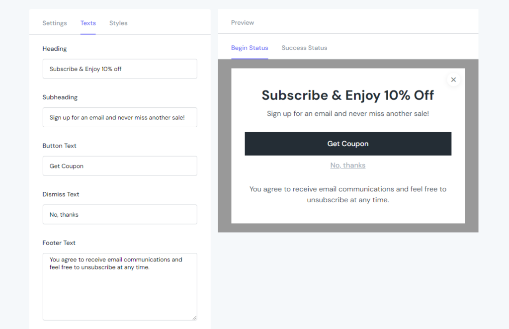
Within the Texts tab, you can configure Heading, Sub-Heading, Button Text, Dismiss Text, Footer Text, and so on.
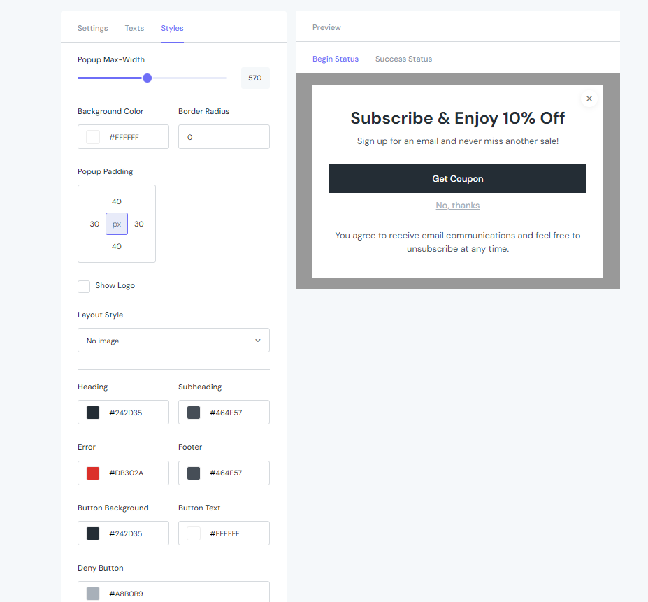
Moreover, you can even configure text & display all the stages including Begin Status, Success Status, Sticky Coupon Bar & Sticky Thumbnail.
Things come the same with the Styles tab as you can configure the settings of each Status, separately.
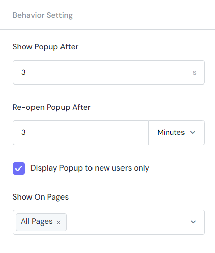
Decide how long to display the Email Popup after accessing the page and how long to re-open it after closing.
Define the new audiences of the popup with the Display Popup to new users only field.
Finally, select pages to display the Email Popup by choosing from the dropdown list.
Then, go set up the Behaviour Setting
Tadaa! This is how the popup look on the front
Countdown Timer
How to create a Countdown Timer in ShineTrust
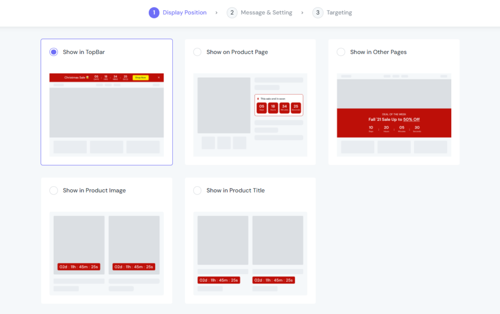
Display Position
Select the Display Position for Countdown Timer from the list:
Show in Top Bar
Show in Product Page
Show in Other Pages
Show in Product Image
Show in Product Title
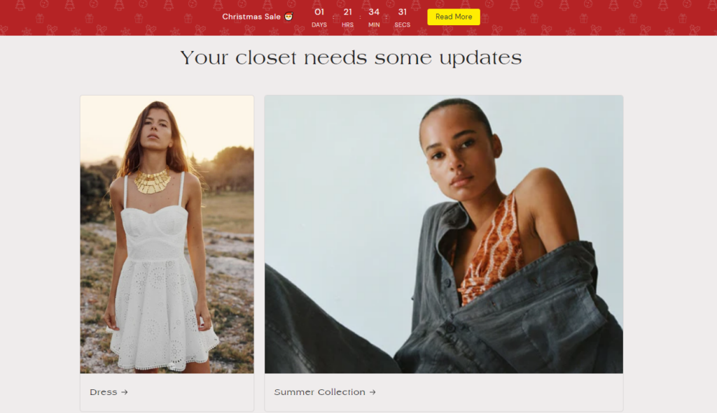
In this case, we decided to show it in the top bar.
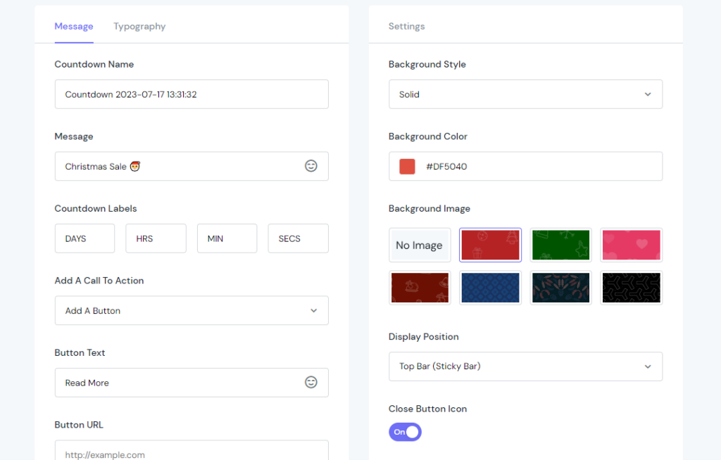
Message & Setting
Configure the Message & Typography tab like this (This case, we are creating a countdown banner for the Christmas sale campaign. So we select the red theme as default)
You can Add a Call To Action button and choose how it will display:
No Call To Action
Call To Action Button
Simple Link
Make Entire Bar Clickable
Whatever you select, you then have to configure the look and feel individually.
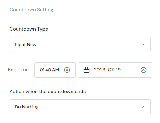
Then, move to the Countdown Setting section
You can choose from 3 Countdown Types including:
Right Now
Definite Time
Fixed Time Per Visitor
This case, we select the Right Now option, and set the End Time like above. Then, go set up Action when the countdown ends. We selected Do Nothing instead of Repeat It or Hide the bar.
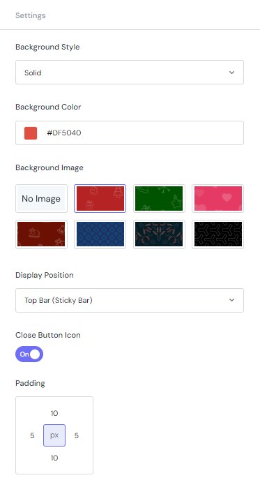
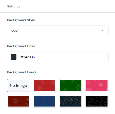
Next, define the look of the countdown bar with the settings of Background Style, Background Style, Background Color, Background Image, Display Position, Close Button Icon, Padding…
Targeting
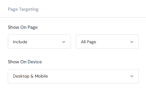
After finishing all the settings, decide where to put your countdown on.
In the Show On Page field, select Include to include the pages listed inside the dropdown list in the right. Otherwise, select Exclude to not show the countdown on the selected pages.
Finally, in the Show On Device section, define which device that the countdown will be displayed on. You can choose from Desktop, Mobile or both.
Okey, time to see how the countdown look in the front:
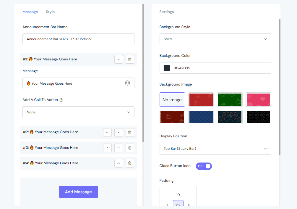
Announcement Bar
How to add an Announcement Bar using ShineTrust
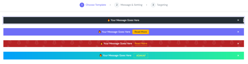
Choose Template
We selected the first one with a simple design.
Message & Setting
Set up the Announcement Bar Name for further management. Configure the Message you want to show on the bar. Then, Add A Call To Action using one of following types:
Button
Link
Coupon
Make the entire bar clickable
We set it as a Button in this case. Now, we go to configure Button Text, Link URL, let the link Open In New Tab or not.
Then, configure Button Style with Solid or Outline style. Furthermore, select Button Background & Text Color, define the Button Border (in pixel). Finally, select Button Animation from the list.
In the Style tab, select Font, Font Size, Text Color & Font Size.
Move to the Settings tab: You can set up Background Style, Color or even Background Image here.
Decide where to display the bar using the Display Position field. If you want to show the Close Button, switch the toggle button on.
Set up the Visibility Duration by Immediately or Custom Date.
Finally, how long will it take to display the bar after accessing pages or when it will disappear can be easily configured in the Behavior Setting field.
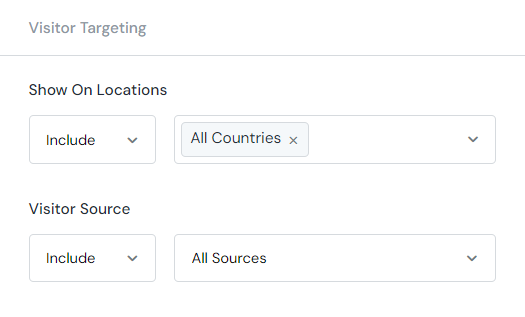
Targeting
Page Targeting section
After finishing all the settings, decide where to put your Announcement Bar on.
In the Show On Page field, select Include to include the pages listed inside the dropdown list in the right. Otherwise, select Exclude to not show the countdown on the selected pages.
Finally, in the Show On Device section, define which device that the Announcement Bar will be displayed on. You can choose from Desktop, Mobile or both.
Visitor Targeting section
This section helps you display your Announcement bar in different countries. With the Show On Locations function, you can Include or Exclude whatever country you want.
Furthermore, the Visitor Source lets you track the leads from social media including Facebook, Twitter, Instagram, Google and Others with customizable tags.
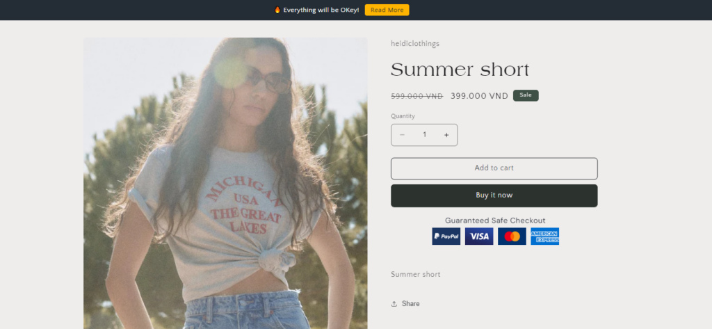
After hitting the Save & Publish button, it’s time to see the result:
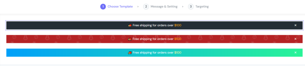
Free Shipping Bar
How to add a Free Shipping Bar to your store?
Choose Template
We selected the first one from the list of 3
Message & Setting
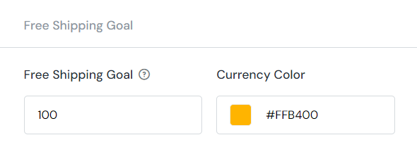
You can set the Free Shipping Goal by entering a number into the field, and selecting the color of currency with the color swatch. Otherwise, go to the Shipping section in store admin to set up a free shipping goal.
Then, go set up the Message section. Customize the Start Message, Progress Message & Success Message the way you want. Configure the Font Family, Weight, Size, and Text Color. The below image can be an example
Similar to previous functionalities, the Settings section comes with the same options that let you define how the Free Shipping Bar looks like.
In this case, we wanna make everything as simple as possible:
Targeting
Just like the Targeting section of previous functionality, you can easily set up the Page Targeting & Visitor Targeting for your Free Shipping Bar.
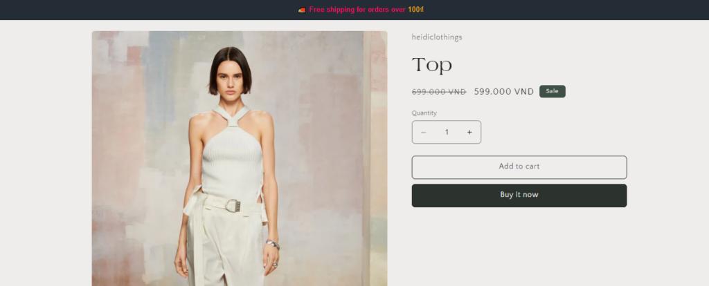
Let’s see the result on the storefront:
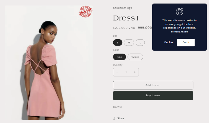
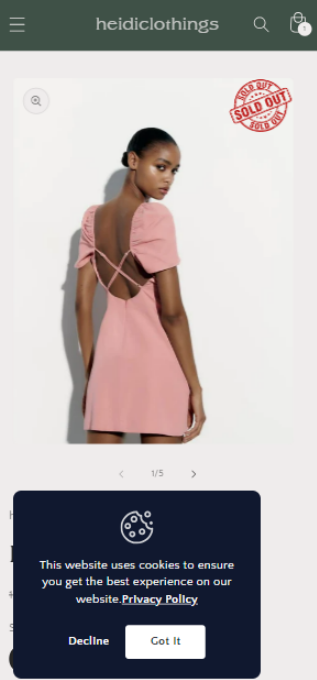
Cookie Banner
How to add a simple cookie banner using ShineTrust
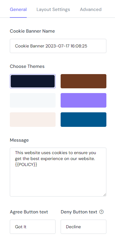
General Tab
Enter the Cookie Banner Name, then choose the theme for your Cookie Banner.
Next, write the message that will display in the cookie popup.
There will be 2 buttons letting visitors close the banner. Customize the content inside.
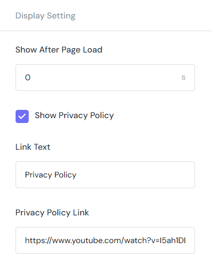
Display Setting
Go custom Display Setting with following fields
Show After Page Load: The duration after that the Cookie Banner will display. It starts when visitors access the page via link.
Show Privacy Policy: To display your policy, tick the checkbox.
Link Text: Set up the name for the link
Privacy Policy Link: Paste the direct link to your policy page.
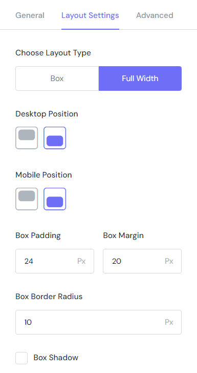
Layout Setting
Choose the Layout Type for the Cookie banner (Box or Full Width)
Set up the Desktop & Mobile Position independently.
Configure the Box Padding, Margin & Border Radius.
Finally, don’t forget to tick the checkbox of Box Shadow to make your Cookie Banner stand out.
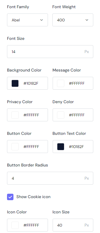
Advanced
The Advanced tab includes following fields that let you customize the total look of Cookie Banner:
Font Family: Select from tons of fonts
Font Size: Enter a value
Background Color: Select a color you like from the color swatch or enter the exact hex code.
Message Color: Select a color you like from the color swatch or enter the exact hex code.
Then, go set up the Privacy Color, Deny Color, Button Color, Button Text Color
Enter a value for Button Border Radius
Show Cookie Icon then set up its Color & Size.
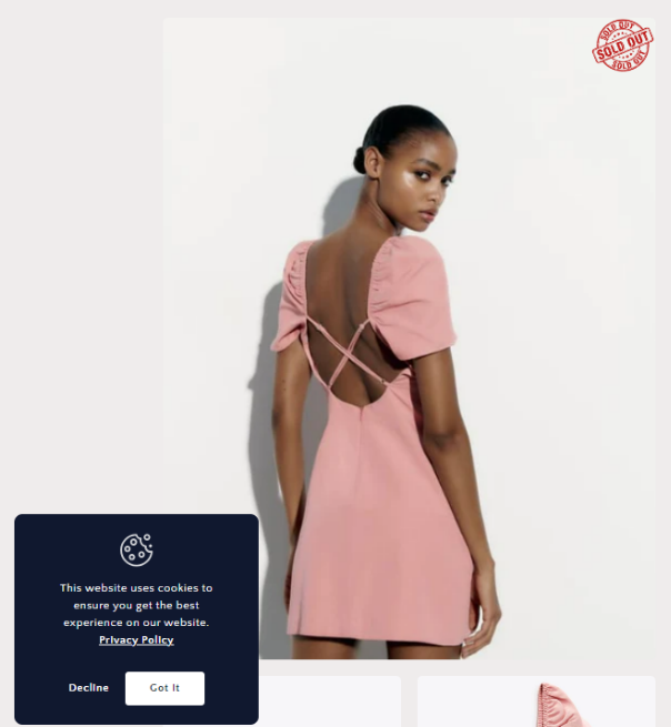
After finishing all the setups, this is how the Cookie Banner looks in the front:
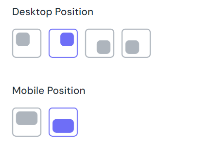
How can I display cookie banner in different positions for Desktop & Mobile
To display Cookie Banner in different positions for Desktop & Mobile, follow these steps:
In the Layout Setting tab, select the position to display Cookie Banner on different devices.
For the desktop, you can choose from 4 positions: Top left corner, Top right corner, Bottom left corner, Bottom right corner.
On the other hand, for mobile, you’re able to choose between top & button position.
Let’s see how the Cookie Banner display in both Devices:


