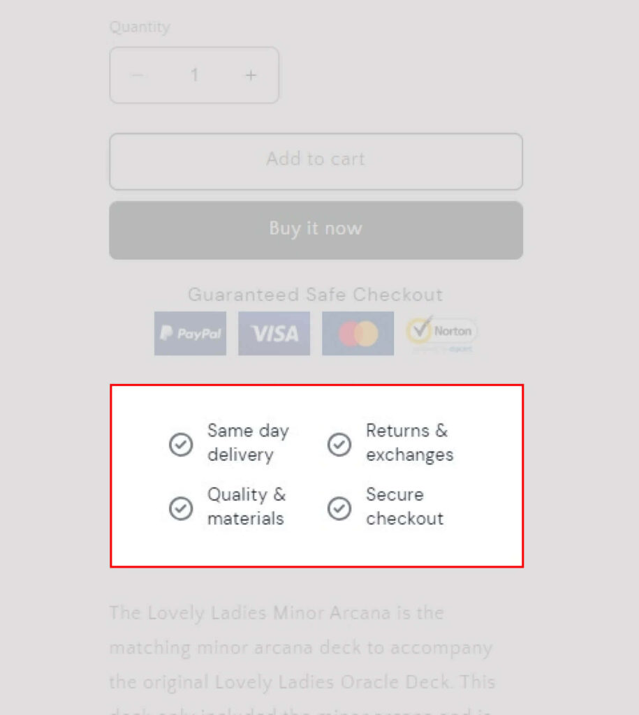
Feature Icons are the visual representations of unique characteristics, components, or processing operations of ShineTrust that must be shown in or on a user interface and are made available by ShineTrust.
Add Icon Block
Step 1: Choose Template
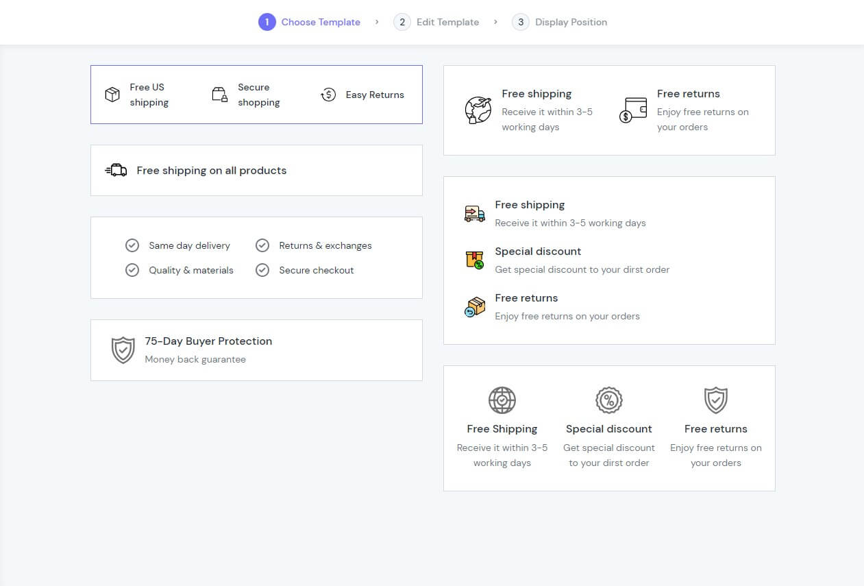
The initial section of a feature icon is called the Add Icon Block. Your screen will automatically start at step one, Choose Icons.
We’ve already created seven layouts, so you may pick the one you think best meets your specific requirements.
Note: If you still feel that our layouts are not special or do not stand out the way you want, don’t worry; here I will show you how you can make a more personalised template in step 2.
After you have selected a layout that best suits you, select “Next” at the bottom right of the screen.
Step 2: Edit Template
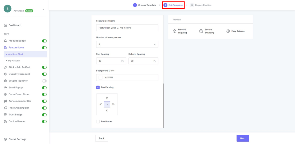
The Edit Template comes with three components to save you time. Currently, Edit Template allows these types of media so you can maximise the display of your products, including:
- Message
- Style
- Layout Style
Message
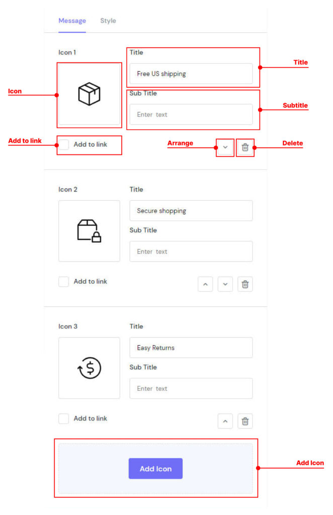
The Message element comes with 5 parameters that allow you to fine-tune the appearance of your content for the best possible conversion rate. Select the element in the layout to see its parameters:
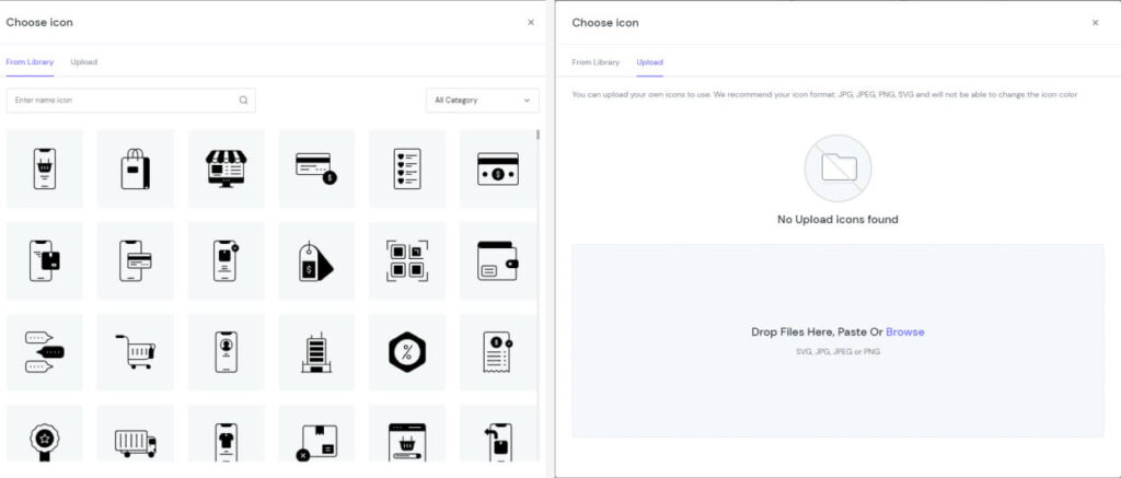
- Icon: We integrate 1000+ templates so that you can choose one basic icon that best suits the needs of today’s market or upload your own icons in the following formats: JPG, JPEG, PNG, and SVG.
- Title: The name that describes an icon.
- Subtitle: Captions displayed at the bottom of the title give additional information.
- Add to link: Add the link that allows users to click their way from page to page.
- Arrange: Change the position of icons easily.
- Delete: Remove icons you don’t need.
- Add icon: Add the number of icons.
Note: You can delete the icon if you don’t need to publish.
Style
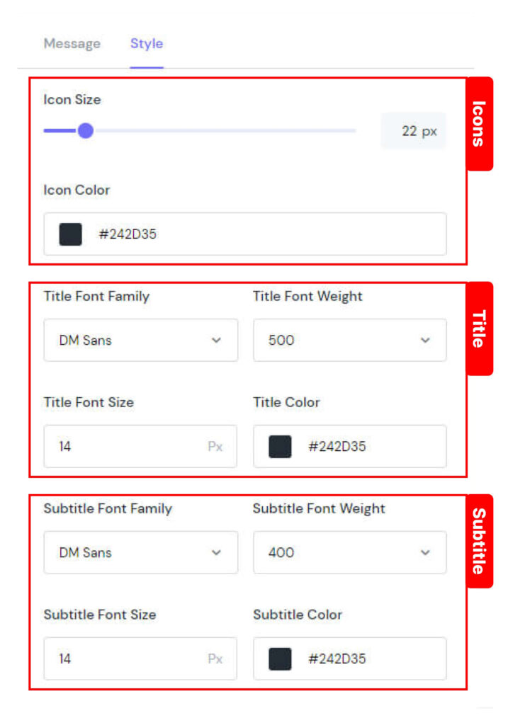
There are 10 components to choose from to improve Feature Icons, such as:
Icons | Icon Size: Control icon size to make it useful |
Icon Color: Modify the colour of icons. | |
Title | Title Font Family: Choose a typeface to be the core design |
Title Font Weight: Determine how bold or light your title will appear. | |
Title Font Size: Make your title font size smaller or larger. | |
Title Color: Modify the colour of the title. | |
Subtitle | Subtitle Font Family: Choose a typeface to be the core design. |
Subtitle Font Weight: Determine how bold or light your sub-title will appear. | |
Subtitle Font Size: Make your subtitle font size smaller or larger. | |
Subtitle Color: Modify the colour of the subtitle. |
Layout Style
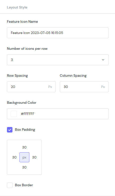
Layout design is the process of positioning graphic and textual components on a screen or piece of paper in order to draw the reader’s eye and convey information in an attractive manner.
Here are 7 ingredients for you to choose from:
- Number of icons per row: Choose the number between 1 and 4.
- Row Spacing: Set the spacing of rows to 50 pixels.
- Column Spacing: Set the spacing of columns up to 50 pixels.
- Background Color: Modify the colour of the background.
- Box Padding: Create space around the element, inside any defined border.
- Box Border: The browser accounts for any border and padding in the values you specify for an element’s width and height.
- Radius: Rounds the corners of the outer border edge.
- Color: Set the colour of this box.
Step 3: Display Position
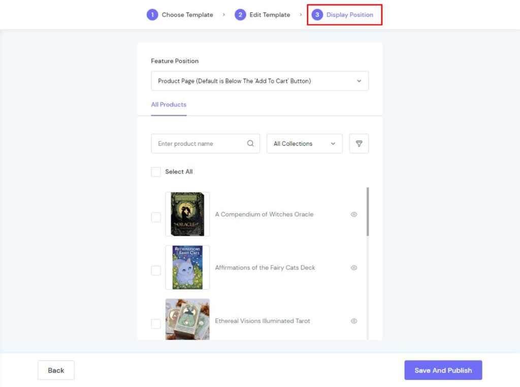
Display Position allows you to position the display according to your needs. You can show your feature icons in 4 positions:
- Product Page (Default is Below The ‘Add To Cart’ Button)
- Cart Page (Default is Below The ‘Check Out’ Button)
- Use Blocks in Customize
- Custom
Finally, click “Save and Publish” to show your Feature icons.
Step 4: Check again
After all, you should check your Feature Icons display in the store and modify them again (if need be).
My Activity
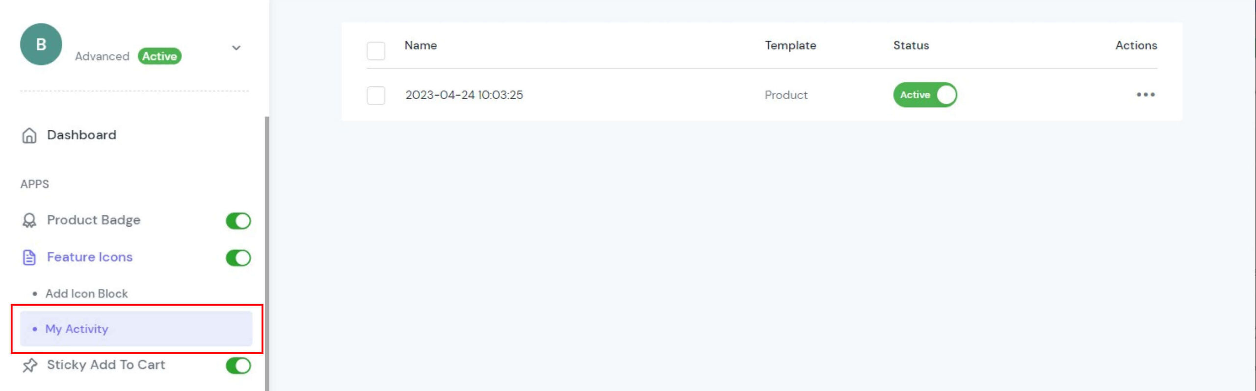
My Activity allows you to check the campaigns you are running on the store with 4 elements:
- Name
- Template
- Status
- Actions
