A window known as an email popup is displayed on a website visitor’s screen and requests their email address in return for a promotional offer. Popups are helpful, but if they are overly large or difficult to close, they may block access to the page’s content, degrading the user experience.
Active Email Popup
Before you can modify the details, you need to activate the toggle button in the Email Popup.
You will be redirected to the Shopify Editor page of your store. You can activate it by switching in the Shopify Editor or selecting where you want to display it on the Product Page by adding the section.
Add Email Popup
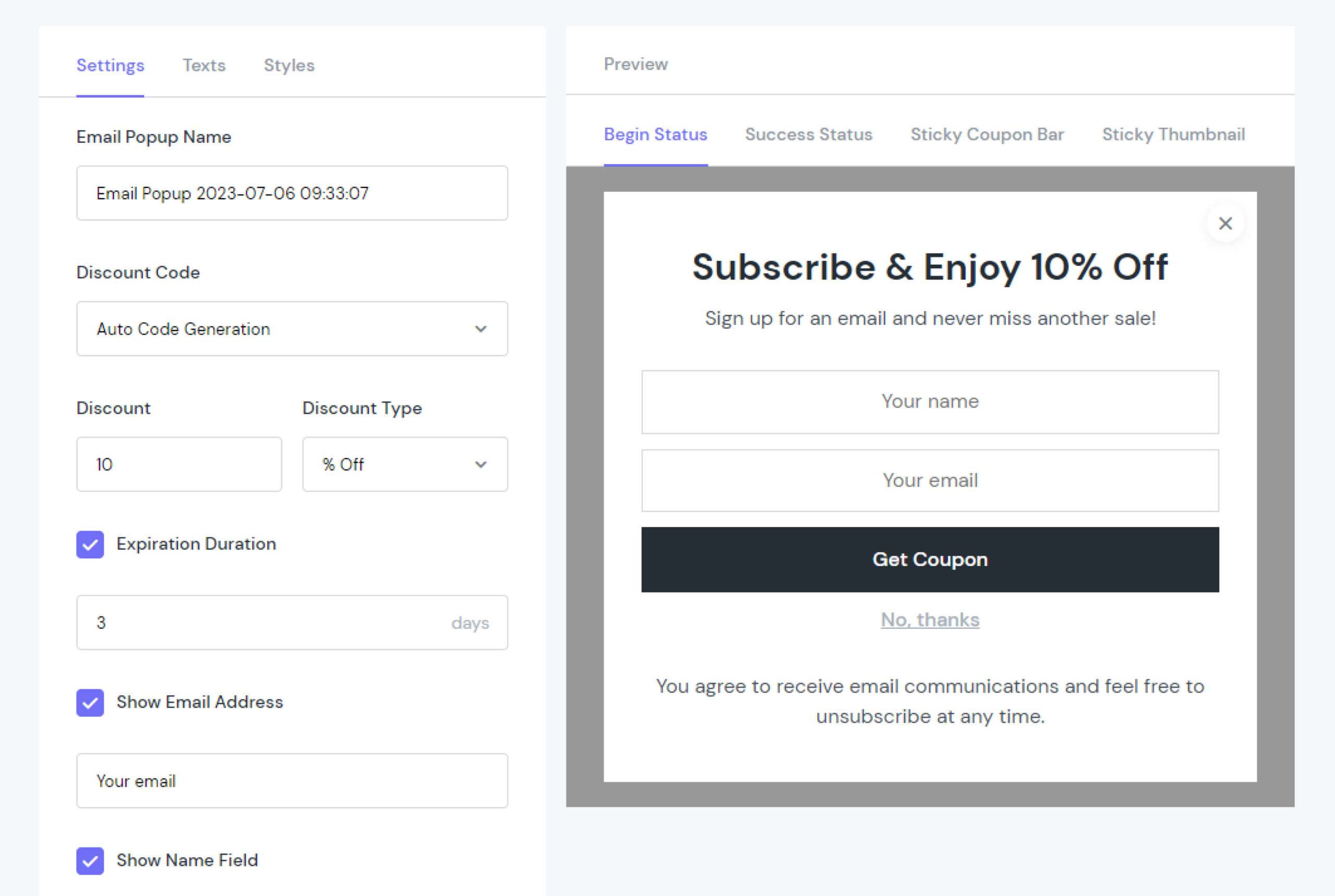
Add Email Popup has many settings that let you adjust the presentation of the information for the highest potential conversion rate. To view an element’s parameters, select the element in the layout:
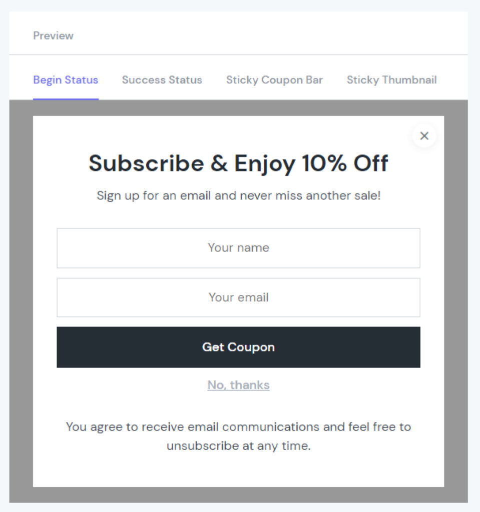
Preview
Settings
Texts
Styles
Behavior Settings
Preview
You can preview your Email Popups on your Desktop, and then you can customise it with the parts that I will introduce in the next section.
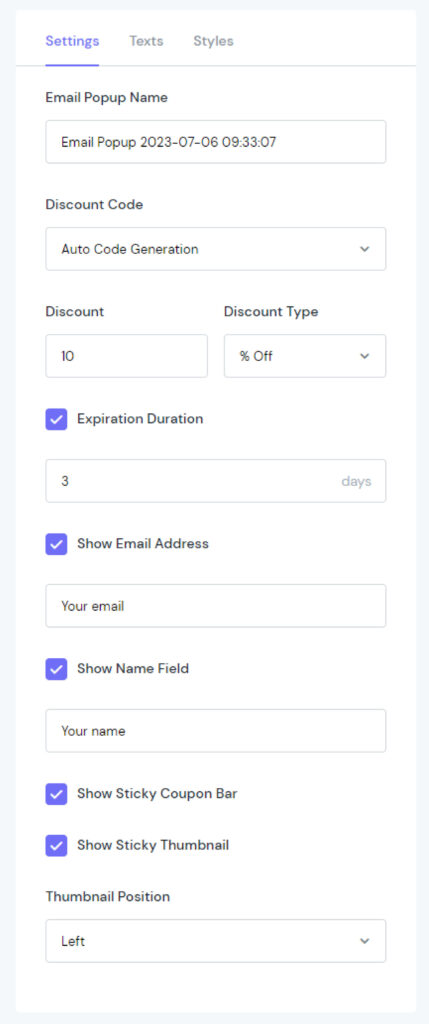
Settings
Settings has a tonne of settings that you can use to fine-tune the presentation of the information for the highest conversion rate.
You may edit the following 8 sections:
Email Popup Name: Change your campaign’s name.
Discount Code: Choose between 3 options:
Auto Code Generation
Enter Code Manually: Add the number in “Enter Discount Code”.
No Coupon
Discount: Type the number of discount codes.
Discount Type: Select between “% Off” and “$ Off”.
Expiration Duration: Display up to 90 days.
Show Email Address: Display the box to type the customer’s email.
Show Name Field: If active, it will show a part to type a name in Begin Status.
Show Sticky Coupon Bar: Display Sticky Coupon Bar in your store.
Show Sticky Thumbnail: Display Sticky Thumbnail in your store.
Thumbnail Position
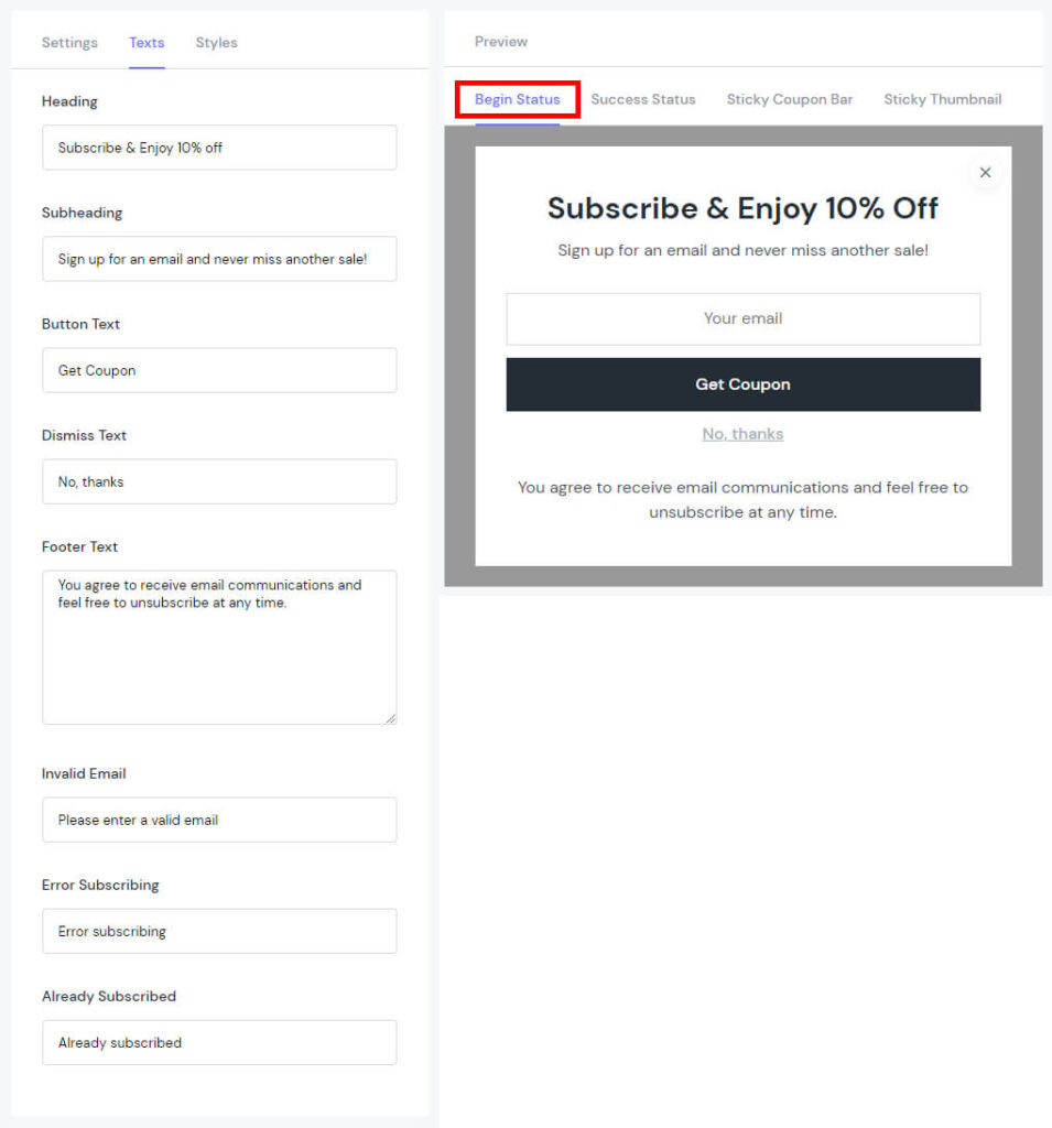
Texts
Begin Status
Heading: Change the text of the Heading.
Subheading: Change the text of the Subheading.
Button Text: Change the text of the Button.
Dismiss Text: Change the text of “Dismiss”.
Footer Text: Change the text of the Footer.
Invalid Email: Change the text of Invalid Email.
Error Subscribing: Change the text of Error Subscribing.
Already Subscribed: Change the text of Already Subscribed.
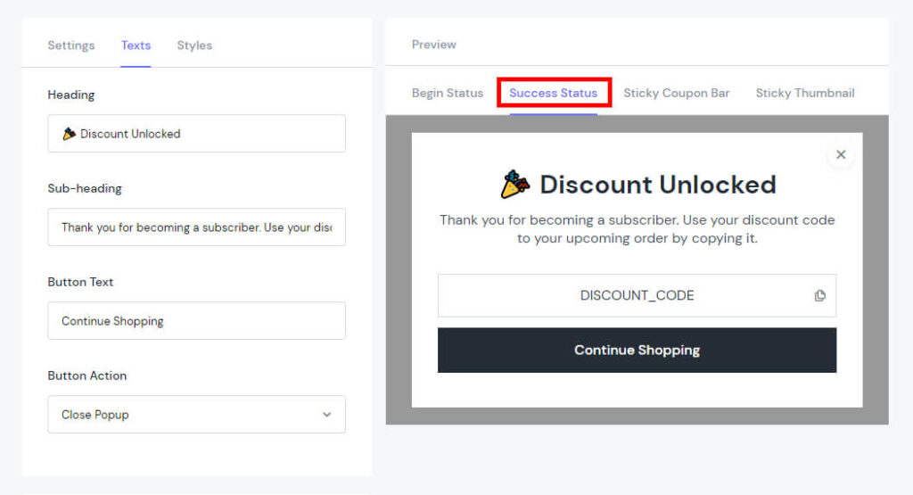
Success Status
Heading: Change the text of the heading.
Subheading: Change the text of the subheading.
Button Text: Change your button’s name.
Button Action: Set to link to another slide, play a sound, or perform a similar action.
Close Popup
Open URL
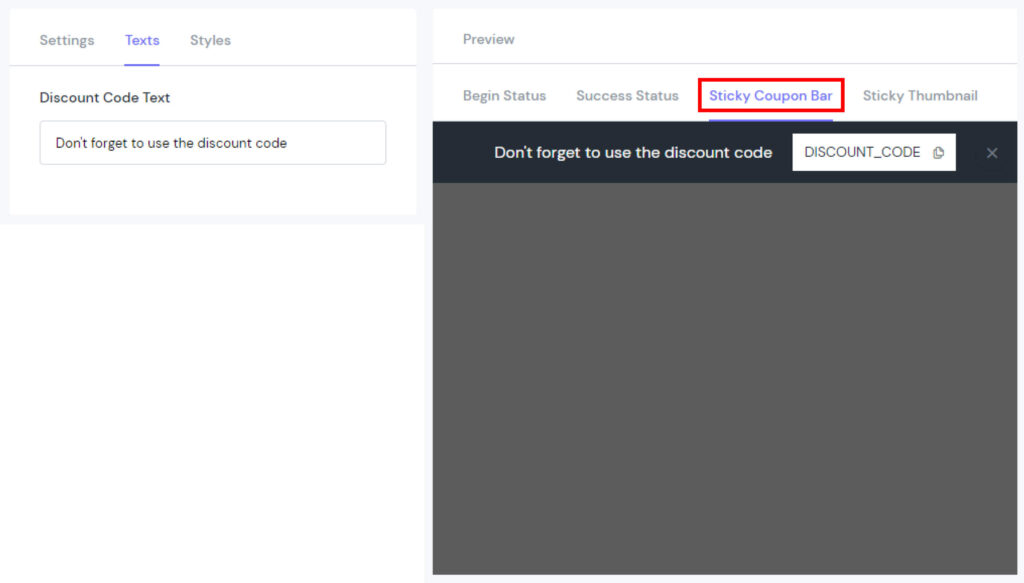
Sticky Coupon Bar
Discount Code Text: Change the text of Sticky Coupon Bar.
Sticky Thumbnail
Sticky Thumbnail Text: Change the text of Sticky Thumbnail.
Styles
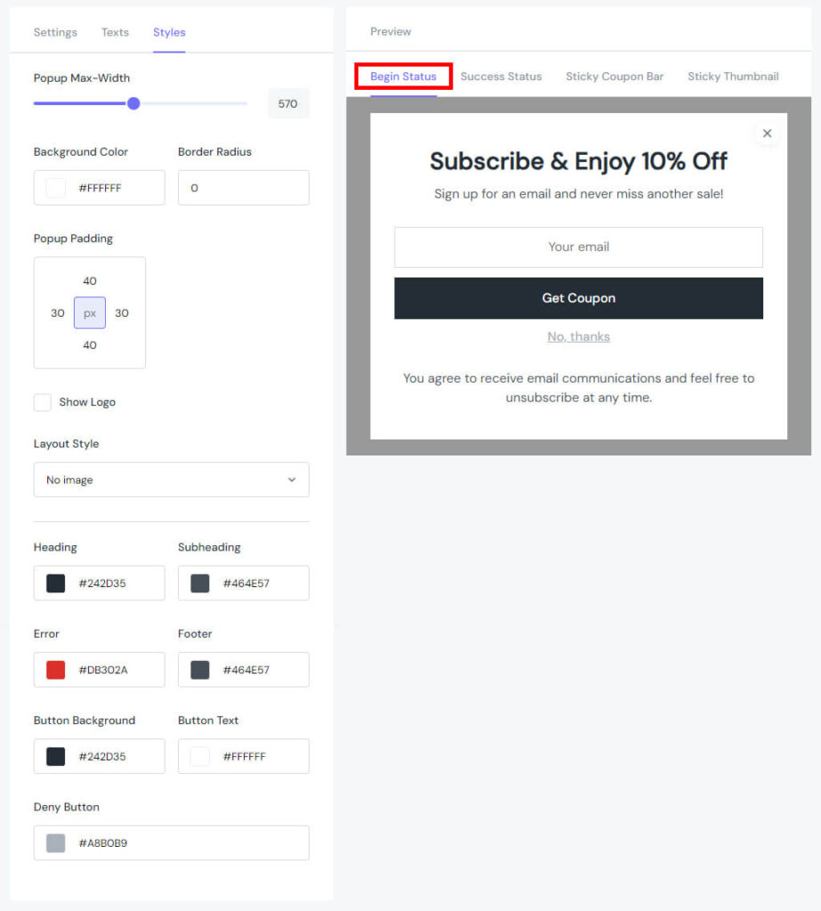
Begin Status
Popup Max-Width: Set the width of the Popup from 200 to 992px.
Background Color: Modify the colour of the background.
Border Radius: Rounds the corners of the outer border edge.
Popup Padding: Create space around the element, inside any defined border.
Show Logo: We provide the option for you to customise to your liking by dropping the file here, pasting, or browsing (jpg, jpeg, png, svg, or gif).
Layout Style:
No image
Left image
Right image
Background image
Heading: Modify the colour of the heading.
Subheading: Modify the colour of the subheading.
Error: Modify the colour of the error.
Footer: Modify the colour of the footer.
Button Background: Modify the colour of the button background.
Button Text: Modify the colour of the button text.
Deny Button: Modify the colour of the deny button.
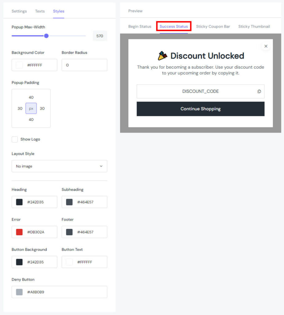
Success Status
Popup Max-Width: Set the width of the Popup from 200 to 992px.
Background Color: Modify the colour of the background.
Border Radius: Rounds the corners of the outer border edge.
Popup Padding: Create space around the element, inside any defined border.
Show Logo: We provide the option for you to customise it to your liking by dropping the file here, pasting, or browsing (jpg, jpeg, png, svg, or gif).
Layout Style:
No image
Left image
Right image
Background image
Heading: Modify the colour of the heading.
Subheading: Modify the colour of the subheading.
Error: Modify the colour of the error.
Footer: Modify the colour of the footer.
Button Background: Modify the colour of the button background.
Button Text: Modify the colour of the button text.
Deny Button: Modify the colour of the deny button.
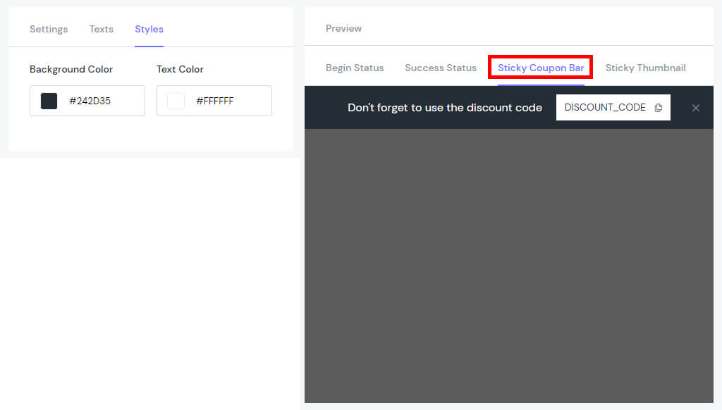
Sticky Coupon Bar
Background Color: Modify the colour of the background.
Text Color: Choose the colour for the displayed text.
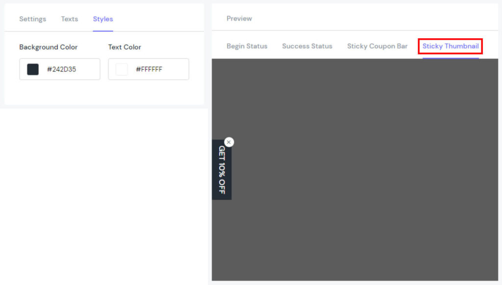
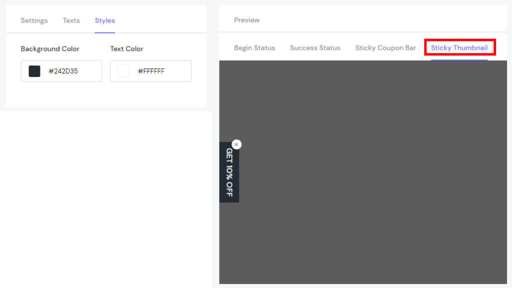
Sticky Thumbnail
Background Color: Modify the colour of the background.
Text Color: Choose the colour for the displayed text.
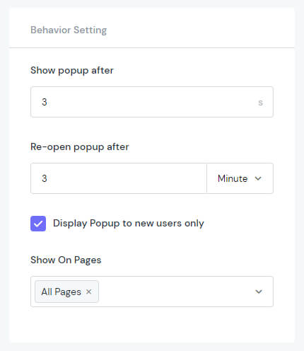
Behavior Setting
Show popup after: Set time to display popup from 0s to 60s.
Re-open popup after: Set time to popup opened again from 1 to 60 mins/hours/days
Display Popup to new users only: Set to display a popup for users visiting the store for the first time.
Show On Pages: Choose the pages to display the Popup.
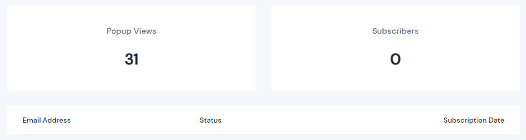
Subscribers
Subscribers provide data on how many people have signed up through the email popup you have created. You not only get a list of potential customers but also evaluate your popup email for completeness and relevance to your customers.
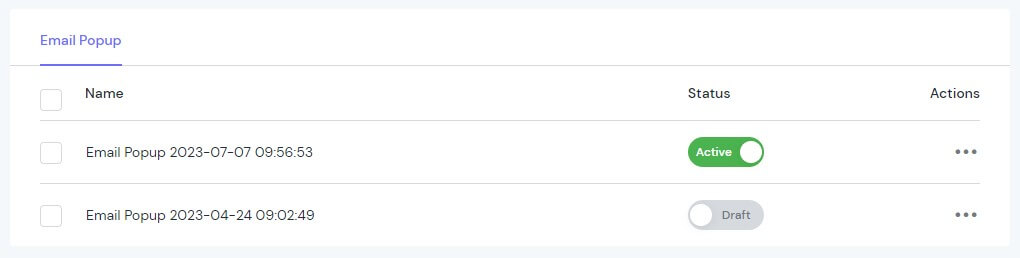
My Activity
You can easily check the campaigns created at My Activity:
Name
Status
Actions
Note: If you create 2 popups of the same style and display them on the same page but with different display parameters, the second popup will override the first one. This can affect the aesthetics of your email popup.

